
These 16 wall painting ideas cover arches, ombre transitions, cloud-like washes, floral murals, and color blocks for living rooms, bedrooms, dining corners, stairs, and shelving. Alongside the inspiration, you will find guidance on choosing an effect, preparing the surface, sampling colors, and adapting each design to your furniture and architecture. The explanations distinguish crisp patterns from softly blended finishes and highlight the application choices that matter, from planning a repeated border to protecting natural wood shelves and caring for a newly painted wall.
Table of Contents
- Choose the Effect and Prepare the Wall
- Choose by the Shape and Finish You Want
- Preparation Comes Before the Decorative Layer
- What “Watercolor-Style” Means on a Wall
- Find an Effect for Your Room
- 1. Layer Soft Watercolor Washes Across the Wall
- 2. Blend an Ombre Wall With Warm Sunset Colors
- 3. Create Soft Purple Watercolor Clouds
- 4. Frame a Seating Area With a Painted Arch
- 5. Use Color Blocks as a Painted Headboard Feature
- 6. Combine Two Green Tones With an Organic Edge
- 7. Highlight an Arched Doorway With Rainbow Bands
- 8. Add a Watercolor Drip Detail Near the Ceiling
- 9. Paint a Floor-to-Ceiling Wildflower Mural
- 10. Follow a Staircase With Diagonal Color Blocks
- 11. Build a Watercolor Feature Around the Fireplace
- 12. Paint a Retro Rainbow Above a Dining Nook
- 13. Add Scalloped Green Borders to a Dining Alcove
- 14. Use Paint to Highlight Built-In Shelving
- 15. Anchor a Sofa With an Oversized Rainbow Arch
- 16. Blend Soft Pastel Color Clouds Above the Bed
- Finish with a Use and Care Plan
Choose the Effect and Prepare the Wall
Choose by the Shape and Finish You Want
For controlled outlines, consider a painted arch, color block, or repeated scallop border. For visible freehand movement, compare the cloud and layered wash designs. A floral mural asks for more drawing and a planned sequence of large shapes before small details. Decide whether the wall should frame one furniture piece, connect an architectural opening, or carry color across a broad surface. That purpose helps narrow the choice before you choose individual shades.
Check the wall width and furniture positions together. Draw the proposed outline on paper or a temporary layout, including the parts furniture will hide. Choose colors under the room’s usual daylight and artificial light. Repeating one wall color in a textile or accessory can connect the scheme, but matching every object is unnecessary. The selected palette should also work with the base color left between the painted shapes.
Preparation Comes Before the Decorative Layer
Remove loose dirt and residue using a cleaning method appropriate to the existing surface. Let it dry, repair damaged areas, and prepare those repairs as the coating system requires. Remove preparation dust and decide on primer from the existing finish, repaired areas, and selected paint. Protect floors, furniture, trim, and any wood you intend to leave exposed. Follow ventilation, drying, and recoating instructions throughout the work.
Plan the tools around the effect: rollers cover broad base areas; brushes work on bands and visible strokes; templates, a ruler, and a level help with repeated patterns. Select masking tape for the actual surface and check both tape and paint instructions before applying it to a fresh coat. Texture can interrupt a taped boundary, so test the edge on a small area. Keep access to high surfaces stable and appropriate to the location.
What “Watercolor-Style” Means on a Wall
Here, watercolor describes the appearance of diffused or overlapping color, not a direction to apply artist’s watercolor paint to an interior wall. Use an interior coating and compatible decorative effect system for the substrate. A brush may leave more apparent strokes, while a sponge or soft cloth can disperse the edge. Follow the chosen product’s limits for thinning; adding large amounts of water to ordinary wall paint is not a dependable substitute for an appropriate system.
Make a sample with the same tools and base color you plan to use. Check transparency, overlaps, edge softness, and the marks left by the application tool after the sample dries. For ombre, test neighboring color transitions; for clouds, test a complete patch and the open space around it. For pronounced texture, choose a coating intended for the wall surface and try its application on a sample before covering the room. You can adapt the palette and pattern without promising that ordinary paint will reproduce every ridge or raised detail.
1. Layer Soft Watercolor Washes Across the Wall
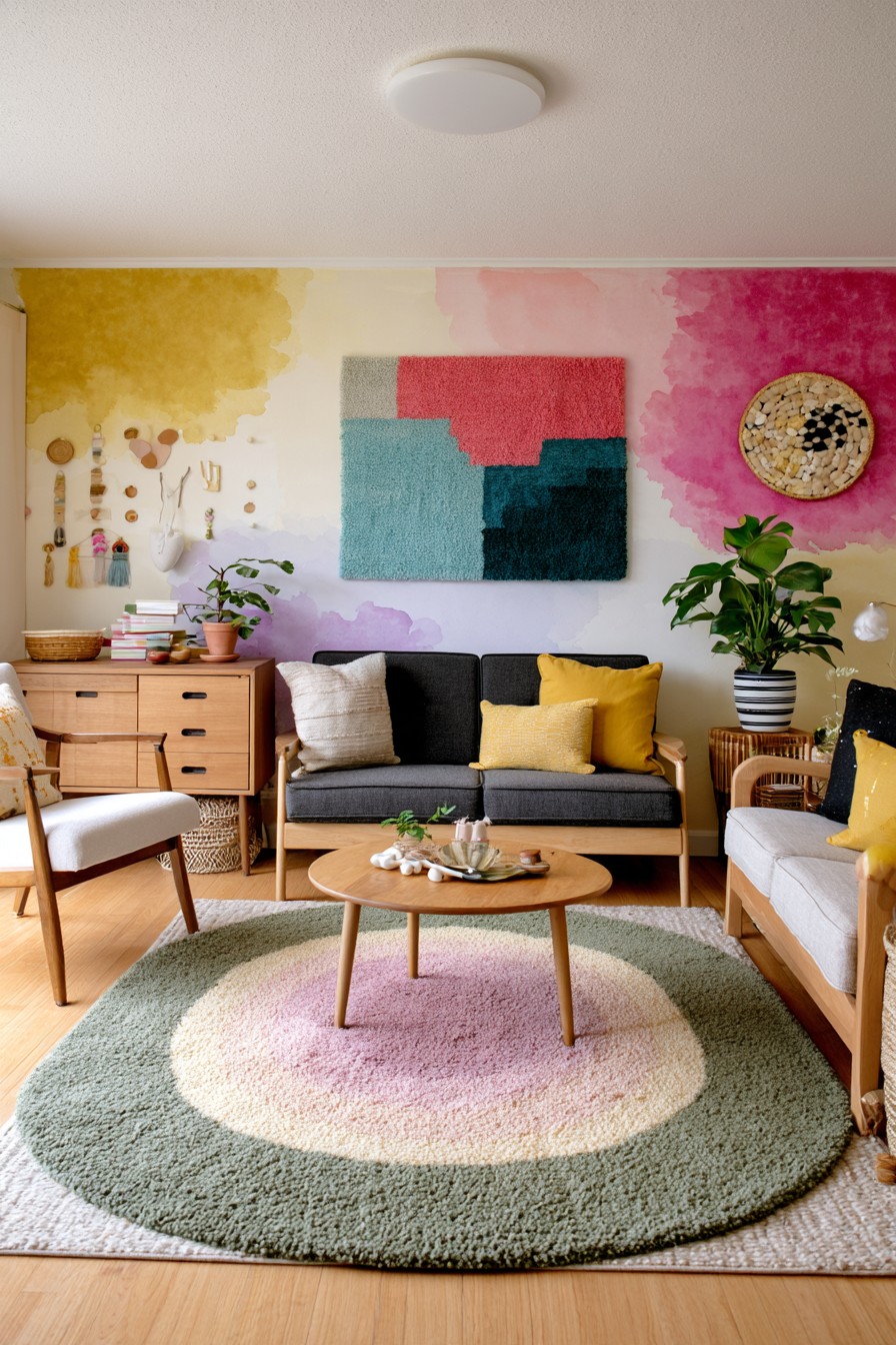
Mustard, pink, magenta, and pale lavender spread across the light wall in broad patches with differing intensity. The arrangement feels energetic because the color areas remain irregular instead of becoming a tiled pattern. A muted green rug sits on visible wooden flooring, with yellow cushions linking back to the wall. The geometric artwork is a separate framed element; its sharp colored shapes are not part of the wash technique.
Plan the large patches around the sofa and artwork, leaving some base color visible between them. Build a sample that includes overlapping colors, since their intersections may read darker than either color alone. Choose an interior-paint effect system that produces the desired transparency within its stated limits. Establish the softer, lighter areas first, then add deeper accents where they improve the composition. Judge the result from the room entrance before enlarging any patch.
2. Blend an Ombre Wall With Warm Sunset Colors
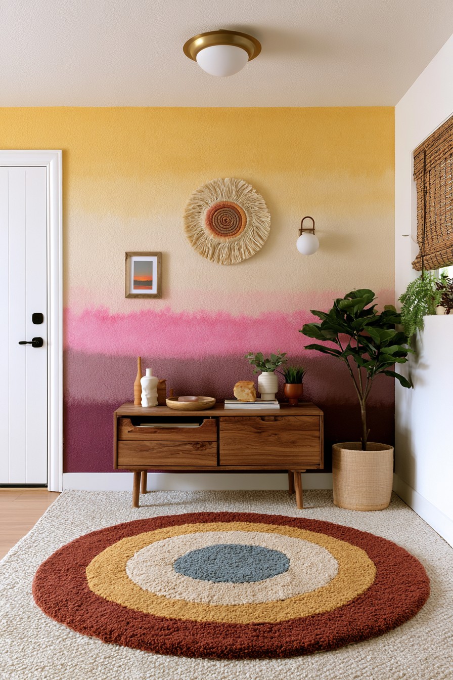
Golden yellow fades through pale beige and pink into mauve and a darker lower band. The whole wall becomes a gradient, with a timber sideboard sitting in front of its deepest colors. Unlike the patchwork washes, this design depends on neighboring tones connecting across the width without obvious stripe edges. The circular rug reinforces the warm palette while introducing a different direction beneath the straight furniture.
Mark the intended band heights and compare the color order on a sample. Blend manageable sections while both adjacent edges are wet; waiting until the whole wall has dried makes their boundaries harder to soften consistently. Where necessary, renew the neighboring edges according to the product’s method instead of scrubbing a drying film. Keep brushes clean enough that one transition does not carry an unwanted color into the next. Working time depends on the coating and room conditions, so avoid a fixed schedule for every wall.
3. Create Soft Purple Watercolor Clouds
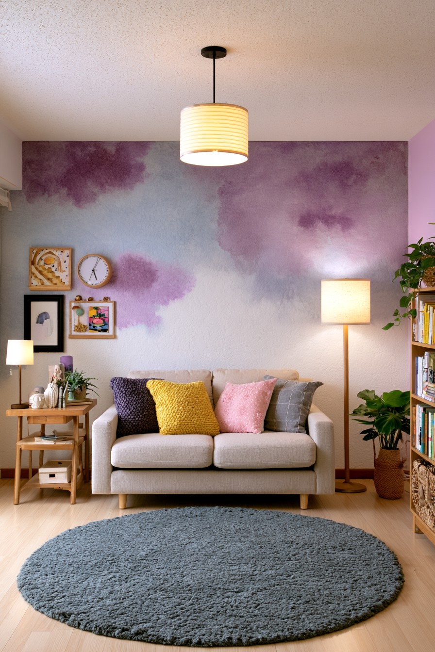
Lavender and deeper violet gather near the ceiling, thinning toward the sofa and leaving a broad pale area below. The color behaves like separated cloud masses, not a full-wall gradient. This arrangement suits a room where furniture needs a quiet background while the upper wall carries the visual movement. Darker pockets give the clouds depth without requiring a defined outline around each form.
Sample both the interior of a cloud and its edge before choosing the application tool. A brush-led finish may preserve visible strokes, while a compatible sponge or cloth method can make the perimeter more dispersed. Plan the main patches at different sizes and include the overlap between purple tones in the sample. Keep light areas between the groups so they remain distinct. Look from the opposite side of the room while working; close-up attention alone can produce patches that become too dense together.
4. Frame a Seating Area With a Painted Arch
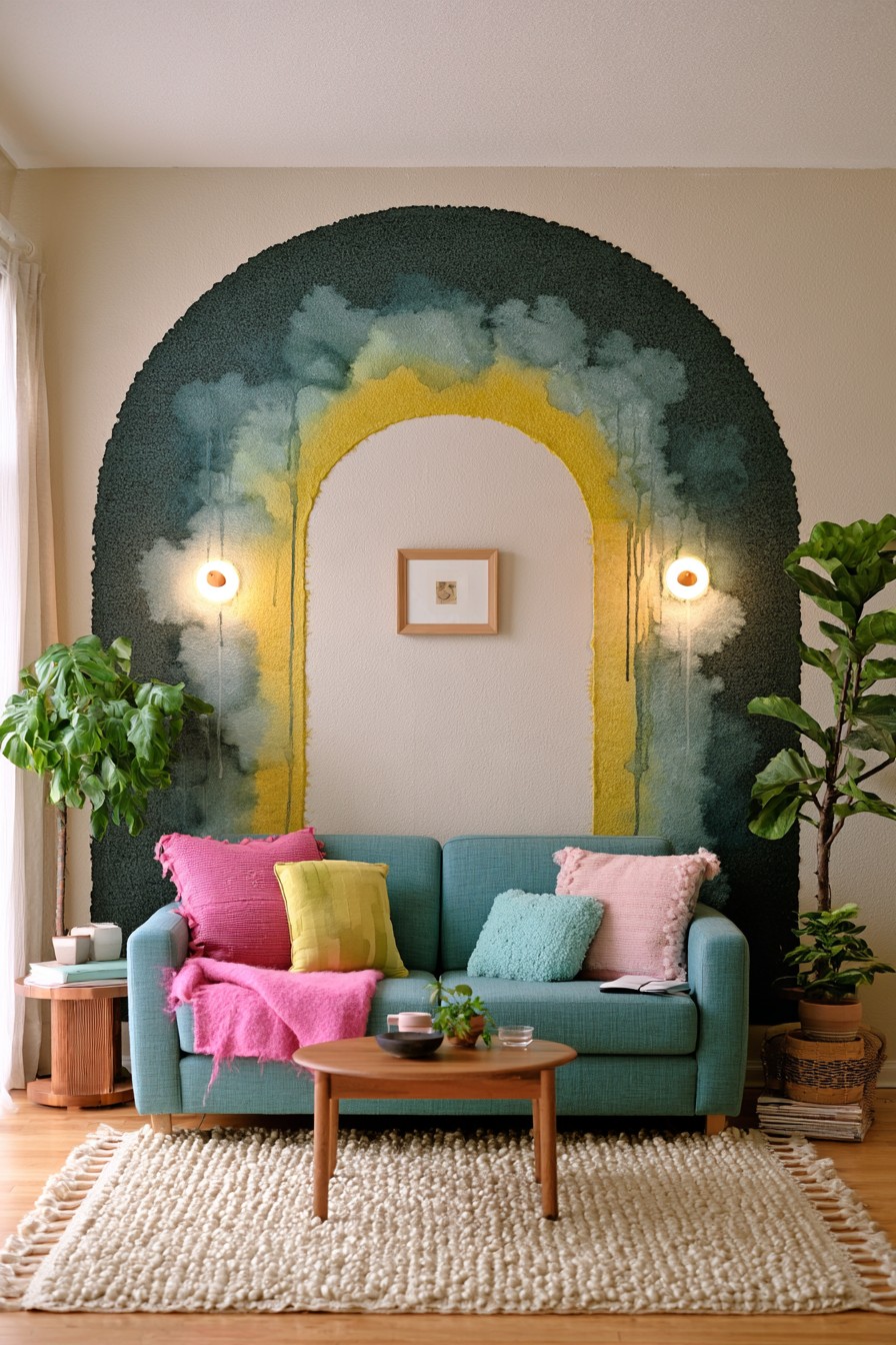
A dark outer arch, mustard inner band, and loose blue-green marks frame the sofa while leaving the center pale. The design separates two decisions: an architectural outline provides order, and painterly marks soften it. Its width relates to the seating group, allowing the mural to define that zone without filling the entire wall with green. The open center also gives the small framed artwork space of its own.
Establish the center from the sofa placement, then plan the outer curve and inner bands together. A string compass works for a genuinely circular top; another outline needs a template matched to its shape. Check both sides against the furniture before painting. Complete the main color areas, allowing the required drying stages, then add the loose transition marks selectively. Sample the color treatment first, then test any textured coating separately on the intended substrate.
5. Use Color Blocks as a Painted Headboard Feature
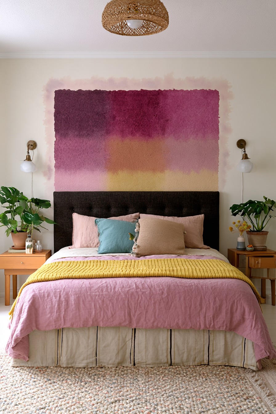
A broad rectangular field above the headboard combines plum, pink, rose, and muted yellow. Its outer boundary is soft as well as its internal transitions, giving the feature the scale of large artwork without a rigid frame. The darker headboard provides a clear lower anchor. This is useful when you want a concentrated bedroom focal point rather than color spreading across the whole wall.
Measure the overall position and width before applying paint, but distinguish that layout from masking every edge into a sharp rectangle. To follow this appearance, keep the placement deliberate while softening selected outer and inner boundaries. Test the transitions and overlaps on the planned base color. Repeat one or two tones in the bedding, leaving the rest quieter. Work in a sequence suited to the decorative coating, and let the broad field remain readable instead of filling it with many small patches.
6. Combine Two Green Tones With an Organic Edge
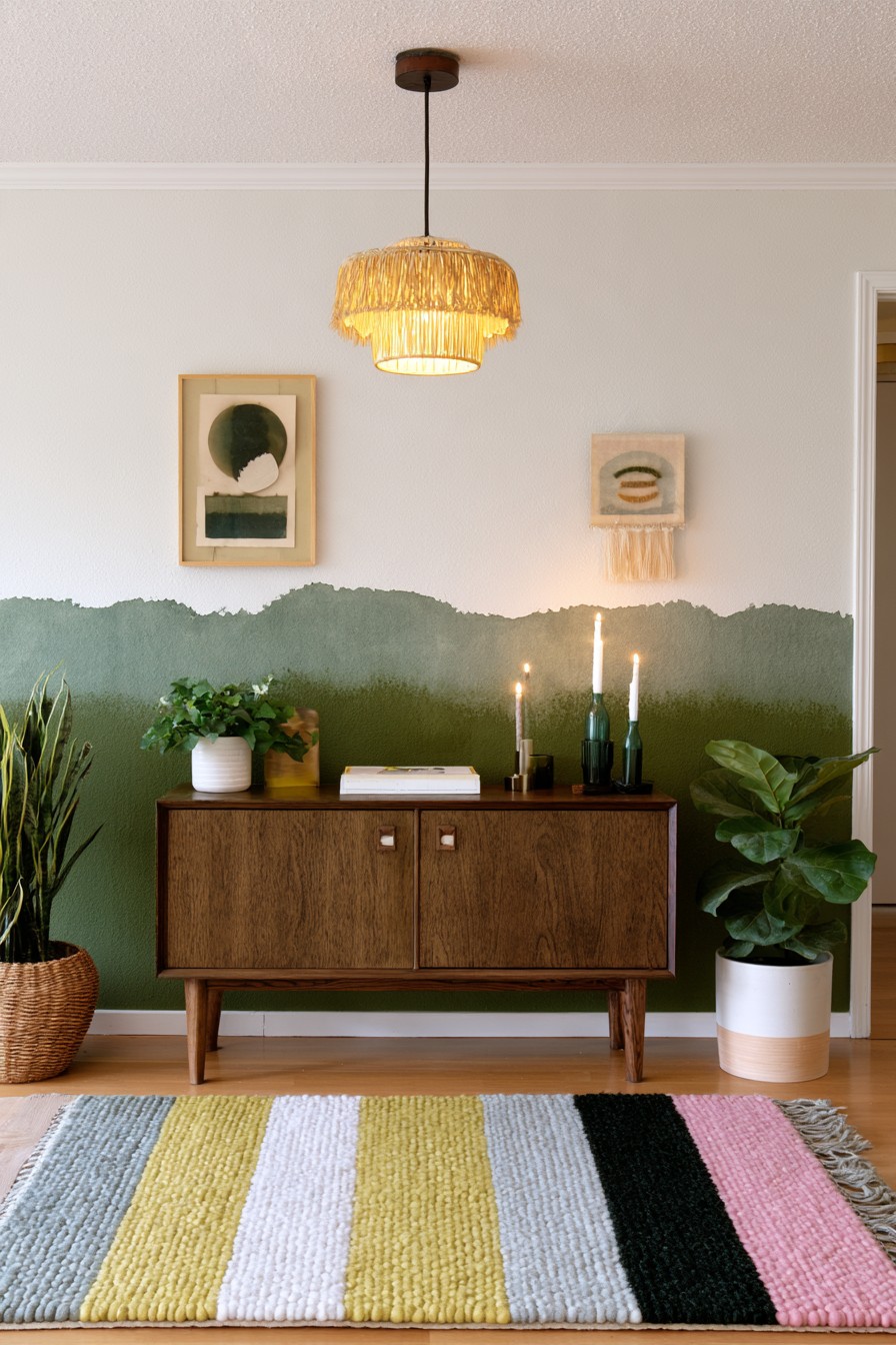
Deep olive follows the lower wall behind a timber sideboard, with a softer sage layer above it and a pale upper surface. The uneven edge gives the simple palette a freehand character. Because the darkest shade stays near the furniture, the upper wall still has room for small artwork and lighting. This is a restrained option for adding depth without the drawing needed for a mural.
Mark the approximate height relative to the sideboard and decide how much variation the upper edge should have. Paint the main fields using their specified drying and recoating stages, then refine the irregular boundary without turning it into a ruler-straight stripe. Compare the greens with the wood, light ceramics, and textiles in the room. Keep the edge variation broad enough to look intentional from a distance.
7. Highlight an Arched Doorway With Rainbow Bands
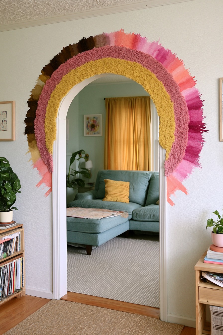
Warm bands follow the existing doorway, with mustard nearest the opening and pink, coral, burgundy, and brown moving outward. The outer marks look looser than the more defined inner curve. This turns the architecture into the pattern’s foundation, making the mural feel connected to the rooms on both sides rather than placed on an arbitrary wall section.
Trace the actual opening and measure band offsets at several points along the curve and sides. Do not assume every arched doorway is a perfect semicircle. Plan the bands as one set so their centers and spacing remain aligned. For crisp divisions, choose tape suited to the surface and respect the waiting period for the fresh paint beneath it. Preserve the freehand outer edge if that is the intended character. The surface relief cannot be established from the photo, so judge the sampled color bands independently of that texture.
8. Add a Watercolor Drip Detail Near the Ceiling
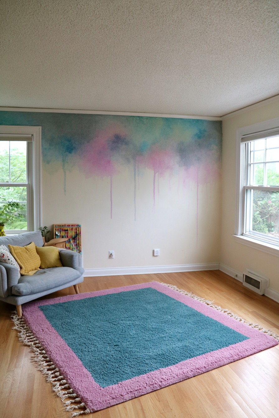
Teal, blue, lavender, and pink collect in a hazy strip near the ceiling, with a few thin runs extending down the otherwise pale wall. The upper placement leaves the lower area available for furniture and storage. The drips distinguish it from the purple cloud design: they add selected vertical lines below a broad horizontal wash without covering the whole surface.
Plan the main color groups and the approximate locations and lengths of the runs before beginning. Test the chosen coating on an upright sample so gravity’s effect is visible, using only the thinning or effect method its manufacturer permits. Protect everything below the work, including skirting and nearby furniture. Add individual runs where they improve the pattern instead of letting every color produce uncontrolled drips. Stop and assess the wall from a distance between stages so the lower portion remains as open as intended.
9. Paint a Floor-to-Ceiling Wildflower Mural
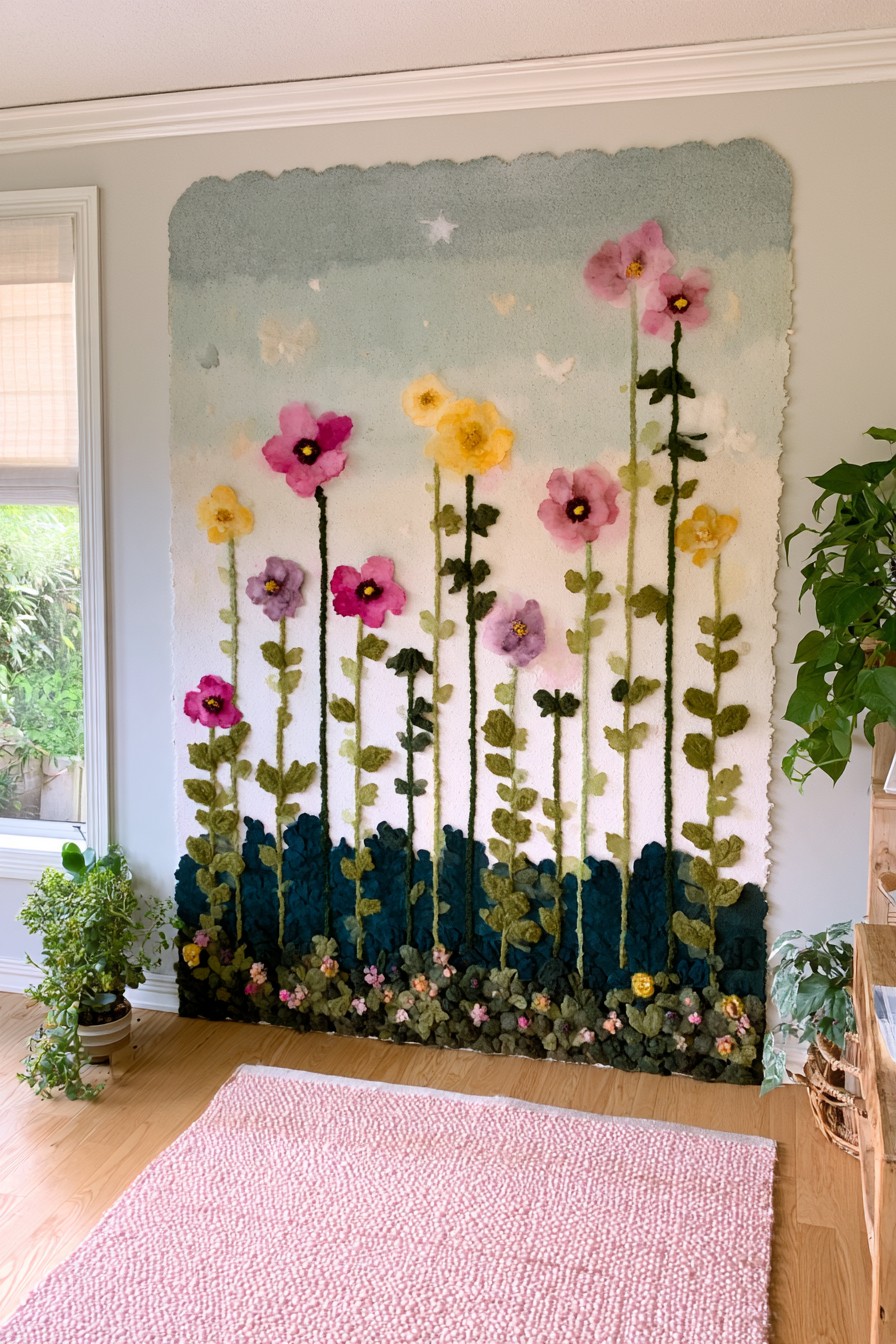
Tall stems end in pink, yellow, burgundy, and lavender flowers at staggered heights above a dense blue-green base. The pale background field makes the flowers stand out, while the lower foliage gives the composition a clear starting point. This approach provides a recognizable mural rather than an abstract effect and suits a wall where the floral shapes can remain visible from floor to ceiling.
Map the largest flower heads against the planned furniture positions before drawing the stems. A cabinet or sofa can hide much of the lower garden, so keep important shapes in the visible area. Establish the background field, then the major stems and foliage, followed by flower heads and smaller accents. Vary stem spacing and direction to avoid a rigid row. The pronounced textures are not a confirmed paint technique; adapt the botanical drawing and palette with a coating method you have sampled on the actual wall surface.
10. Follow a Staircase With Diagonal Color Blocks
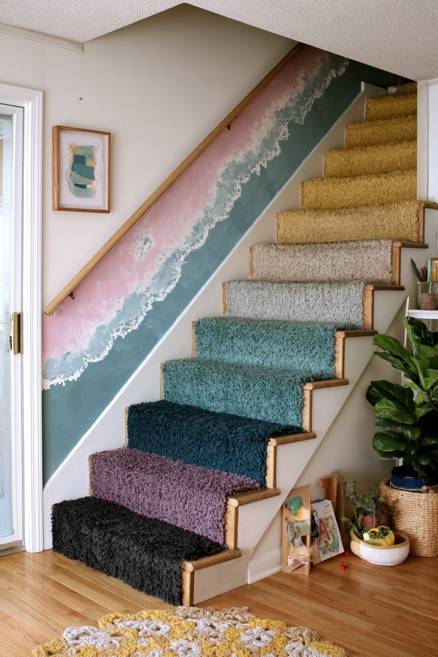
Dusty pink and blue-green run diagonally beside the stairs, with a loose pale transition following the upward slope. The orientation makes the wall respond to the circulation route instead of imposing a horizontal stripe against it. Repeated colors in the stair runner connect the wall with the nearby surfaces, but the decorative boundary remains separate from the handrail and tread edges.
Use the stair angle to locate guide points, then compare the proposed boundary with the rail and the visible wall area. Choose a taped division for a cleaner interpretation or sample the softer freehand transition shown here. Resolve access before painting high sections: use equipment designed for the location with a stable, level working position. Improvised blocks or uneven supports on the steps are unsuitable. Keep the route clear and protect the rail and runner without compromising access. The wall pattern should follow the architecture without interfering with its use.
11. Build a Watercolor Feature Around the Fireplace
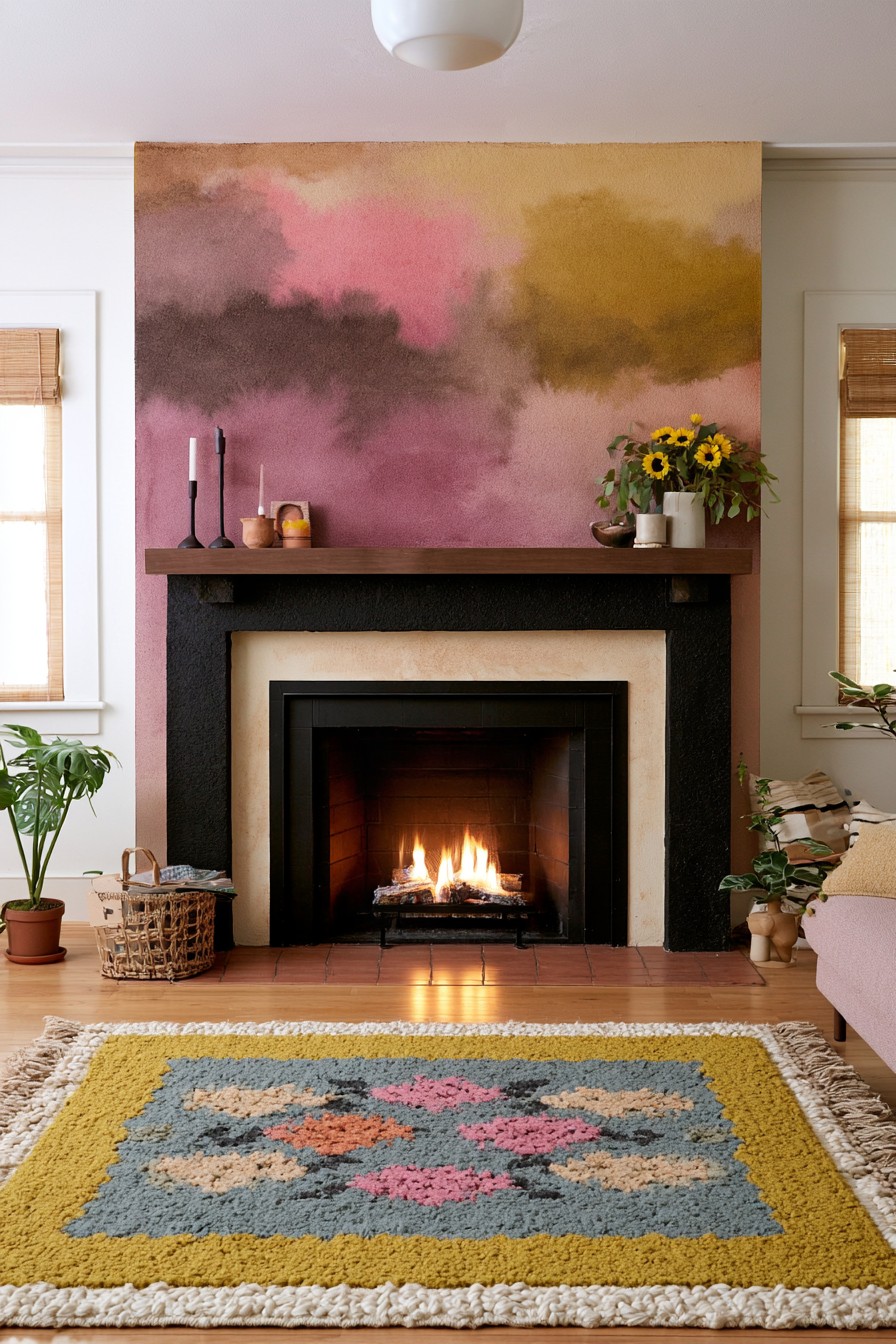
Plum, pink, brown, beige, and mustard occupy the wall section above and around the fireplace, with deeper areas near its visual center. The composition is concentrated rather than spread across the complete room. Its connection to the mantel makes the feature feel architectural, while the irregular outer color patches prevent it from reading as a strict rectangular block.
Confirm which surfaces may be coated under the fireplace manufacturer’s instructions, including the appliance’s clearance zones and the actual wall construction. Measure the actual clearances and check the surrounding materials against the appliance manufacturer's installation requirements. Within the permitted area, sample overlapping colors and plan their relationship to the mantel and nearby objects. Build the softer outer areas and deeper accents in the sequence required by the chosen effect system. Keep decorative coatings off components that need access or specified heat protection, and avoid assigning one paint type or distance to every fireplace installation.
12. Paint a Retro Rainbow Above a Dining Nook
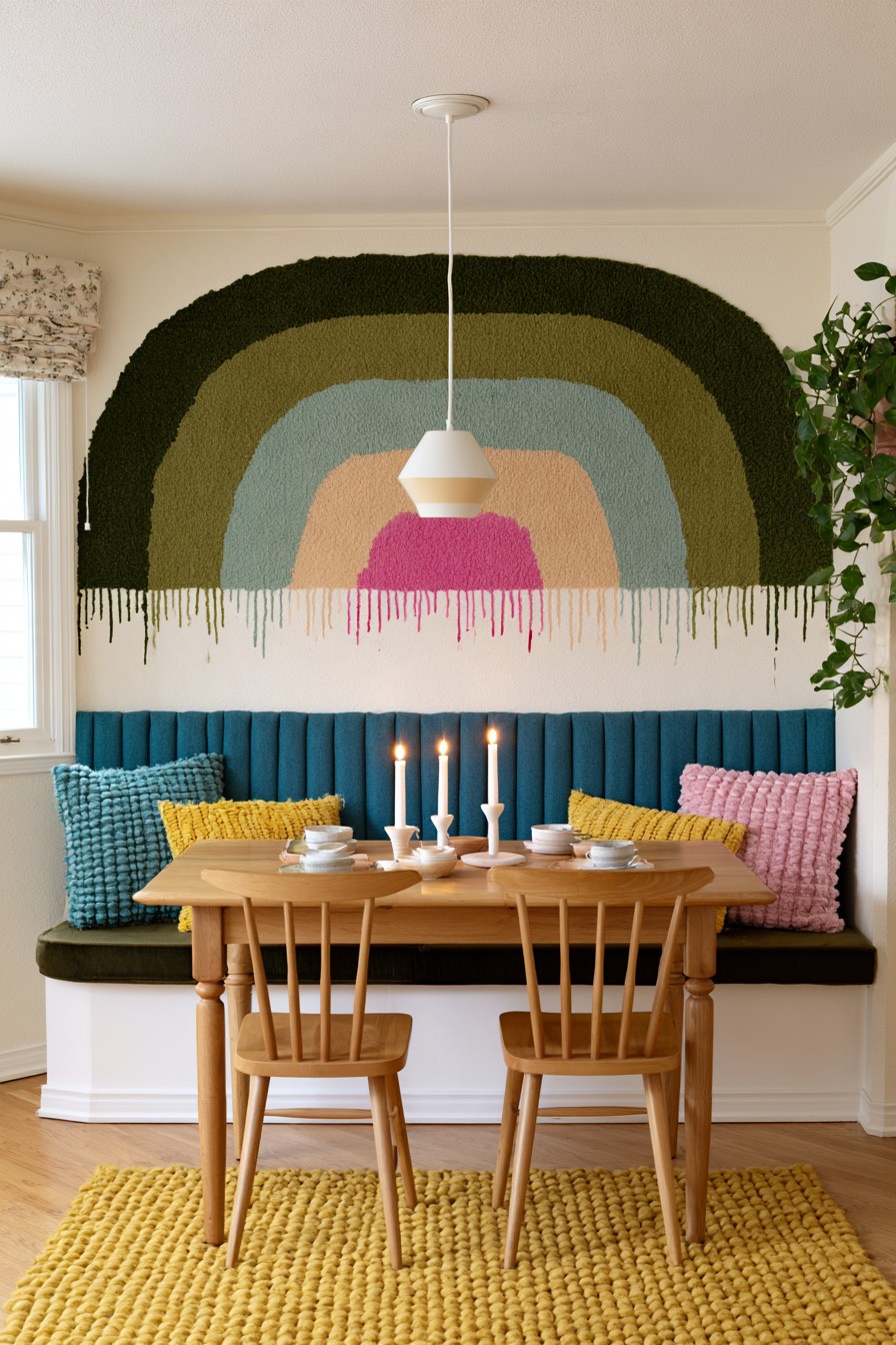
A broad nested arch spans the dining bench in dark green, olive, muted blue, beige, and pink. Narrow runs extend below the lower band edges, giving the otherwise regular geometry a deliberately expressive finish. Its scale is central to the effect: the arch acts as the bench’s backdrop, while the open wall around it keeps the dining corner distinct.
Set the common center from the seating position and plan the outer shape and band widths together. Compare the full outline with the pendant light and bench before beginning. Paint the main bands through their required drying stages, then decide separately where the drips will start and how far they will extend. Protect the table and upholstery before that final layer. Sample the pattern and color boundaries without assuming that ordinary wall paint will reproduce the visible raised surface. The dripping treatment should remain a controlled design decision.
13. Add Scalloped Green Borders to a Dining Alcove
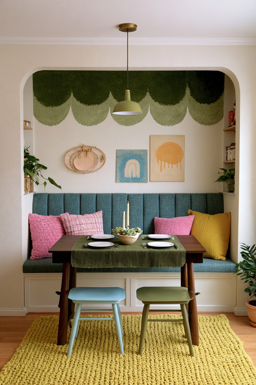
Deep green scallops sit high within the dining alcove, overlapping a softer sage row below. Most of the wall stays pale, leaving room for artwork and the bench. The repeated curves relate to the rounded opening around the nook but create their own smaller rhythm. It is a useful alternative to a full arch when you want pattern limited to the upper wall.
Measure the usable width and decide how many repeats fit before tracing the first scallop. Adjust the template size or starting position so neither corner ends with an unintended narrow sliver. Mark a level reference and the center positions for both rows, then check their overlap on paper. If tape helps define part of the pattern, select it for the existing finish and the age of the underlying coat. Paint and remove masking according to the relevant instructions. Keep the lower edge consistent enough that the repetition remains clear across the alcove.
14. Use Paint to Highlight Built-In Shelving
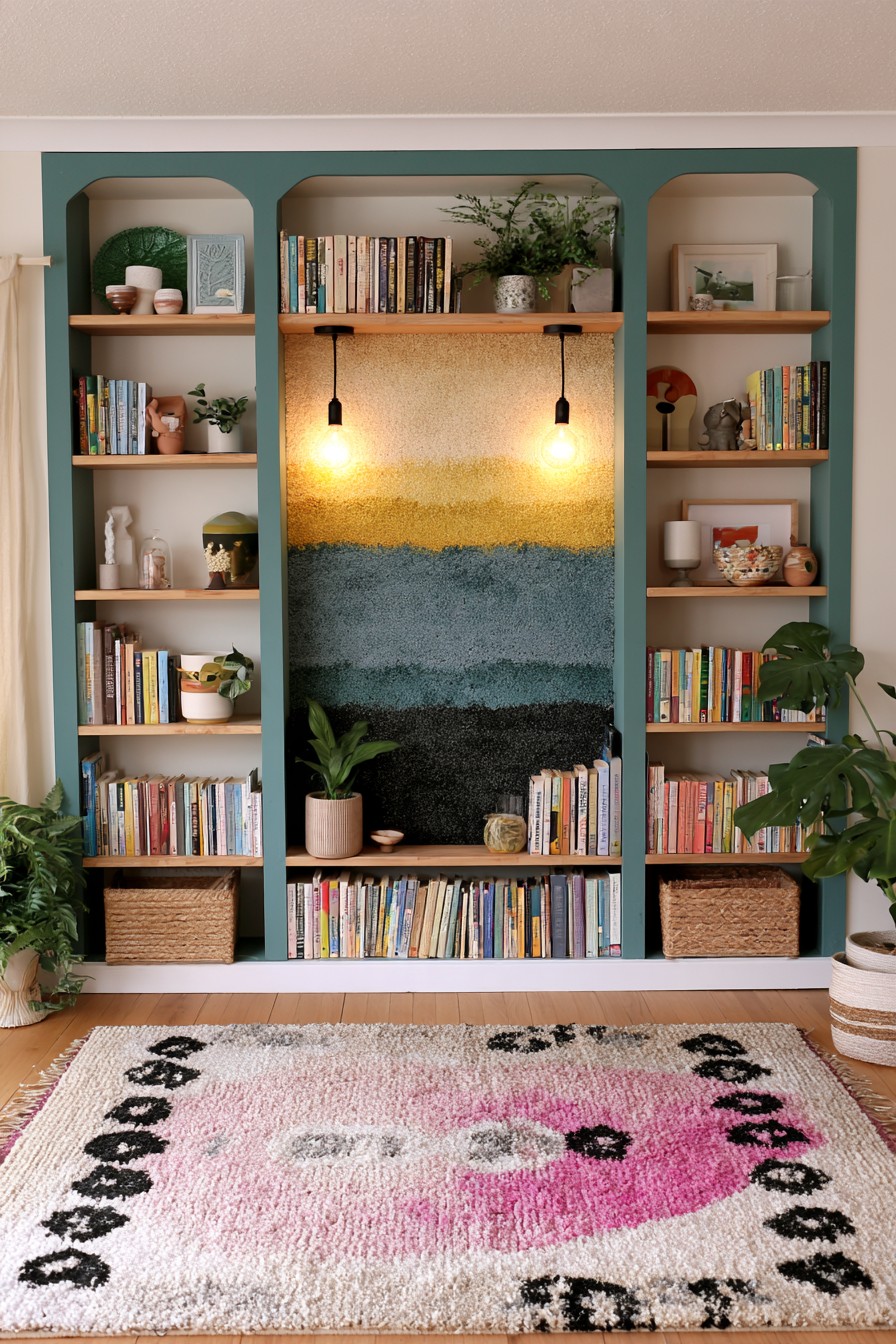
A muted blue-green framework surrounds natural wood shelves and a central recess with horizontal beige, mustard, blue, teal, and dark bands. The dark lower portion anchors the tall unit, while the lighter top links it to the warm wood. Here, the color operates across several planes, so the shelving architecture matters as much as the pattern inside it.
Identify the niche wall, outer framework, and shelves separately before choosing preparation and coatings. Wood, MDF, previously coated joinery, and a plaster wall may require different systems. Protect the shelves intended to remain natural, and plan the color sequence without obscuring access to fixings. Use a wall finish for the wall where appropriate and a furniture-suited coating for handled joinery. To repeat selected colors on a smaller nearby piece, compare these painted furniture ideas. Choose crisp or softer boundaries from a sample rather than from the photograph’s unconfirmed texture.
15. Anchor a Sofa With an Oversized Rainbow Arch
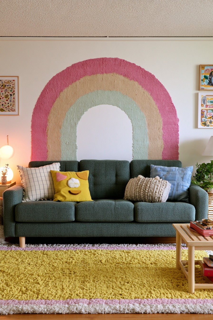
Three large bands in dusty pink, warm beige, and pale sage surround an open center behind the dark green sofa. The simple palette lets the arch’s scale provide the impact, with the surrounding furniture and rug remaining distinct. Unlike the doorway rainbow, this form responds to a furniture group and can be repositioned without depending on an existing opening.
Draw the arch’s outer curve, inner opening and color bands together, centered on the sofa. Check the view from the entrance before painting. Use one consistent center for circular curves or a full-size template for another shape. Sample the colors on the actual wall finish before marking the final layout.
16. Blend Soft Pastel Color Clouds Above the Bed
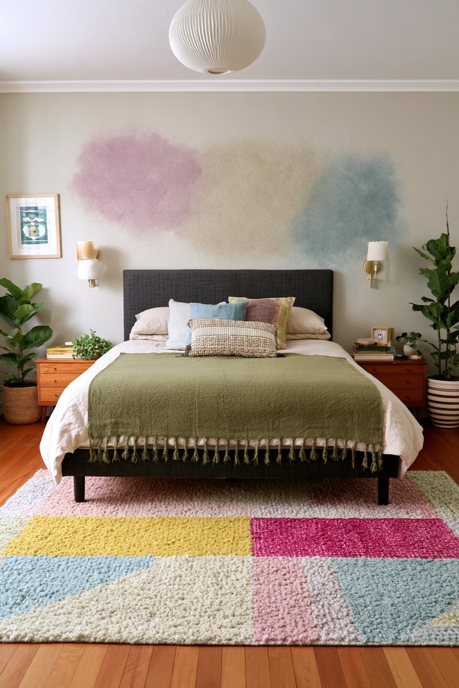
Pink, warm beige, and muted blue appear as three hazy color areas above the dark headboard. Pale background remains between them, preventing the arrangement from becoming a single solid field. This differs from the rectangular headboard feature: the individual clouds stay recognizable and the open base color is part of the composition. The room’s textiles pick up softer tones without copying every wall color.
Place the three main areas on a sketch relative to the bed, then sample their edges and any intended overlap. Build coverage gradually with the chosen interior effect system, keeping some base color exposed. Avoid repeatedly manipulating paint that has begun to dry; follow the product’s working and recoating method instead. Relate the softer patches to bedding through a limited palette, such as blush, cream, and one deeper accent. Assess the three shapes together before enlarging any one of them.
Finish with a Use and Care Plan
Choose the wall and its purpose, set the design in relation to furniture, then confirm the preparation and coating system. Keep the final sample as a reference for color and technique. Label leftover paint with its product, color, and finish so future touch-ups use the correct material.
Dry to the touch does not necessarily mean ready for cleaning. Wait for the coating system’s stated curing period, especially near dining seats, stairs, and handled shelf frames. Clean gently using the finish manufacturer’s method and test it in a discreet area first. Avoid one universal waiting period for every product; the wall paint, effect layer, and joinery finish may have different care requirements.

Leave a Reply