
A painted floor can give a room character through a simple border, a repeating stencil, or a larger illustrated scene. The method below explains the preparation and finishing decisions first. Then, 35 ideas show how color, scale, and placement can turn the floor into a distinctive part of your interior.
Table of Contents
- How to Paint a Floor Before Adding a Decorative Design
- Step 1: Prepare and Test the Surface
- Step 2: Measure the Layout Around Furniture and Doorways
- Step 3: Apply Primer or a Background Where Required
- Step 4: Paint the Pattern in Controlled Passes
- Step 5: Add a Compatible Protective Finish if Needed
- Step 6: Allow Curing Before Returning the Room to Use
- Find Your Direction in These 35 Painted Floor Designs
- 1. Sweeping Green Waves Around a Freestanding Bath
- 2. Scalloped Medallions Along a Wooden Hallway
- 3. Sage and White Checkerboard Beneath a Dining Table
- 4. A Storybook Garden Path for a Bedroom
- 5. A Rounded Turn in Sage and Cream Stripes
- 6. Folk Flowers Arranged in Kitchen Rows
- 7. An Earthy Sunburst Across the Seating Area
- 8. A Spiral Runner Between Bookcases
- 9. A Compass Inspired Star Inside a Decorative Frame
- 10. A Single Tree Canopy for a Reading Corner
- 11. White Daisies on a Deep Green Laundry Floor
- 12. A Symmetrical Rose Vine as a Floor Mural
- 13. A Greek Key Runner with Broad Right Angles
- 14. Octagons That Define a Compact Breakfast Nook
- 15. Oversized Retro Daisies on an Ochre Ground
- 16. Large Plum Blossoms Around a Dressing Table
- 17. Framed Green Octagons with Floral Centers
- 18. Burgundy Octagons Through an Arched Hallway
- 19. Nested Borders Beneath a Dining Table
- 20. Dark Starbursts in a Small Powder Room
- 21. Wide Color Frames for a Living Room
- 22. Quiet Stripes with a Burgundy Bed Frame
- 23. Repeating Fans Toward a Green Door
- 24. Butterflies and Seed Pods Along a Narrow Passage
- 25. A Botanical Moth Runner on Dark Timber
- 26. Scissors, Thread, and Ribbon for a Sewing Room
- 27. A Lemon Vine Border Around a Breakfast Nook
- 28. Peacock Feathers Near a Vanity
- 29. A Letter Inspired Trail for a Playroom
- 30. A Road Map That Becomes a Toy Car Route
- 31. A Hopscotch Court in Soft Colors
- 32. A Rich Folk Floral Border Around Natural Wood
- 33. Large Iris Blooms Along an Entry Hall Border
- 34. A Blue Citrus Frame for a Dining Room
- 35. Dark Roses Around a Moody Bedroom Floor
- Test the Pattern Before Committing to the Floor
How to Paint a Floor Before Adding a Decorative Design
Start by identifying both the flooring material and its existing finish. A coating approved for wood or concrete is not automatically suitable for ceramic tile, laminate, or vinyl. Choose a complete floor paint system rated for your surface and the room’s use. Ordinary wall paint or craft paint should not replace a coating designed for foot traffic.
Bathrooms and laundry rooms need particular attention to moisture and traction. Choose products specifically suitable for those conditions, and do not extend a general decorative coating into a shower floor or continuously wet area. Painting does not replace waterproofing or repair a moisture problem. Check the label’s limits before selecting a design.
Materials: A suitable floor cleaner, measuring tape, pencil, painter’s tape, paper layout, reusable stencil, small roller, stencil brush, and compatible floor paints. Add abrasive paper, primer, and a clear floor finish only when your chosen system specifies them. Follow the product directions for ventilation and protective equipment.
Step 1: Prepare and Test the Surface
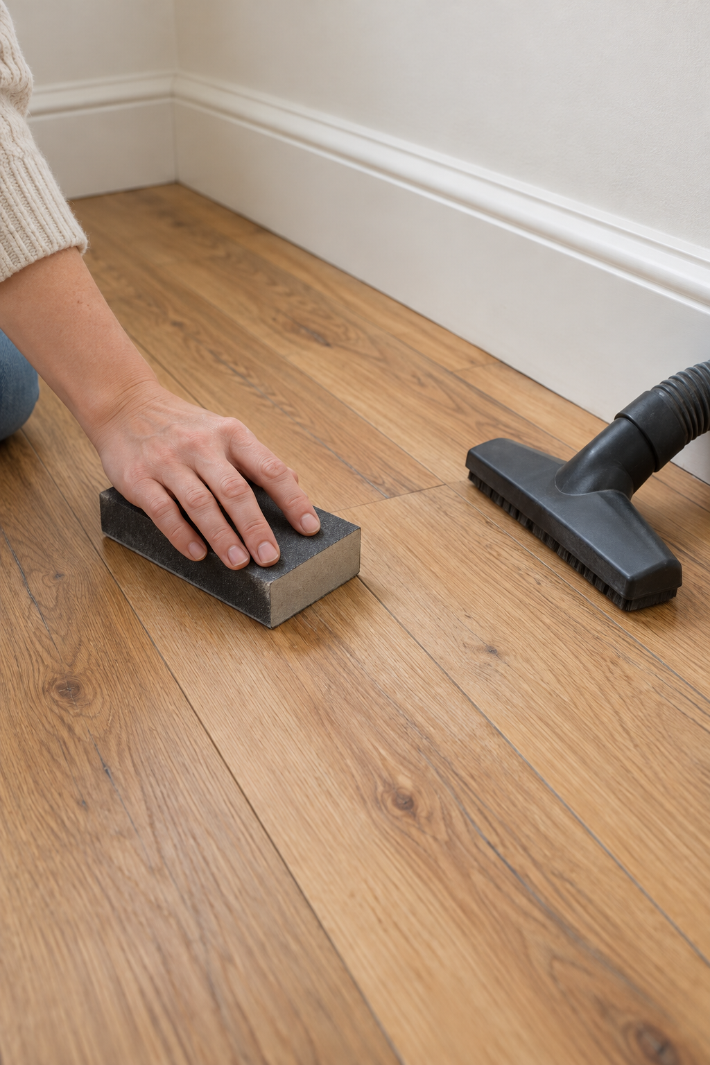
Move furniture and rugs out, then remove dirt, grease, wax, and cleaner residue using the preparation method specified for the coating. Let the floor dry fully. Repair suitable defects before decorating, while preserving intended movement joints and expansion gaps. Address loose boards or persistent dampness before applying paint.
Some finishes need abrasion to help paint adhere, while other systems do not require routine sanding. Follow the directions for the actual surface rather than sanding every floor by default. Have old paint of unknown composition assessed before disturbing it. Test the complete coating system in an inconspicuous area and perform the manufacturer’s adhesion check before proceeding.
Step 2: Measure the Layout Around Furniture and Doorways
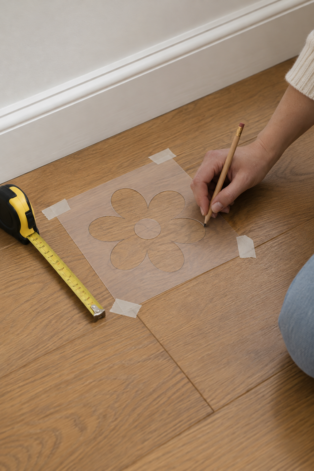
Sketch the design, including the position of furniture and the open walking areas. For borders, use a consistent reference line instead of assuming every wall is straight. For repeated motifs, mark a grid of centers and check how the final repeat meets thresholds and corners. Place a stencil or paper template on the floor to assess its scale.
Mark lightly so guide lines will not remain visible through a pale finish. Straight bands can be masked with suitable tape; curved motifs may need a stencil or transferred drawing. Work out an exit route before starting the coating, especially if you plan to paint most of the room.
Step 3: Apply Primer or a Background Where Required
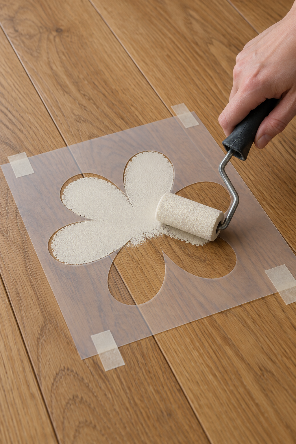
Use primer only when the specified system requires it, then apply the background coat if your design has one. Keep an opaque undercoat within the area that will receive opaque color if you intend to leave neighboring wood visible. The example shows a pale undercoat confined to a flower motif; a full painted rectangle would need its own measured boundaries.
Apply coats at the recommended thickness and observe the stated interval between them. Follow the product’s timing for applying tape or a stencil over fresh paint. Working from the far end toward the exit helps avoid stepping across newly coated areas.
Step 4: Paint the Pattern in Controlled Passes
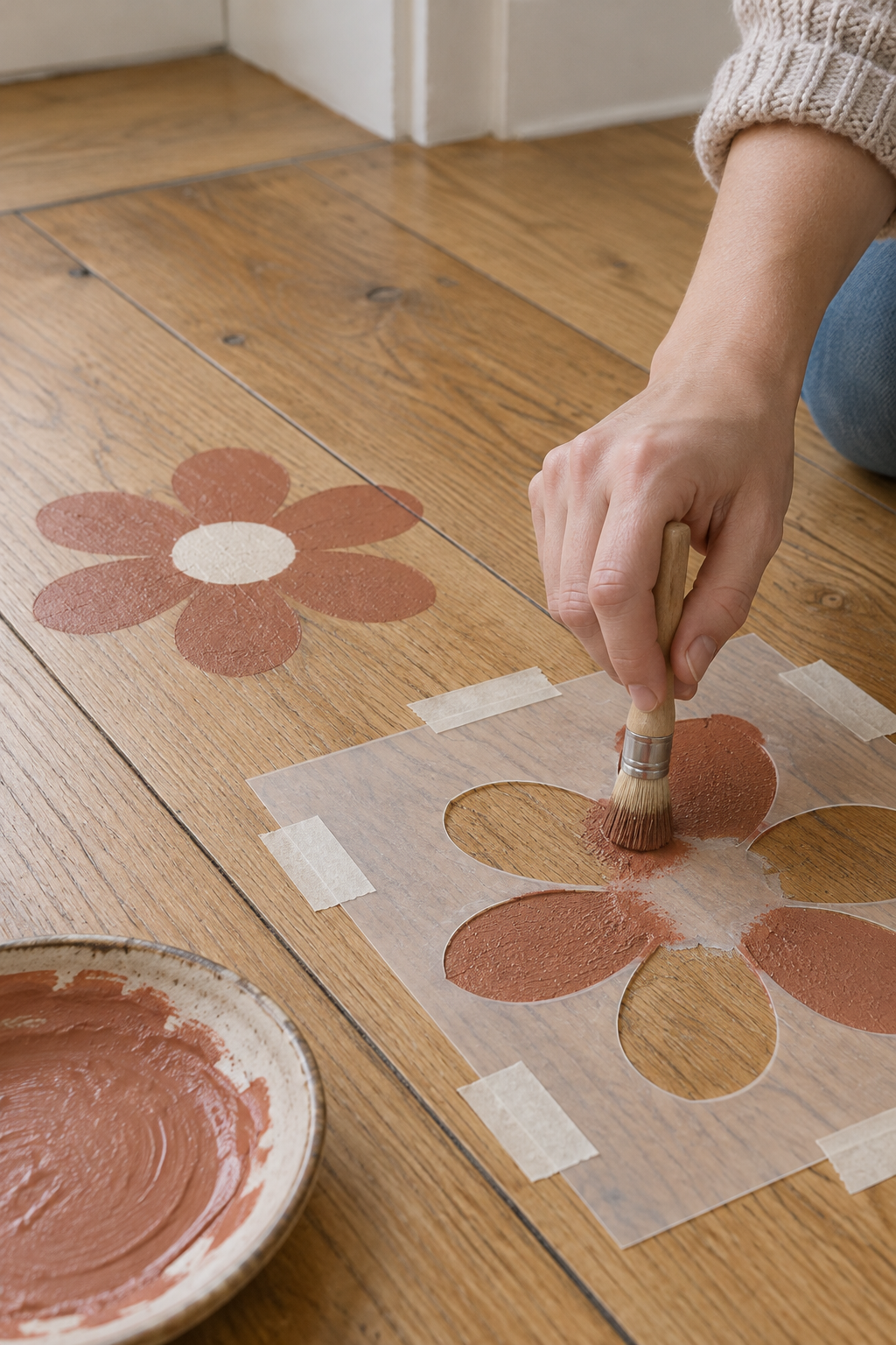
Secure a clean stencil and load the brush or small roller sparingly. Remove excess paint before applying light passes, following the coating’s application directions. Heavy loading can push paint beneath the stencil and blur the outline. Lift the template carefully and reposition it against the layout marks without smearing a wet motif.
For straight stripes, press the tape edges into place and apply the specified coats inside the bands. Remove tape at the stage recommended for that tape and coating. Add smaller details only when the surrounding paint is ready to handle. Keep paint from pooling in floorboard joints, and retain any required movement gaps.
Step 5: Add a Compatible Protective Finish if Needed
Some floor paints form their own finished surface; other systems require a specific clear topcoat. Complete every required layer. If a clear finish is optional, confirm that it is approved for the paint, the flooring, and the intended use before applying it. Do not substitute an unrelated varnish simply because it is transparent.
Test the finish for changes in color and sheen, including on any existing wood finish it will overlap. Observe the application and recoating window for the whole system. For areas where grip matters, choose an appropriate floor finish or a manufacturer approved traction option; adding a clear coat does not automatically make the surface slip resistant.
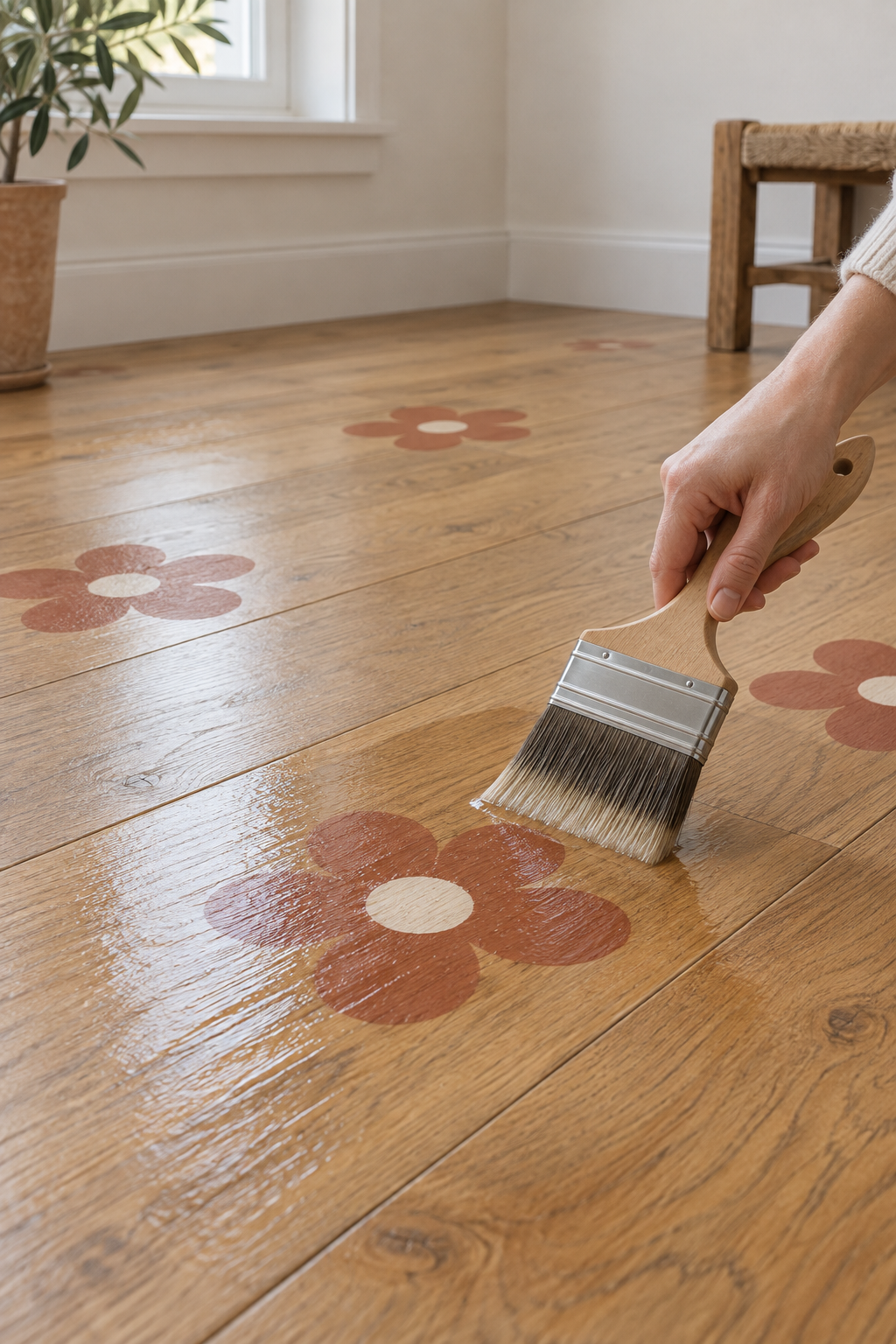
Step 6: Allow Curing Before Returning the Room to Use
Dry to the touch, ready for light walking, ready for furniture, and fully cured can be different stages. Follow the manufacturer’s timings for each, allowing for the stated temperature and humidity conditions. Keep rugs off until permitted, and lift furniture back into place instead of dragging it.
After curing, use suitable furniture pads and clean according to the coating instructions. Remove spills promptly without abrasive scrubbing. Keep the paint color details and product information so a worn motif can be maintained with a compatible repair rather than an improvised coating.
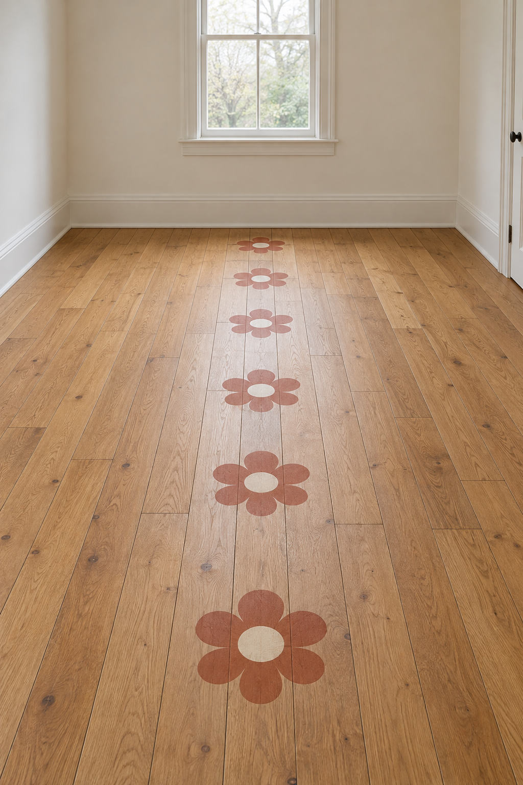
Find Your Direction in These 35 Painted Floor Designs
A border preserves a quieter center, a repeating pattern creates an even rhythm, and an illustrated scene gives the floor a stronger narrative. Consider the surface you have, the furniture that will cover it, and the amount of measuring or drawing you want to take on. The ideas below offer different ways to balance those choices.
1. Sweeping Green Waves Around a Freestanding Bath
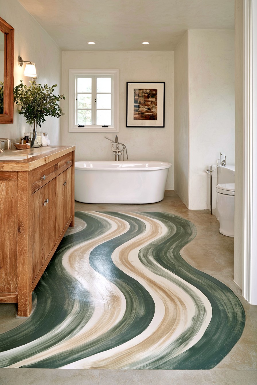
Broad green, beige, and ivory bands flow past the freestanding bath, giving the floor the movement of a winding stream. Their varying widths keep the design from looking like a regular stripe repeat. Warm timber cabinetry picks up the earthy tones, while the pale fixtures leave the curves as the main feature.
Sketch the principal sweep before adding narrower bands, and check how it passes around the vanity and toilet. In a smaller room, three colors may be enough. Use this as a composition reference for a suitable bathroom floor coating, with the pattern kept outside the shower or other continuously wet area.
2. Scalloped Medallions Along a Wooden Hallway
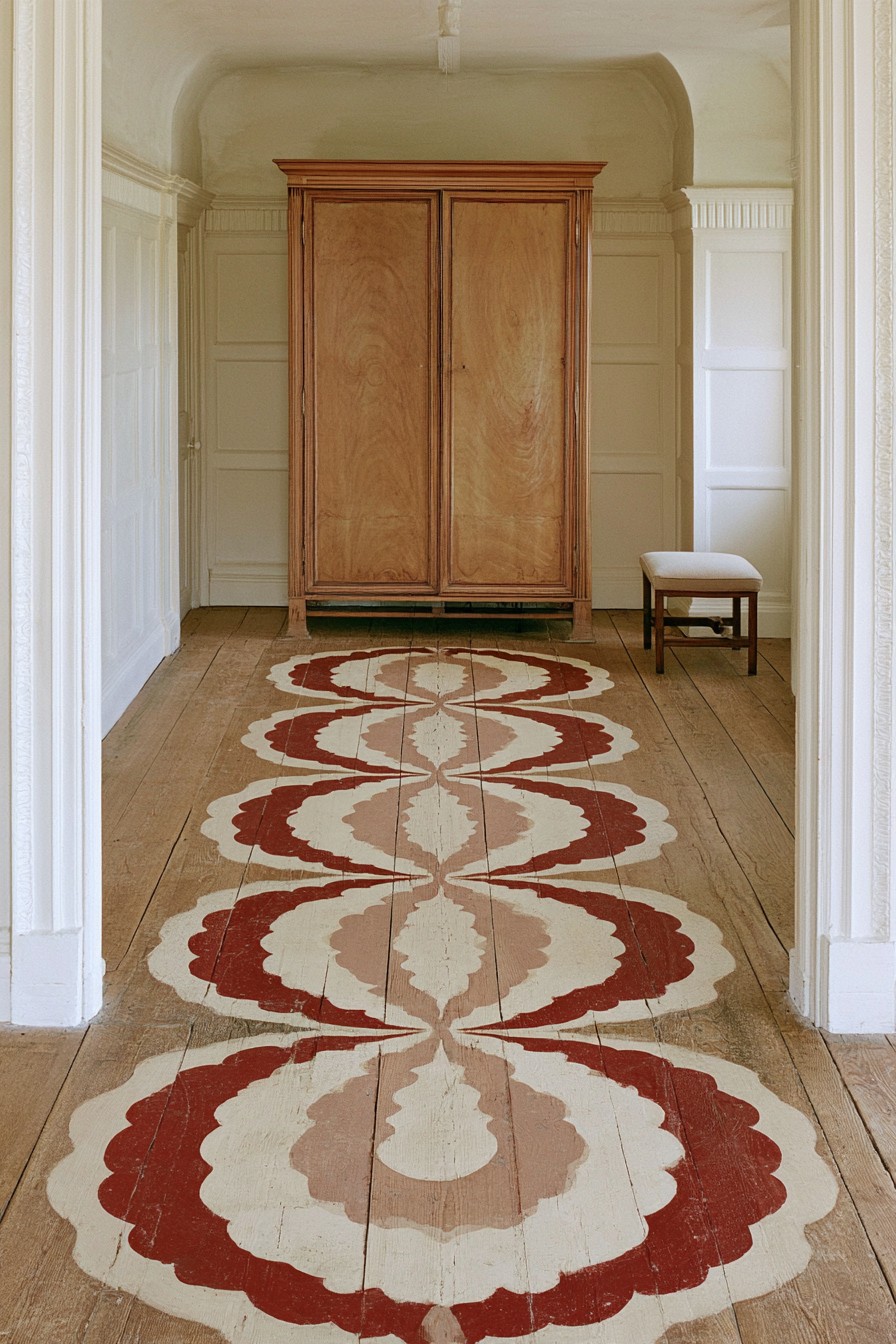
A line of large scalloped medallions gives this hallway the rhythm of a runner while leaving timber visible on both sides. Rust red outer edges, pale interiors, and smaller blush details add depth without introducing many competing colors. The connected centers draw the eye toward the cabinet at the end.
Measure the usable length first and divide it into complete repeats. Adjust the size of each medallion so the final one does not disappear awkwardly beneath a doorway or piece of furniture. One reusable template can establish the main shape, with the inner details added in a separate pass.
3. Sage and White Checkerboard Beneath a Dining Table
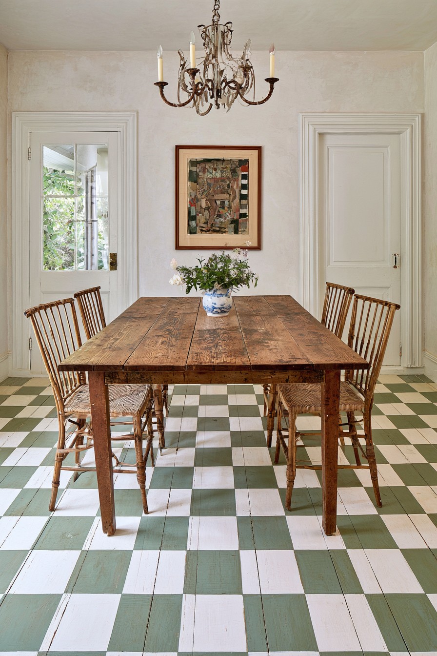
Sage squares alternate with white to give the dining area a clear geometric foundation. The grid extends across the boards rather than following each plank individually, which separates the decorative pattern from the timber construction. A plain wooden table and slim chairs leave much of the checkerboard visible.
Lay out a central row of squares before marking the whole room. Check the cuts along both opposite walls so one side does not end with an unnecessarily narrow sliver. Large squares usually require less marking than a fine grid, but choose the scale by testing it against the table footprint. If you also plan to refresh the table or chairs, explore these furniture painting ideas and choose a restrained finish that leaves the floor grid as the main pattern.
4. A Storybook Garden Path for a Bedroom
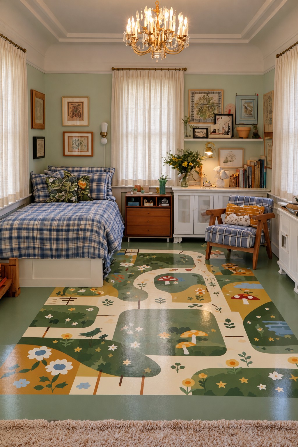
Cream paths wind between rounded green areas filled with flowers and mushroom shapes. Instead of repeating one motif, the floor becomes an illustrated landscape, with little scenes appearing between the bed and the open walking area. Mustard and blue accents add variety while the larger green fields hold the composition together.
Plan the path around furniture rather than drawing it across places that will be covered. Paint the broad shapes first, then add a few recognizable details. A simplified garden with one bend and several flower clusters can capture the same sense of discovery without requiring a complete mural across the room.
5. A Rounded Turn in Sage and Cream Stripes
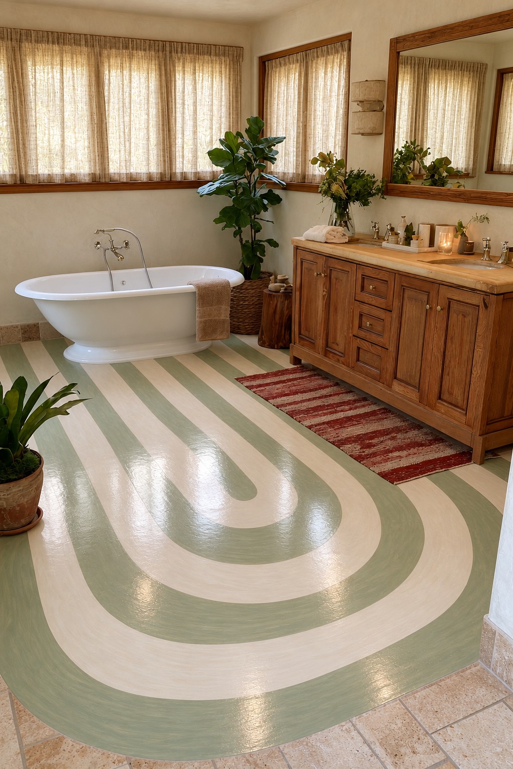
Wide sage and cream stripes bend into a generous rounded turn near the middle of this bathroom. The curve softens the straight cabinetry and follows the room’s open floor area. Compared with the irregular waves in the first idea, these bands have a steadier width and a more orderly, retro character.
Establish a centerline for the curve, then mark the other bands at consistent offsets. Straight tape alone will not form a smooth bend, so use a suitable curved template or carefully draw the transition. Test the layout around the bath before painting to avoid an abrupt or cramped turn.
6. Folk Flowers Arranged in Kitchen Rows
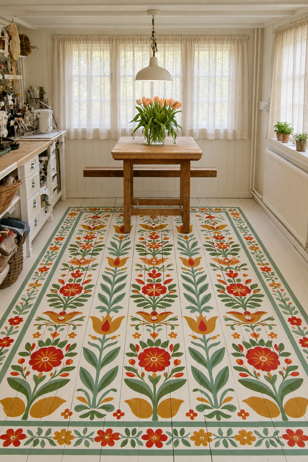
Upright stems carry red and mustard flowers across a pale kitchen floor. The rows give the botanical design structure, while a smaller floral border finishes the perimeter. Repeating the same greens in both the main stems and the edging makes the many small details feel related.
Choose a repeat that remains readable between cabinets, chair legs, and an island. A long kitchen may suit parallel rows, but a compact one could use a single central strip. Begin with a few main flower shapes and reserve finer leaves for areas that will stay visible after the furniture returns.
7. An Earthy Sunburst Across the Seating Area
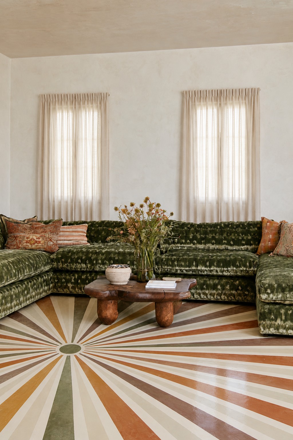
A small circular center sends long cream, olive, ochre, and rust rays across the living room. The pattern reaches toward the seating rather than staying inside a narrow border, giving the open floor a strong presence. Its earthy palette connects with the deep green upholstery and timber table.
Position the center where it can still be seen from the doorway and main seat. A coffee table placed directly over it could hide the design’s organizing point. Mark a limited number of broad rays first; fine wedges add measuring work and may lose their definition at the far edges of the room.
8. A Spiral Runner Between Bookcases
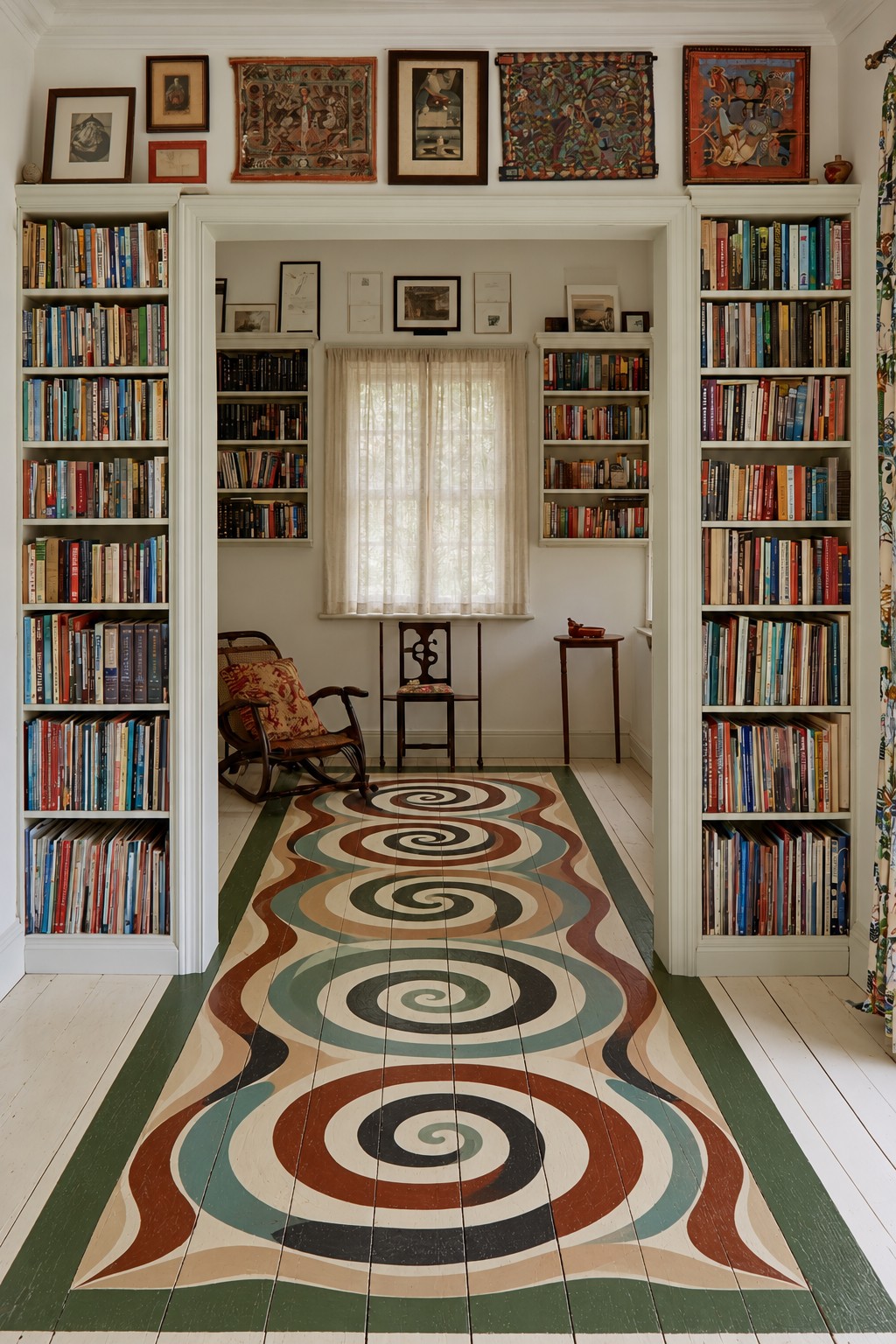
Large spirals repeat through the passage between bookcases, with rust and teal shapes flowing around cream and charcoal centers. Dark green edging gives the curves a contained silhouette. The runner follows the opening through successive rooms, making the connecting floor part of the interior’s visual rhythm.
Use a full size paper template to check that each spiral fits the available width. Keep the side margins steady even if the internal curves vary. In a shorter passage, two or three generous spirals will retain the movement more clearly than a compressed series of miniature ones.
9. A Compass Inspired Star Inside a Decorative Frame
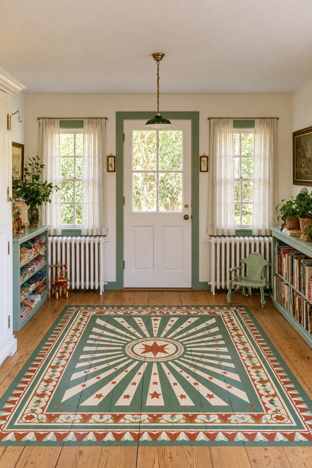
A central star sits inside radiating bands and several layers of decorative edging. Terracotta accents and small botanical details soften the sharper green and cream geometry. Exposed wood around the painted rectangle gives the entryway a defined focal area without carrying the pattern right to every wall.
Work outward from the star, checking each border against the same central axes. Small inaccuracies become more noticeable when several frames surround one motif. Unless you intentionally align it with actual compass directions, treat the star as a decorative symbol rather than a navigation marker.
10. A Single Tree Canopy for a Reading Corner
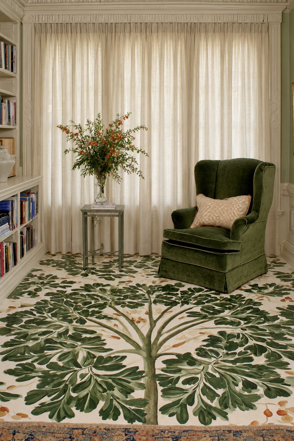
One tree spreads its branches and leaves across a cream ground, bringing the scale of a wall mural down to the floor. The trunk provides a clear starting point, while the leafy canopy fills the area around the reading chair. Olive tones connect the design to the upholstery without requiring a repeated grid.
Decide where the trunk should begin when viewed from the room’s entrance. Draw the main branches before filling in leaves so the tree remains coherent beneath and around furniture. Fewer, larger leaf clusters are easier to read from a standing position than many tiny isolated marks.
11. White Daisies on a Deep Green Laundry Floor
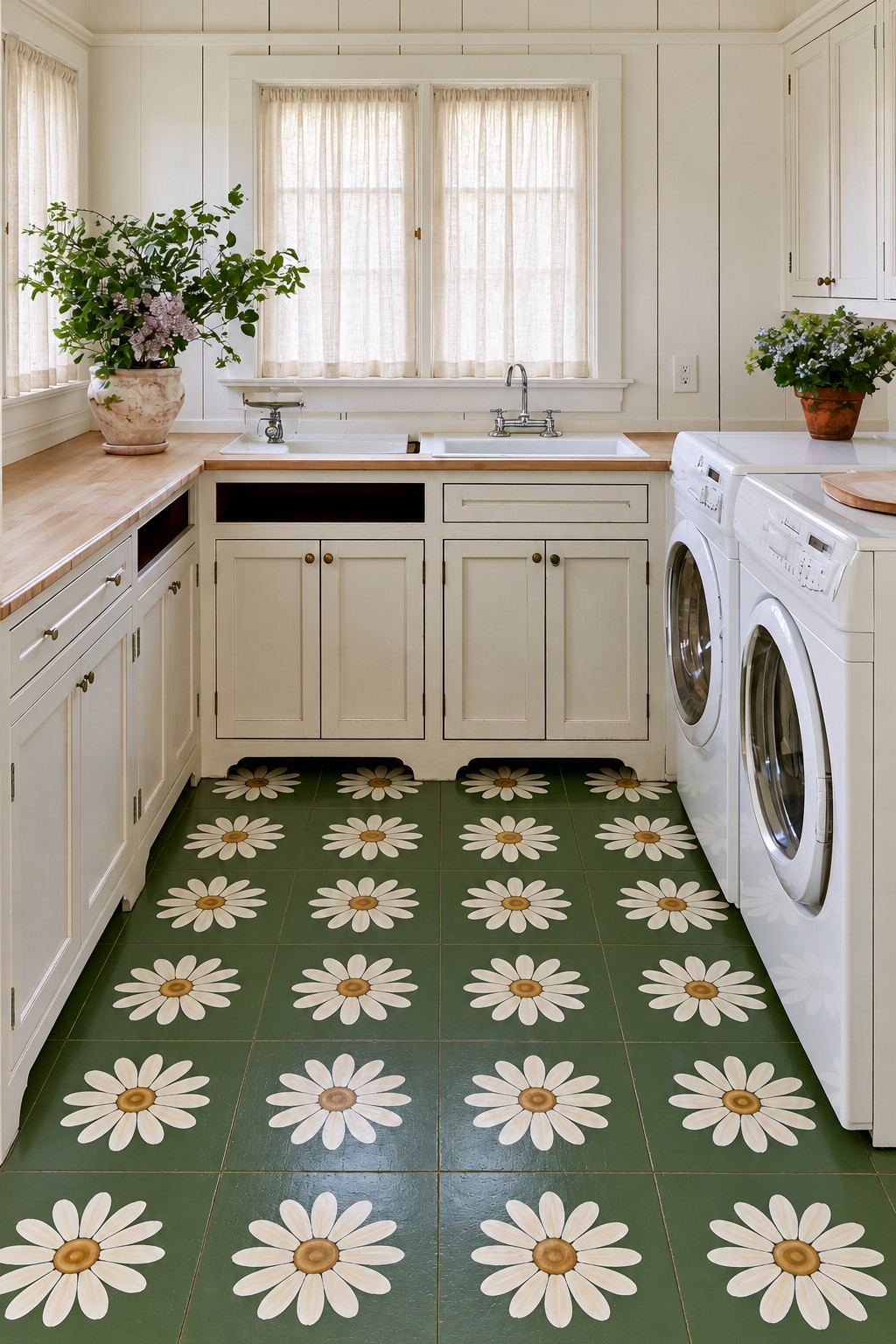
White daisies repeat across a deep green floor, bringing a cheerful graphic layer to the laundry room. Golden centers give each flower a clear focal point, and regular spacing keeps the pattern orderly beside the cabinetry and washing machine. The petals stand out because the background is consistently dark.
Mark the flower centers before using a stencil, checking the arrangement across the whole floor rather than one row at a time. Leave enough background between neighboring petals for the repeat to remain distinct. Choose the coating for the room’s cleaning and occasional spill conditions, as well as for its color.
12. A Symmetrical Rose Vine as a Floor Mural
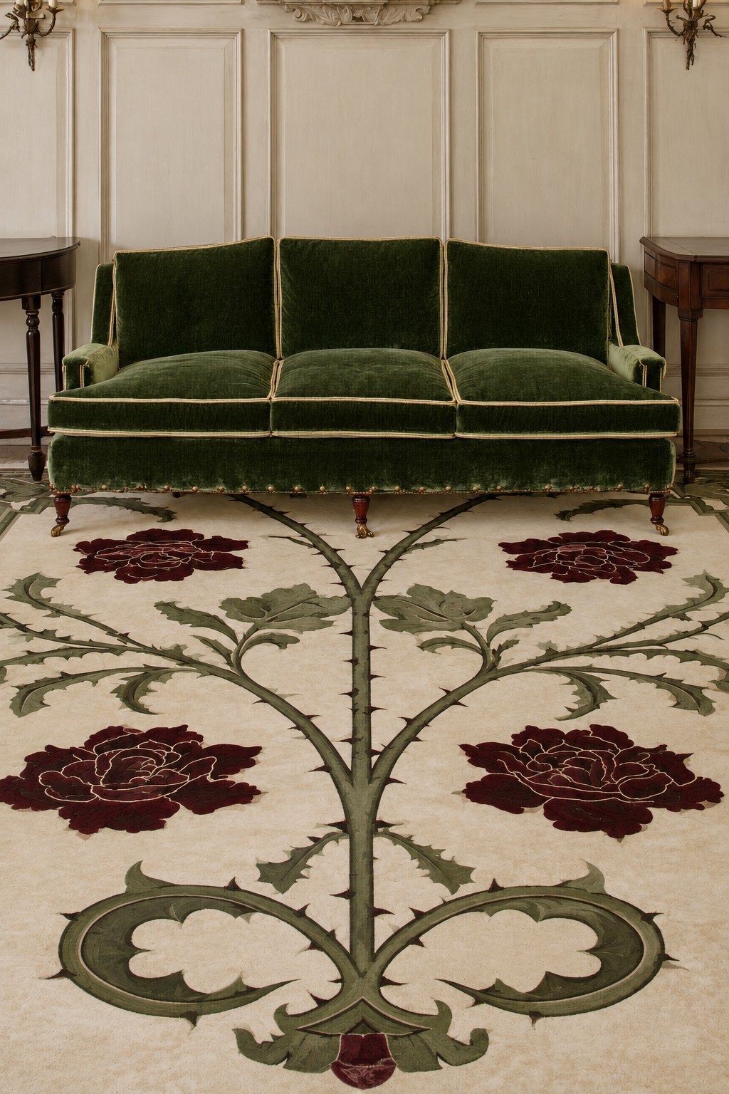
Burgundy roses branch outward from a central green stem, creating a balanced botanical mural. Curled leaves and pale open areas stop the composition from becoming a solid floral field. The broad design relates to the sofa above it, giving the sitting area a strong central axis.
Draw one side on paper and reverse the template for the other if you want a mirrored layout. Keep the main stem visible beyond the coffee table footprint, or the branches may appear disconnected. This is a more involved option than a repeating stencil because the overall composition needs to work before any individual flower is refined.
13. A Greek Key Runner with Broad Right Angles
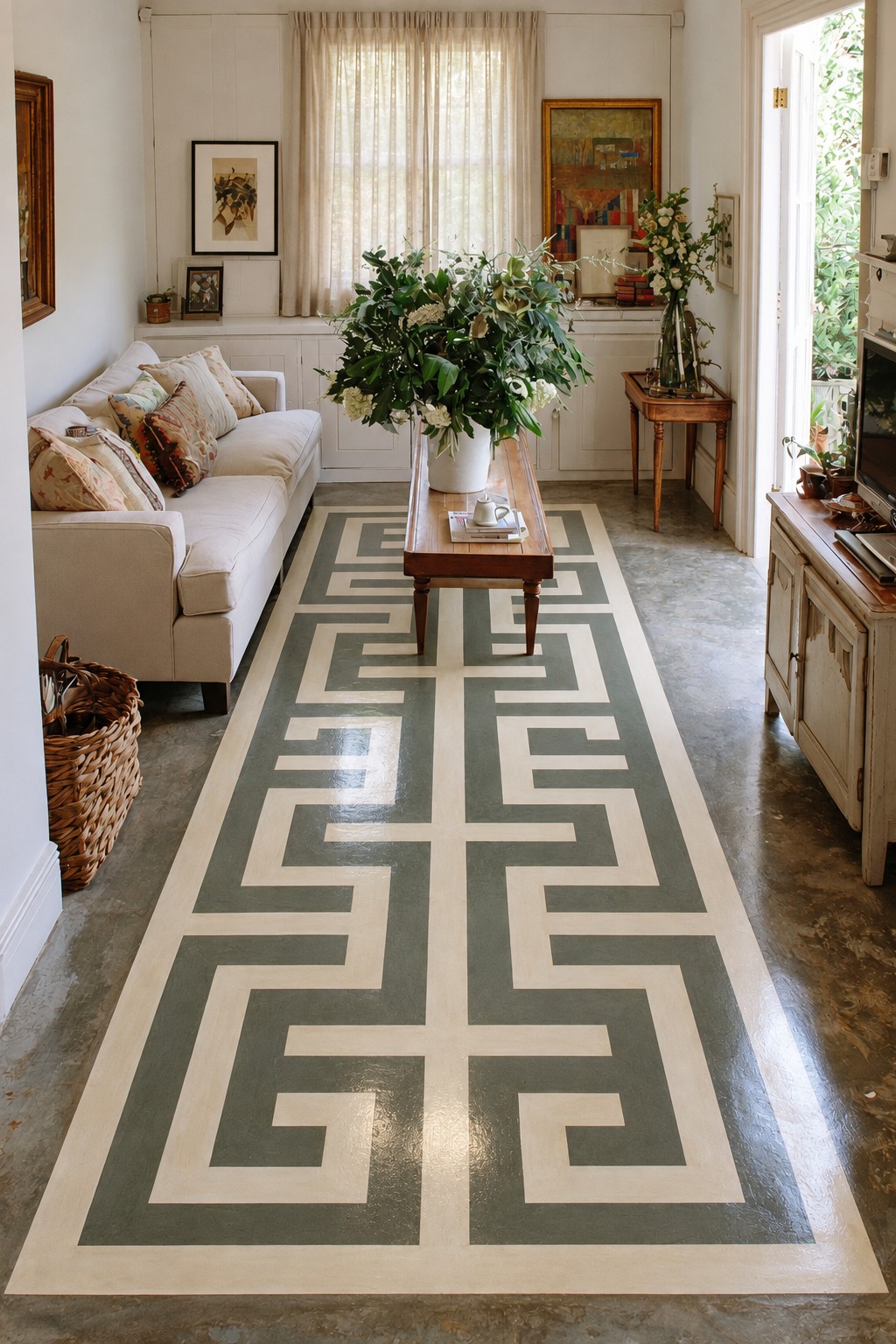
Cream right angles interlock over a muted gray green ground, creating a long Greek key pattern. Its straight lines provide a contrast to upholstered seating and timber furniture. A plain outer band contains the design, so the geometric turns do not continue into every corner of the room.
Define a consistent line width and mark the complete repeat before masking. Check every corner against the same measurements; a slightly misplaced turn can interrupt the visual rhythm. For a first geometric project, use one broad repeat rather than several narrow parallel key patterns.
14. Octagons That Define a Compact Breakfast Nook
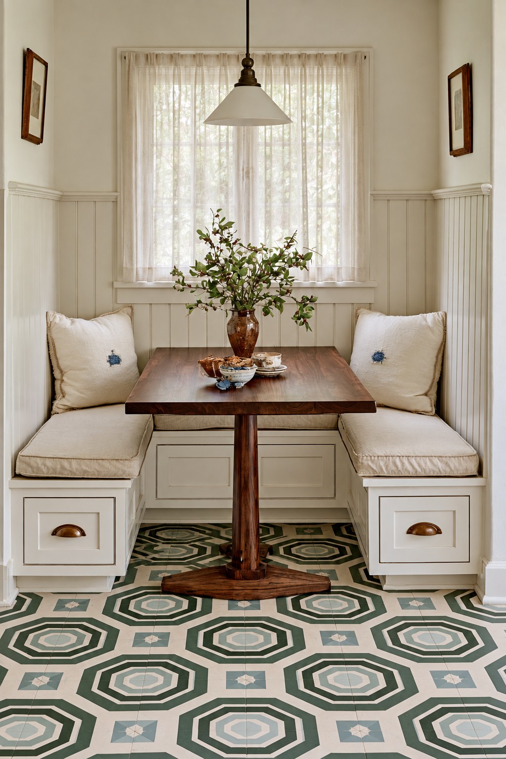
Green and cream octagons repeat beneath the table, with small blue square accents filling the gaps. The pattern occupies the visible nook floor rather than forming a separate framed runner. Its regular geometry gives the built in seating area a distinct identity within a small footprint.
Lay the repeat out with the table in mind, ensuring complete motifs remain visible near the bench edges. A large stencil may leave very few full octagons in a compact nook, so compare two sizes on paper. Keep the blue accents consistent to prevent the secondary squares from competing with the main shapes.
15. Oversized Retro Daisies on an Ochre Ground
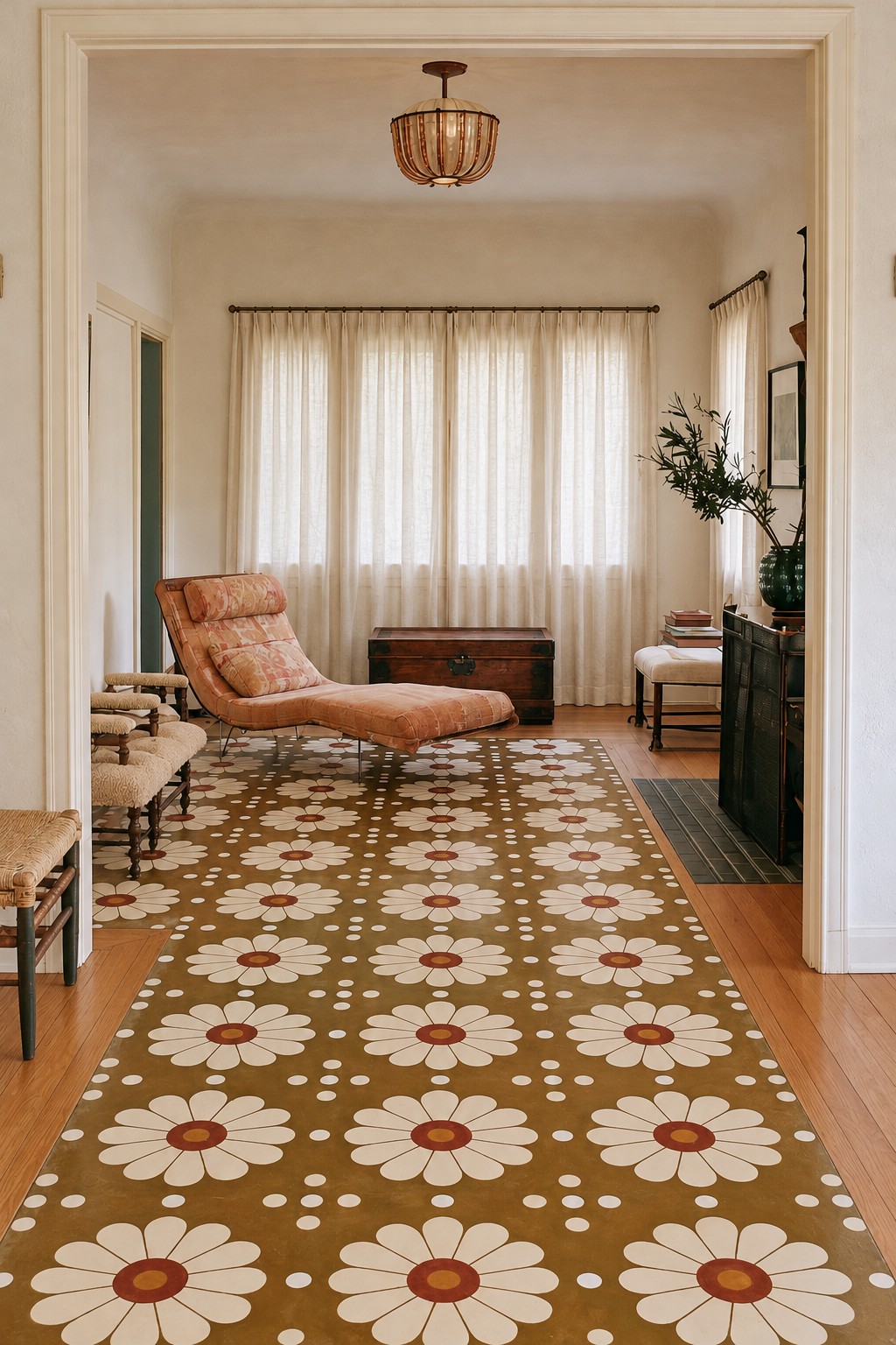
Cream daisies spread across a warm ochre ground, with rust centers and small dots between the flowers. The rounded petals echo the relaxed curves of the seating. Compared with the laundry room’s green daisy grid, this version feels warmer and more decorative because the flowers occupy a larger visual field.
Choose the background color first, since it will remain visible over much of the floor. Then test a flower at its intended size. Reduce the dotted accents if the upholstery already has a busy pattern; the daisies can carry the design without filling every remaining gap.
16. Large Plum Blossoms Around a Dressing Table
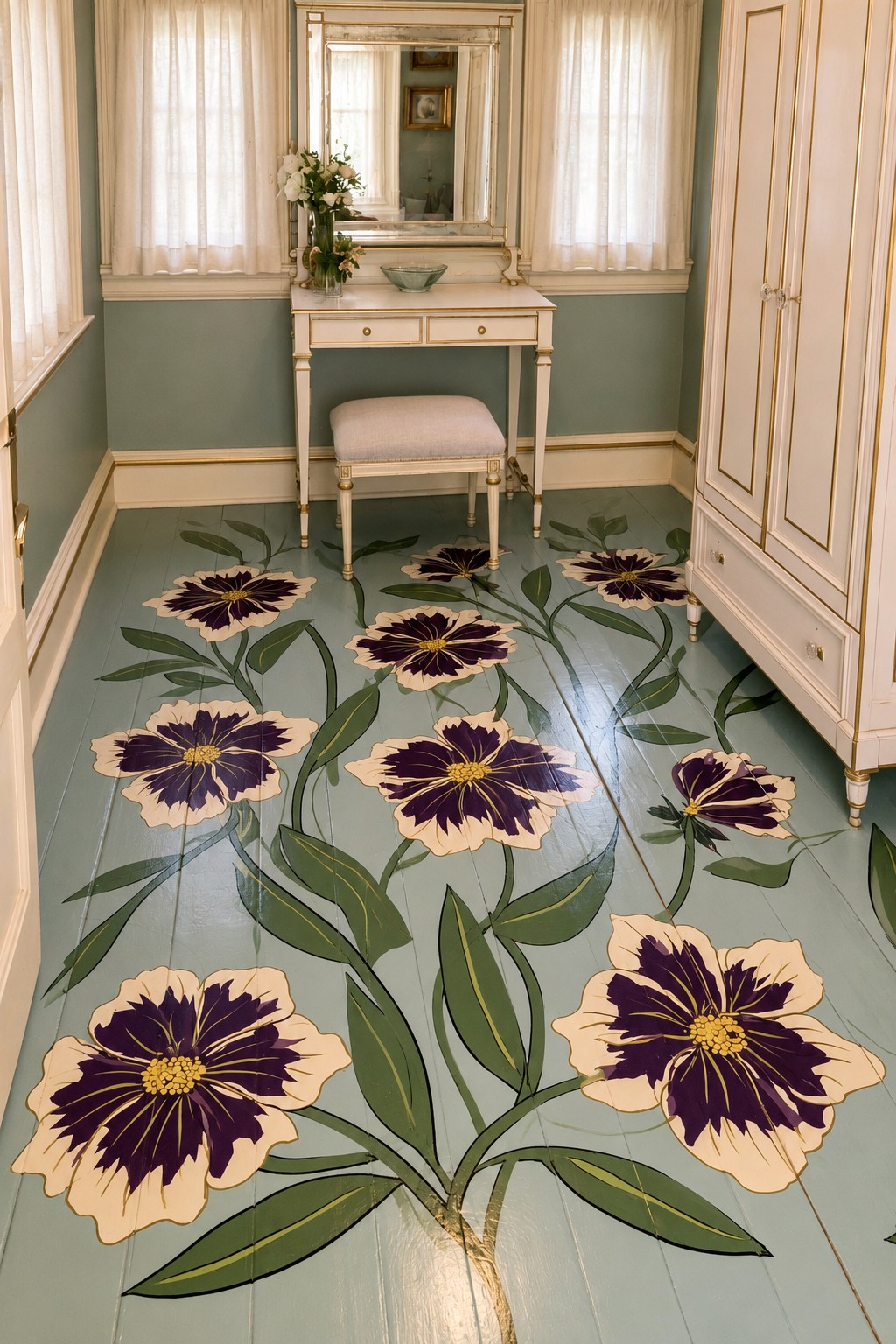
Plum blossoms edged in cream rise on sweeping green stems over a muted blue floor. Their large scale gives the narrow dressing area a garden mural rather than a small floral repeat. The long stems provide continuity between blooms, even where the stool and vanity interrupt the view.
Reserve the largest flower for an open area beside or in front of the stool. Several broad blossoms are easier to organize than many equally detailed ones. Draw the connecting stems lightly first, allowing them to curve around the furniture footprint rather than disappear underneath every piece.
17. Framed Green Octagons with Floral Centers
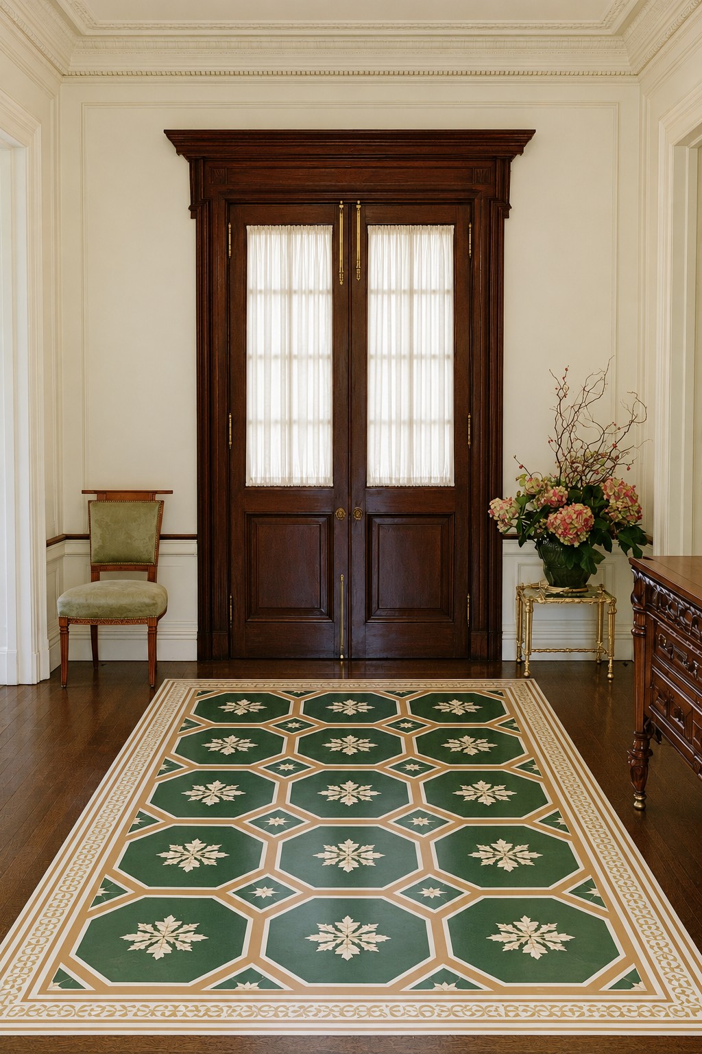
Green octagons contain pale floral motifs, with small diamonds linking the spaces between them. Several cream and beige border lines frame the entire arrangement, leaving a margin of dark timber around the outside. The result resembles a patterned carpet in its layout, though the surface remains painted flooring.
Establish the outer rectangle before calculating the octagon repeat. Allow enough room for the layered border, otherwise the central pattern may feel squeezed. This contained arrangement suits an entry hall where you want to define a central zone and preserve a visible band of the original wood.
18. Burgundy Octagons Through an Arched Hallway
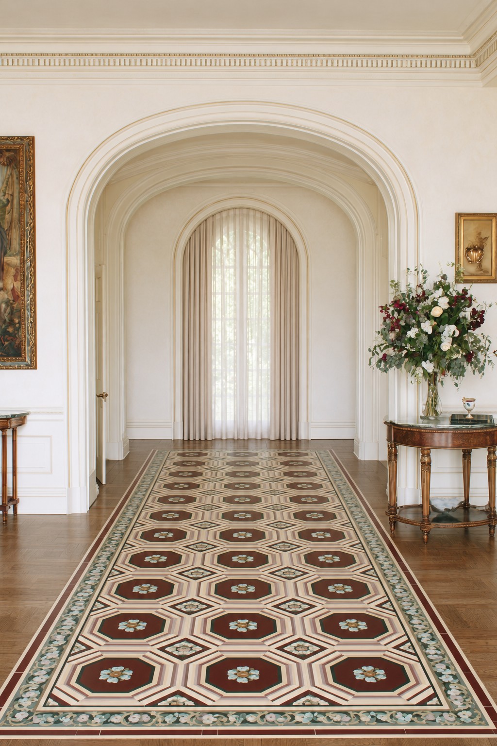
Rows of burgundy octagons extend beneath repeated arches, with cream outlines and small blue floral centers adding detail. The narrow painted runner follows the hallway’s symmetry. Unlike the wider green entry design, this pattern relies on its length and closely repeated modules to create its formal effect.
Measure from the first visible threshold to the last before choosing the number of repeats. Keep the motifs centered within the runner, even if the boards underneath do not align perfectly. A simpler version could use the burgundy octagons and plain cream edging while omitting the miniature flowers.
19. Nested Borders Beneath a Dining Table
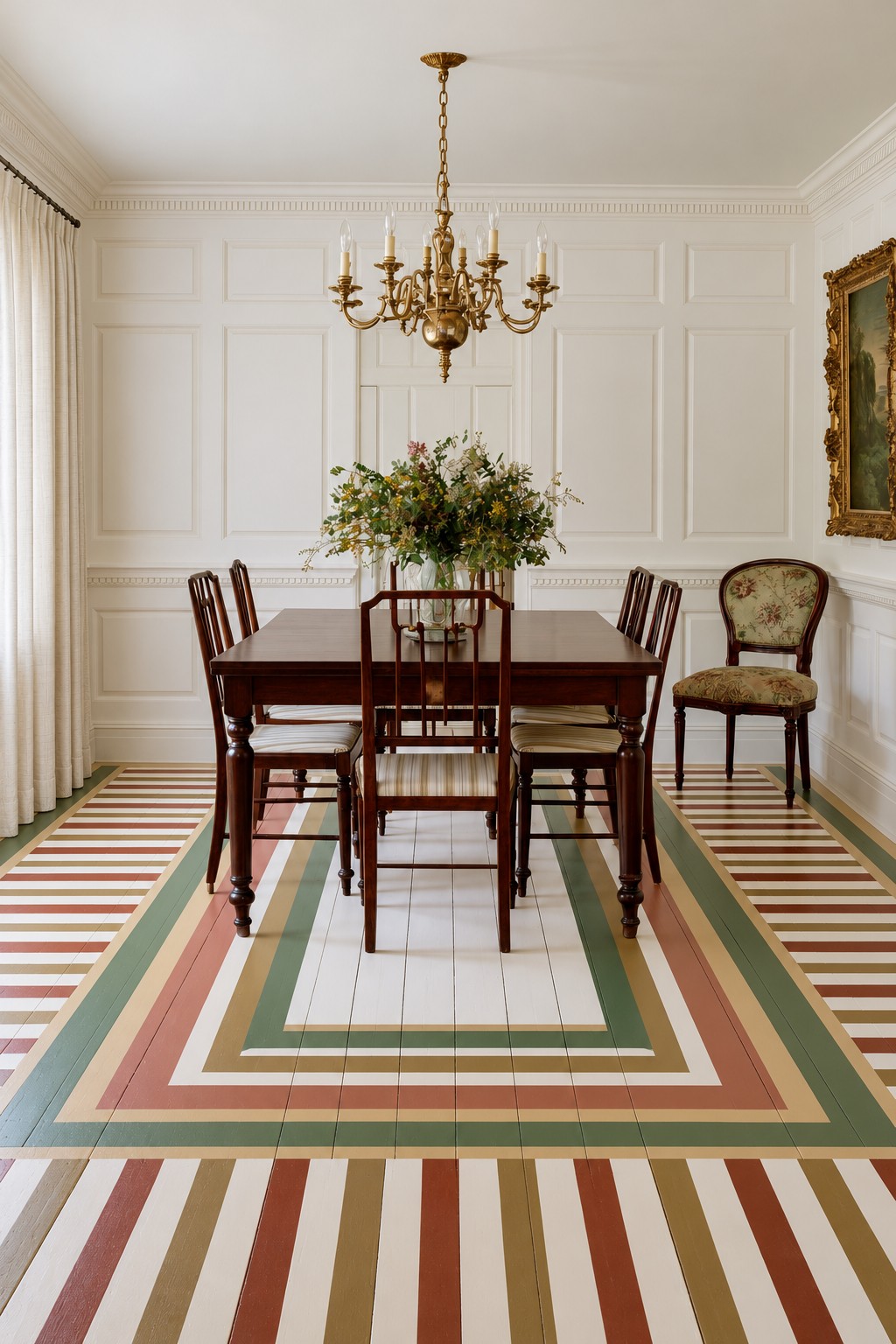
Broad nested rectangles define the dining area, while narrower stripes fill the surrounding floor. Green, terracotta, ochre, and cream appear in both zones, connecting the different band widths. The pale center provides a calmer area beneath the table, so the pattern remains strongest around the chair positions.
Base the inner rectangle on the table and the space needed to pull chairs out. If it is too small, the design may appear to stop abruptly beneath the seating. Mark all the border widths before painting, and compare the balance from the doorway as well as from above the floor.
20. Dark Starbursts in a Small Powder Room
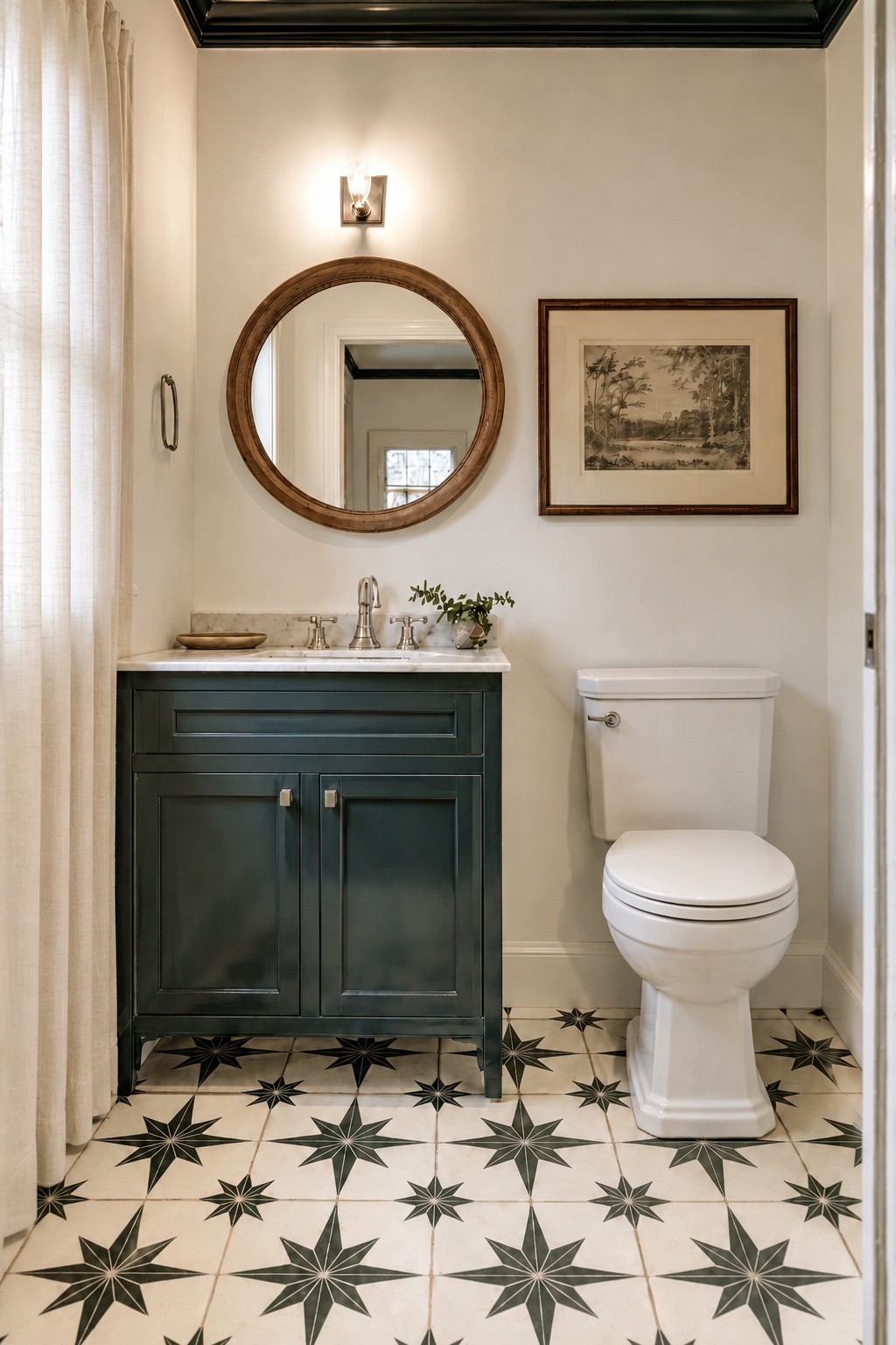
Dark pointed stars repeat over a cream ground, giving this powder room contrast without a large illustrated scene. Smaller stars fill the spaces between the larger ones, making the arrangement read as a continuous pattern. The dark vanity relates to the motifs without copying their shape.
Keep at least a few complete stars visible in the open floor area. Very large motifs can become unrecognizable when most are cut off around a toilet or cabinet. For simpler stenciling, start with one star size and generous spacing, then decide whether the smaller accents are needed.
21. Wide Color Frames for a Living Room
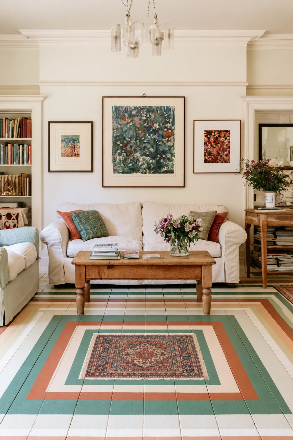
Wide teal, terracotta, cream, and blush bands frame the living room center. Their simple geometry provides a counterweight to the books, artwork, and textiles around the room. A small rug sits within the painted area, adding texture while leaving the main bands visible.
Choose border widths by considering what the sofa and table will cover. The colored bands should still make sense after the room is furnished. If you plan to add a rug, wait until the coating permits it and select a size that leaves the strongest part of the painted frame exposed. To carry one of the floor colors into the rest of the room, compare these wall painting ideas and use a simple arch or color block to echo the palette without repeating every band.
22. Quiet Stripes with a Burgundy Bed Frame
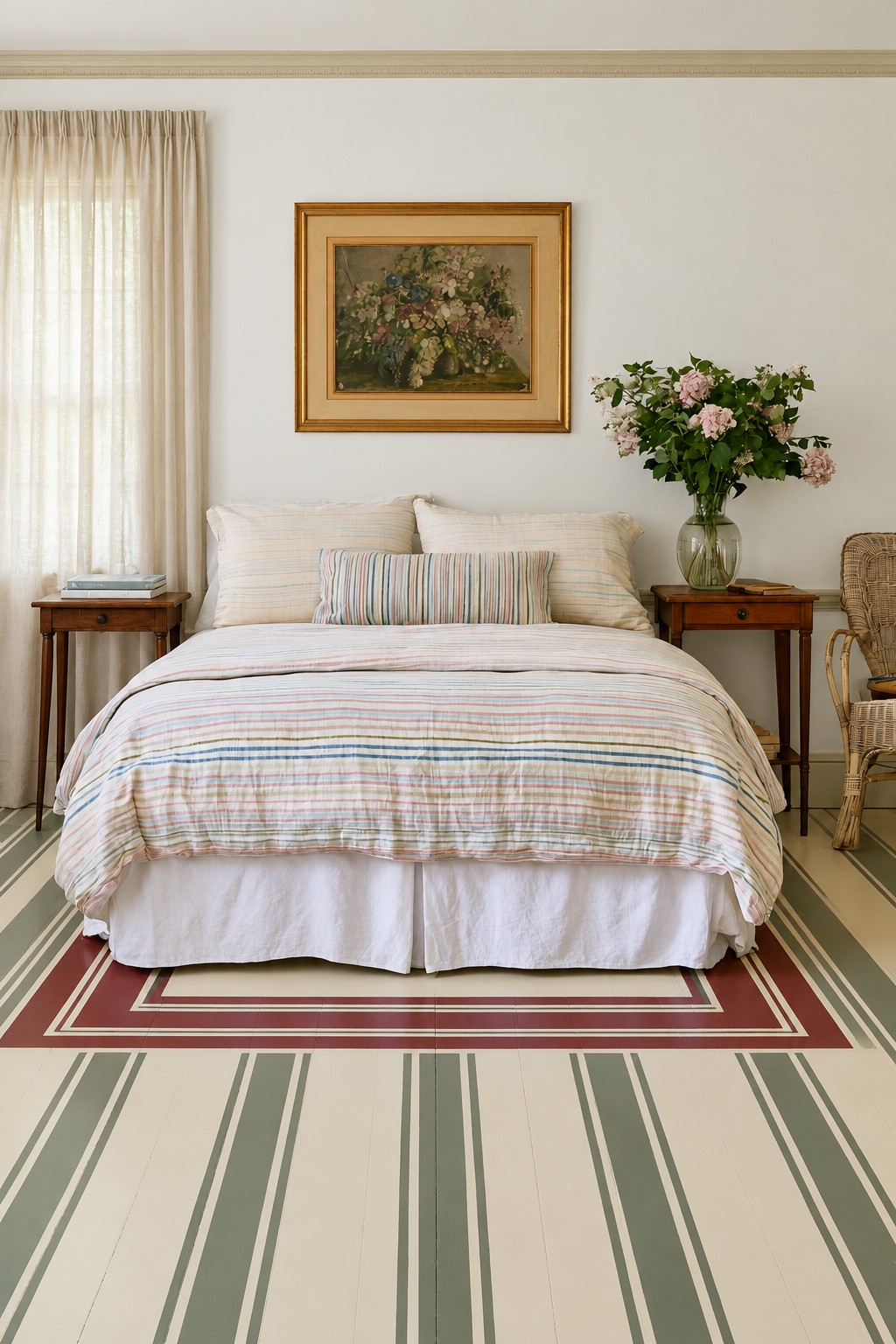
Sage lines run along a pale floor, while a burgundy rectangle frames the bed area. The narrow stripes bring detail into the foreground without filling it with a dense motif. The darker outline gives the bed a defined setting, even though much of the rectangle lies beneath the furniture.
Check the bed’s final position before marking the border. Aim for visible, balanced margins on the sides and at the foot. If the room is slightly irregular, use the bed’s centerline as the main reference rather than trying to make every stripe agree with a crooked wall.
23. Repeating Fans Toward a Green Door
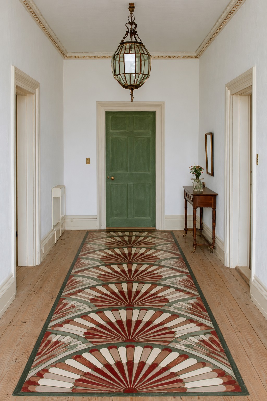
Layered fan shapes repeat toward the green door, with cream segments separated by terracotta and brown lines. A dark border contains the semicircles, and exposed timber surrounds the runner. The rounded repeats introduce movement while the straight edges keep the overall silhouette orderly.
Use one fan template for the central shapes, but map the complete sequence before painting. Leave a deliberate gap at the doorway instead of forcing a partial fan into the final few inches. A limited palette helps the curved details remain readable along a long passage.
24. Butterflies and Seed Pods Along a Narrow Passage
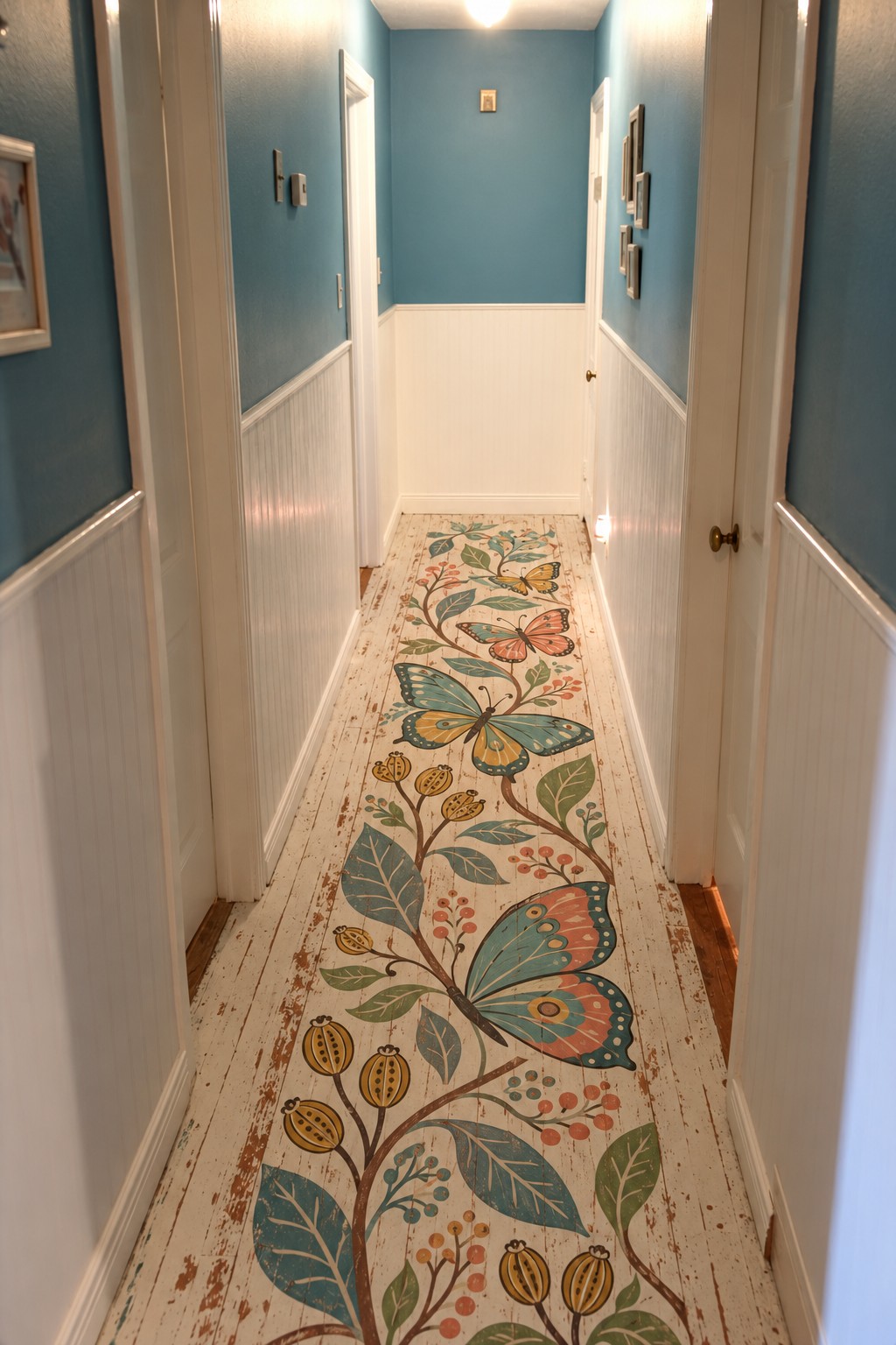
Oversized butterflies sit among leafy stems, berries, and seed pods on a cream strip. Teal wings provide the main accents, while ochre and coral details connect the separate subjects. The illustrated runner uses the hallway’s length to unfold a scene rather than repeat an identical tilelike unit.
Place the largest butterflies where they will be visible between doorways. Add stems afterward to connect them, keeping enough pale ground around each wing. In a short corridor, one butterfly and a few leaves may convey the theme more clearly than a compressed version of the entire arrangement.
25. A Botanical Moth Runner on Dark Timber
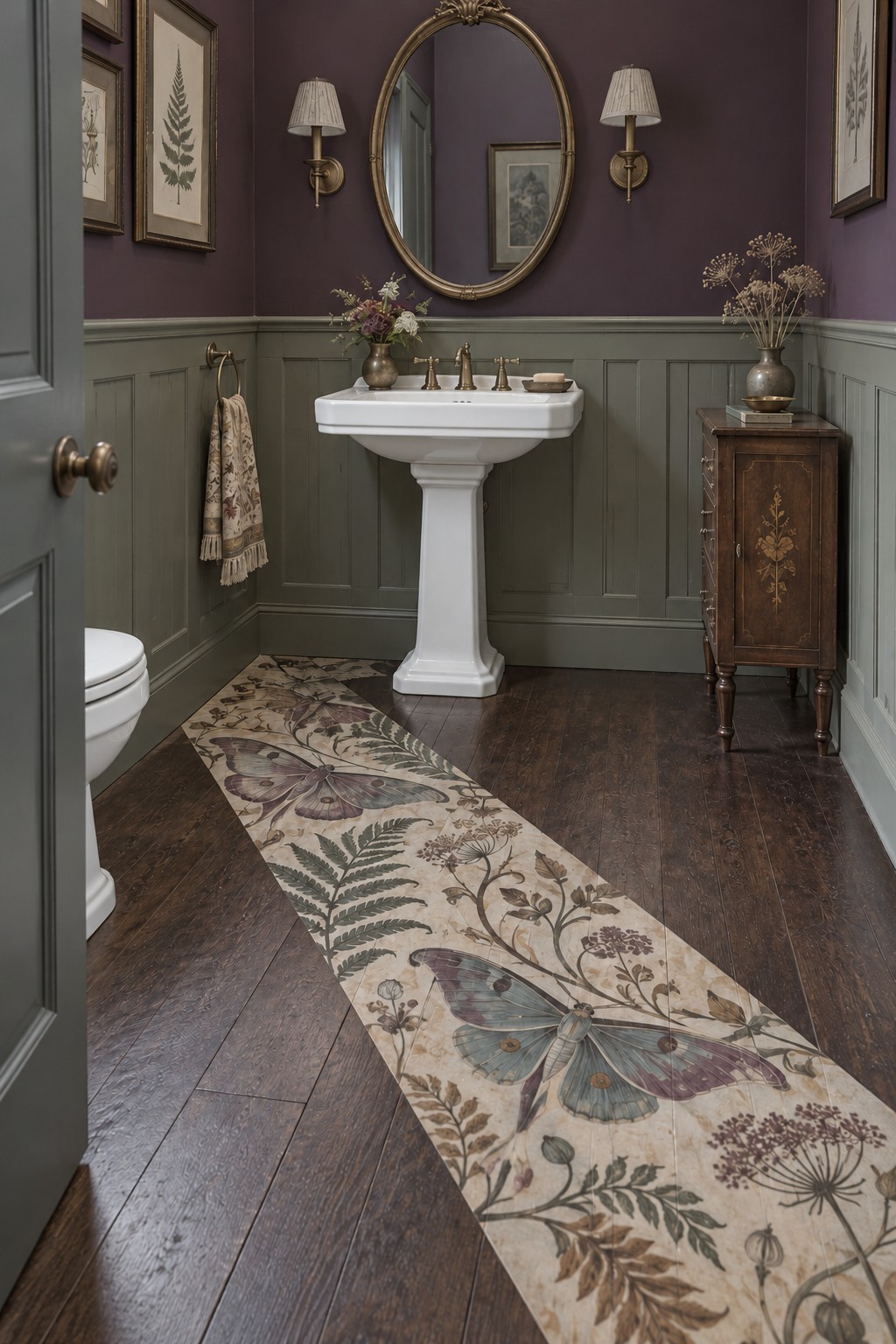
A pale illustrated strip crosses the darker wood, carrying large moths, fern shapes, and delicate seed heads. Its muted plum, blue, and green details relate to the powder room’s deeper wall colors. The surrounding unpainted boards give the botanical subjects a clear boundary.
Plan the runner’s angle and endpoint before drawing individual insects. A composition that looks balanced on paper may become crowded where it meets the sink pedestal. Keep that area simpler, and place the largest moth in the unobstructed foreground where its wing pattern can be seen.
26. Scissors, Thread, and Ribbon for a Sewing Room
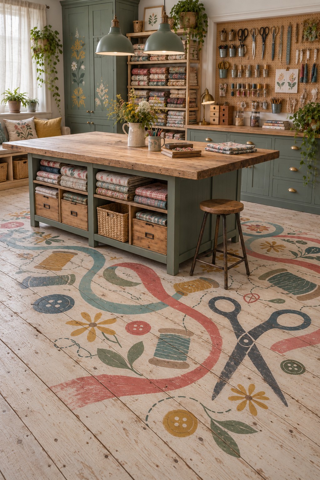
Oversized scissors, spools, buttons, and curling ribbons make the floor reflect the room’s purpose. Teal, coral, mustard, and green tie the sewing motifs together, while small flowers fill a few gaps. The larger illustrated objects remain recognizable beneath the worktable and beside the stool.
Arrange the tool shapes around the actual working positions before adding decorative flourishes. A chair on casters may repeatedly cross one area, so choose the coating with that use in mind. Two or three main sewing symbols can establish the theme; every small gap does not need another button or flower.
27. A Lemon Vine Border Around a Breakfast Nook
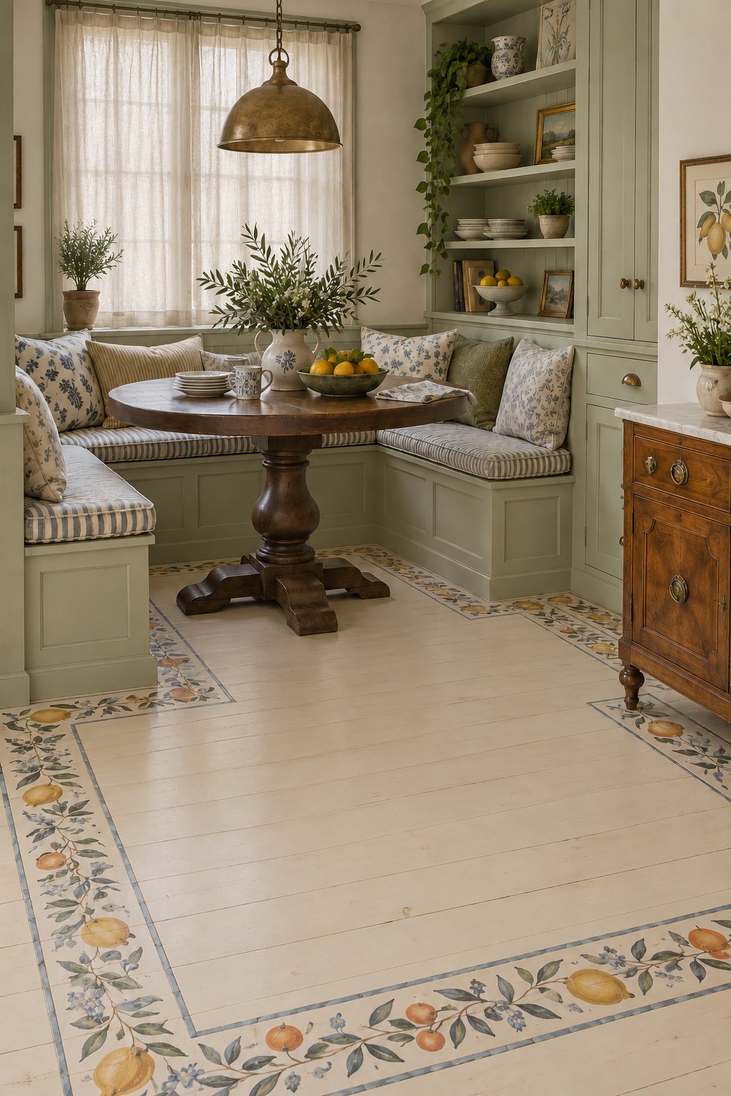
A narrow citrus vine runs around the edges of a pale floor, with yellow fruit, small orange accents, and green leaves adding detail. The center remains quiet beneath the table. Compared with a full floral field, this lighter border places the illustration where it can outline the nook without dominating it.
Set the border just beyond the seating footprint so its main fruit clusters remain visible. Make a separate corner template instead of simply overlapping two straight sections. Leaving the central floor plain can also make it easier to notice crumbs and spills around a dining area.
28. Peacock Feathers Near a Vanity
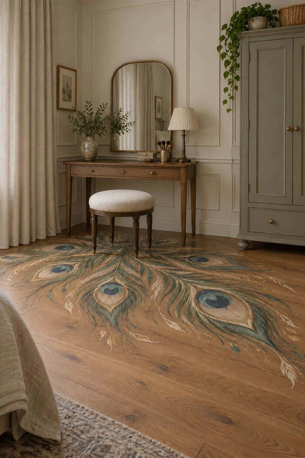
Long feather shapes sweep across the timber near the dressing table, with blue and teal eye markings distributed along their curves. The design leaves much of the wood visible, so it reads as an ornament across the surface rather than a fully colored background. Its direction follows the open area in front of the vanity.
Draw the feather stems first, then place a small number of prominent eye markings. The shape will lose its flow if every feather is equally dense. Test how your chosen paint covers the existing finish; the soft visual effect here should not be assumed achievable by diluting a coating beyond its instructions.
29. A Letter Inspired Trail for a Playroom
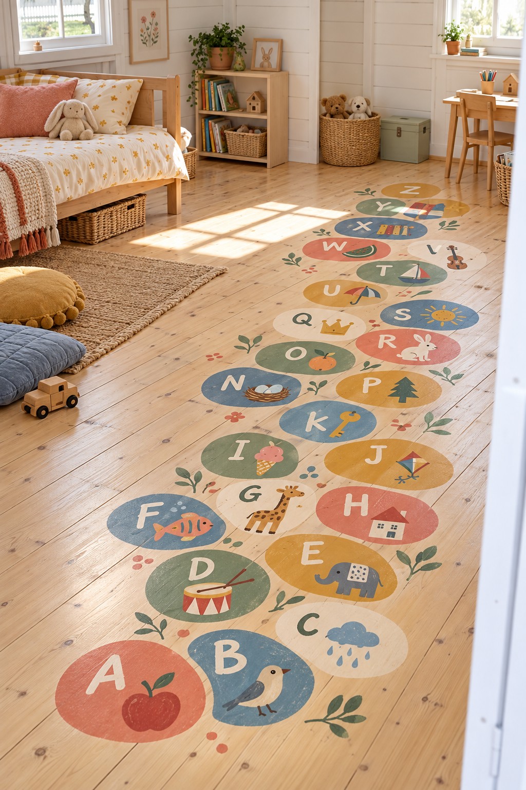
Colored circles form a trail through the open playroom floor, pairing large letters with small pictures. Coral, mustard, blue, and green make the route easy to follow visually. The winding arrangement uses the gap between the bed and desk while leaving timber visible around the individual shapes.
For a teaching version, prepare and proofread a complete A to Z layout first. Include L and M between K and N, and make every picture match its English letter: J for jellyfish, T for triangle, Q for queen, and Y for yo yo are possible choices. These details need correcting before copying the illustrated trail as an alphabet activity.
30. A Road Map That Becomes a Toy Car Route
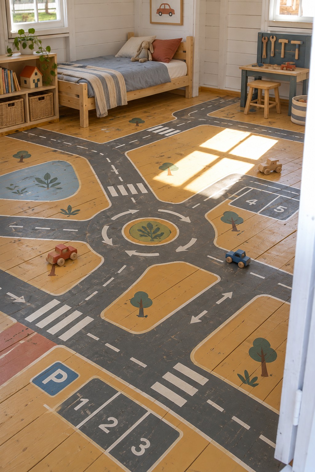
Charcoal roads curve between ochre blocks, with white crossings, arrows, parking bays, and a central roundabout providing recognizable features. Small tree shapes fill the areas between routes. The floor becomes a setting for toy cars while retaining clear spaces around the bed and desk.
Plan the route with the toys you actually use, allowing enough width for two cars to pass where needed. Connect every road intentionally so there are no confusing unfinished junctions. Keep the main passage through the room unobstructed, and use simple markings that can still be understood from a child’s seated position.
31. A Hopscotch Court in Soft Colors
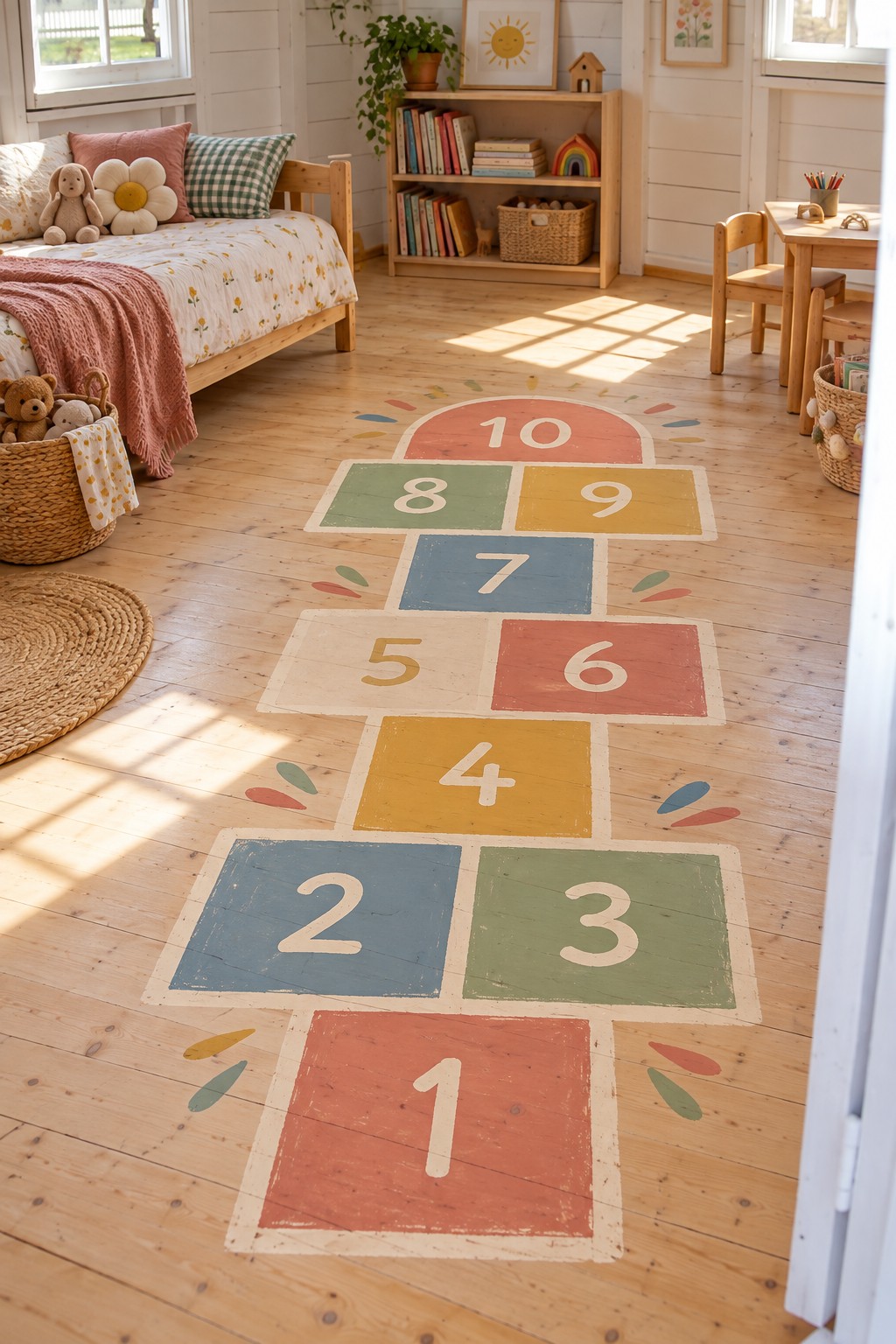
A numbered court alternates single and paired squares before reaching a rounded finish at ten. Coral, mustard, blue, and sage distinguish the sections, with pale outlines keeping the layout readable. Small leaflike marks around the sides decorate the court without obscuring its numbers.
Measure the available landing space before sizing the squares, and keep the play area clear of furniture corners and loose rugs. Choose a floor finish with documented traction appropriate to the activity and the expected wet or dry conditions. If the room cannot accommodate safe hopping, retain the motif as decoration rather than treating it as a usable court.
32. A Rich Folk Floral Border Around Natural Wood
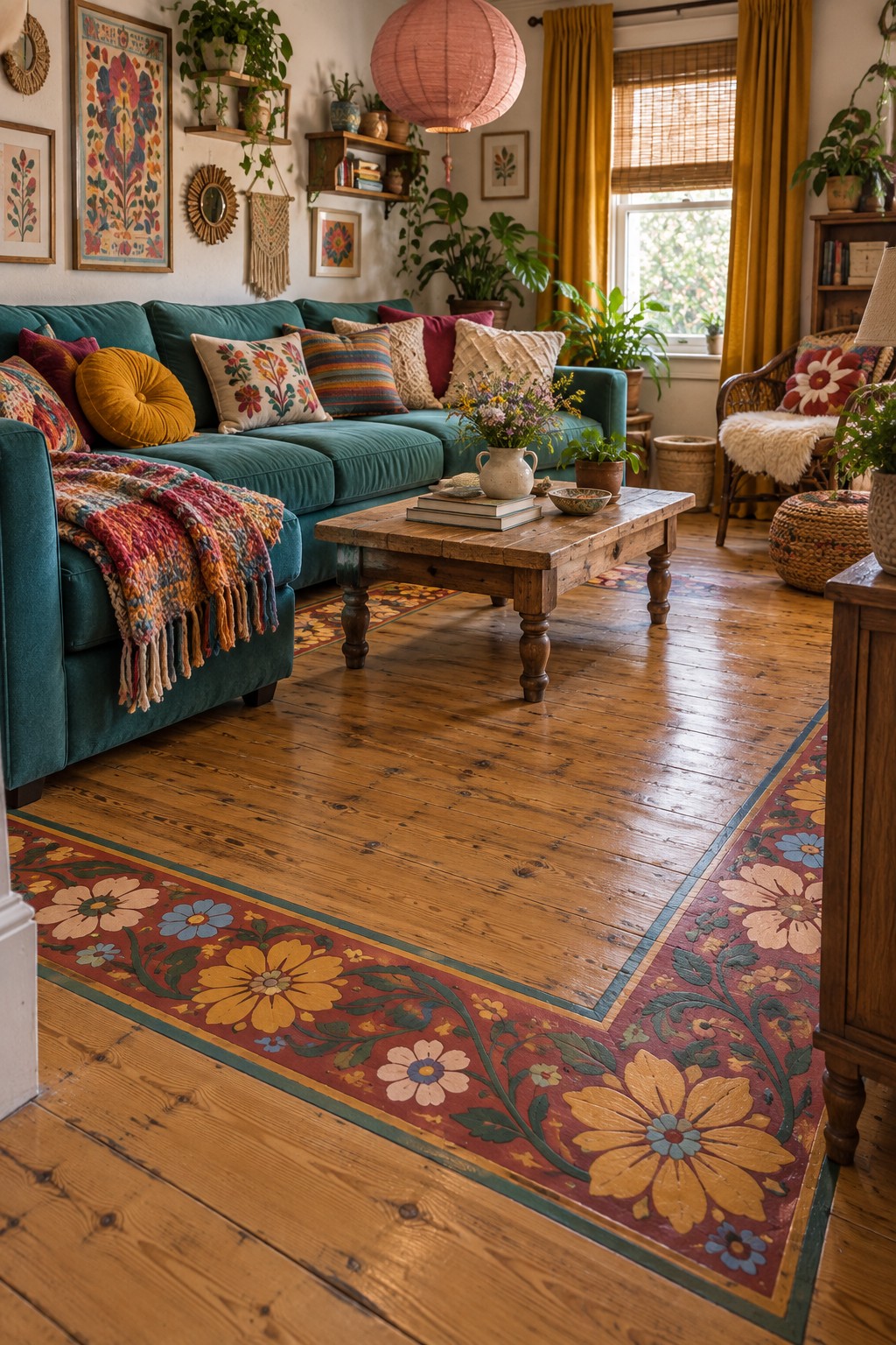
Mustard, cream, and blue blossoms sit on a rich rust border, with deep green leaves connecting the clusters. Natural wood remains visible through the middle of the living room. The painted edge echoes the room’s patterned cushions and textiles, giving the perimeter a decorative role of its own.
Begin with the border width and a few larger flower positions, then connect them with stems. Keep the most detailed areas away from places the sofa will completely cover. In a smaller room, narrowing the band and increasing the space between flowers can preserve the folk character without crowding the floor.
33. Large Iris Blooms Along an Entry Hall Border
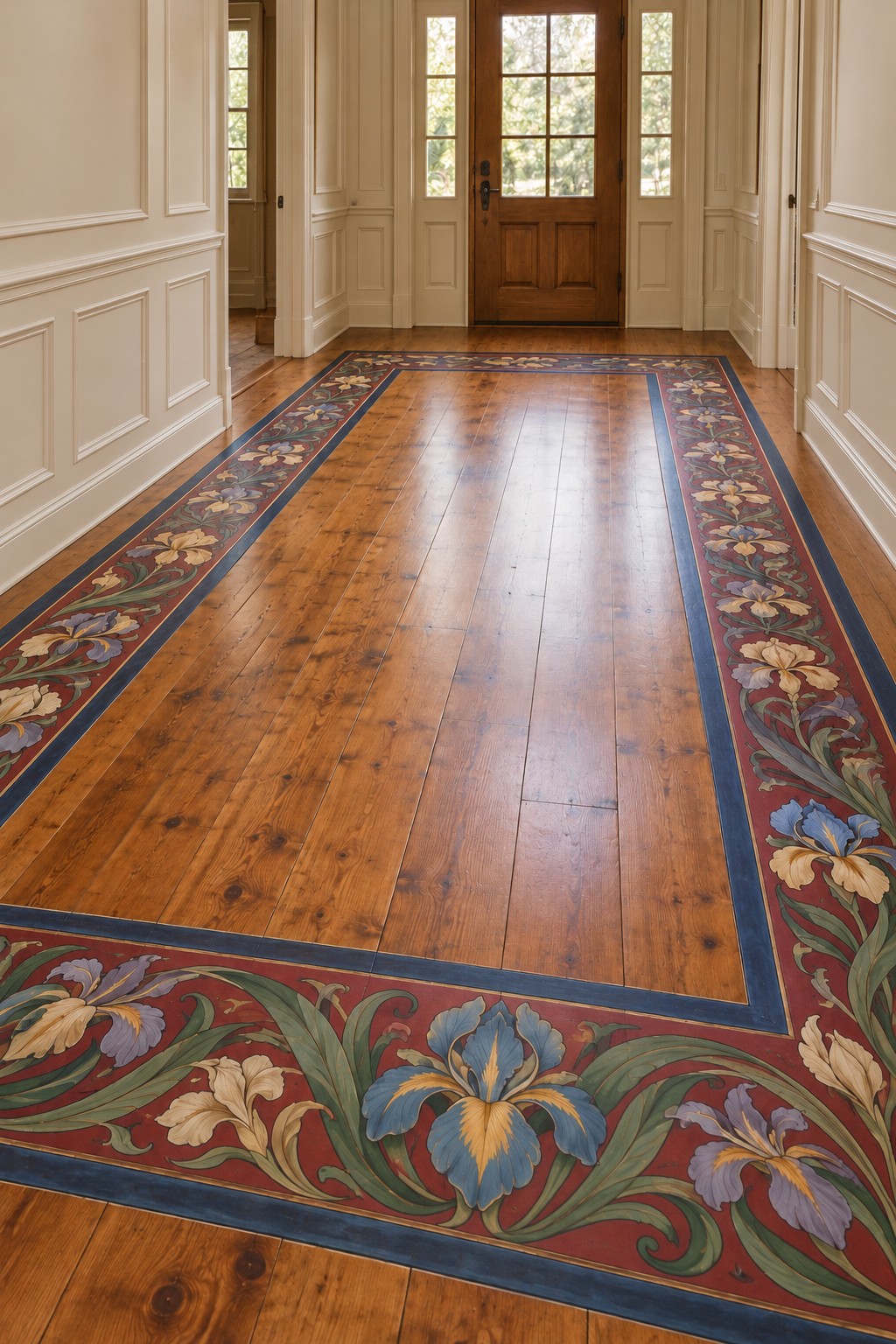
Large blue and cream iris shapes stretch through green leaves over a red ground. A narrow blue outline separates the painted border from the wood center. The long stems and pointed petals suit the entry hall’s proportions, giving the edges more height and movement than a small repeating flower could.
Plan how the stems turn each corner before committing to the straight sections. Keep the largest blooms within open areas near the entrance rather than beneath a console. A scaled paper sketch can help judge whether the border leaves enough exposed timber for the hall to retain its spacious center.
34. A Blue Citrus Frame for a Dining Room
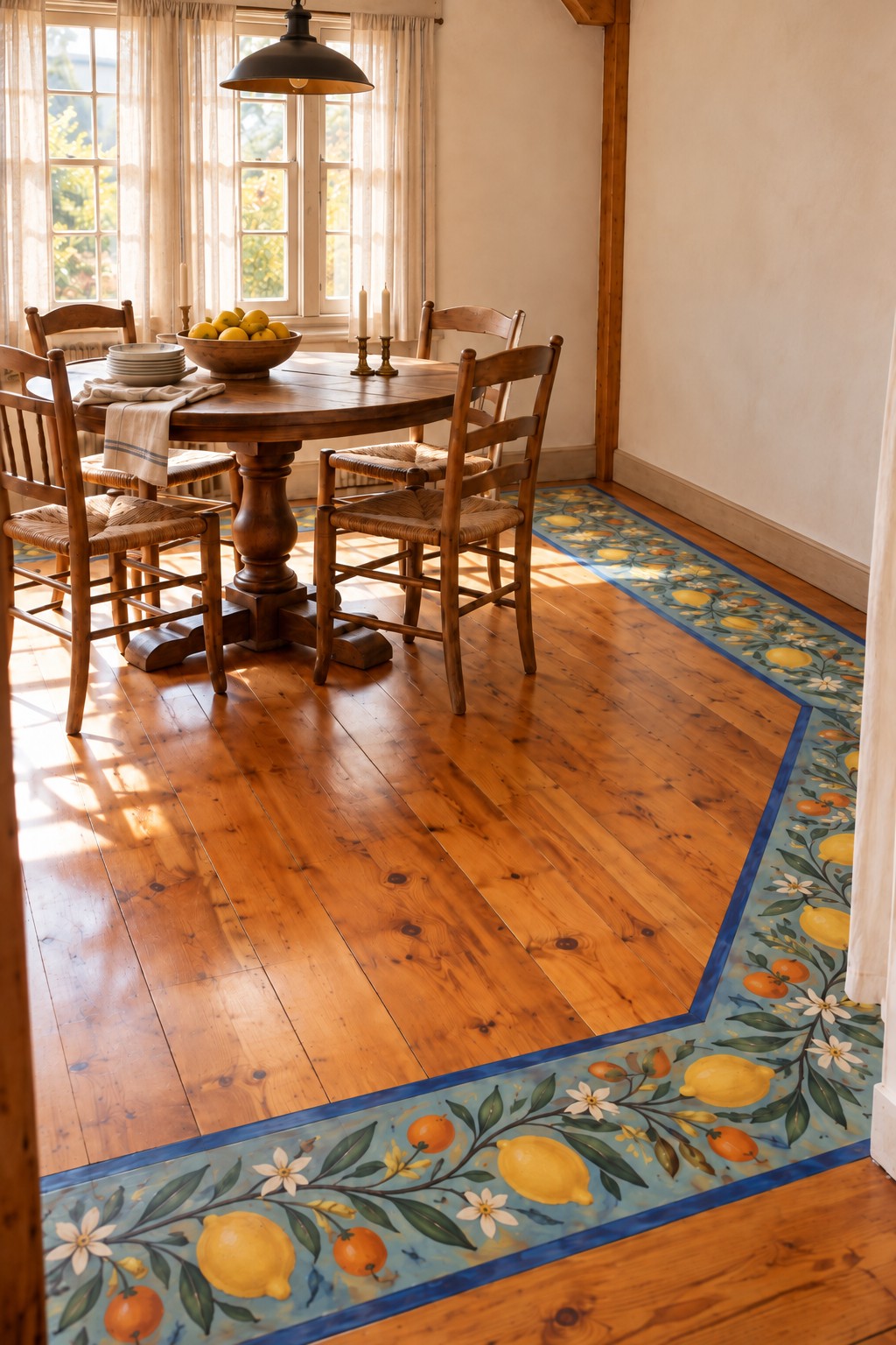
Yellow lemons, smaller orange fruit, and white blossoms sit against a blue perimeter band. The cool background distinguishes this broad frame from the breakfast nook’s pale citrus edging. Warm timber remains central, linking the floor to the table and chairs while the painted band supplies the main color contrast.
Place fruit clusters where they will be seen after chairs are pulled in. Use a smaller blossom or leaf repeat for narrow stretches beside furniture. If the blue looks too strong in a test section, adjust the background color before painting the whole border rather than trying to soften it later with extra motifs.
35. Dark Roses Around a Moody Bedroom Floor
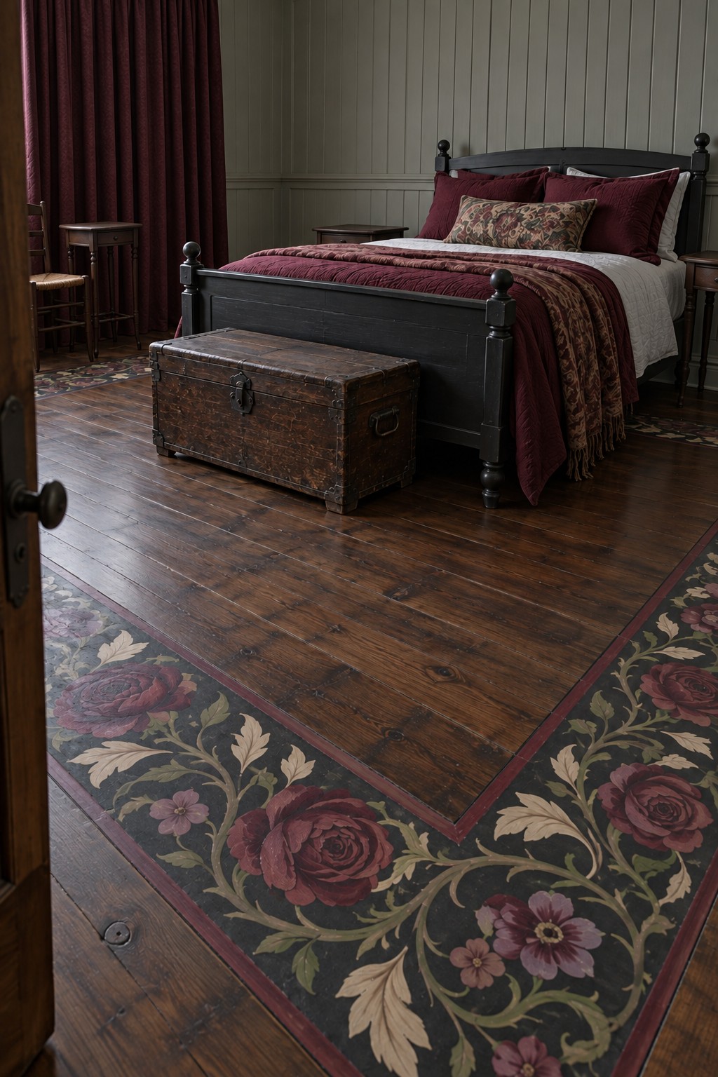
Burgundy roses and plum flowers wind through pale leaves on a nearly black border. A thin red line defines the painted frame, while the dark wood center keeps the bedroom from becoming a complete floral field. The pale foliage is essential because it gives the design contrast in a dimmer room.
Examine the palette under the lighting you normally use in the evening before choosing the final colors. Roses that are too close in tone to the background can disappear. Keep a few lighter leaf shapes beside the darker blossoms, and place the most intricate corner where the bed or chest will not hide it.
Test the Pattern Before Committing to the Floor
Compare a full size paper section with the actual furniture layout, then test the coating on a small suitable area. A design that looks striking in an empty room may be mostly hidden once the table, sofa, or bed returns. Choose a pattern whose most important details remain visible, and keep its complexity within the time and skill you can give it. Careful preparation and a well placed motif will matter more than adding another layer of decoration.


Leave a Reply