
Start a vintage scrapbook page with the memory you want to preserve, then choose its portrait, caption and keepsake. Twenty-three layouts offer lace borders, botanical layers, fabric grids and useful pockets. A floral-panel video and assembly guide explain how to build the decoration with photo copies while keeping pages easy to turn and the album able to close.
Table of Contents
- Choose a Page That Fits Your Story and Album
- Materials and Tools for Vintage Scrapbook Pages
- Keep Originals Separate from Decorative Crafting
- A Simple Assembly Sequence
- Video Example: Building a Floral Portrait Panel
- 23 Vintage Scrapbook Ideas to Adapt
- 1. Pressed Flower Portrait Frame with Vintage Lace
- 2. Layered Postcard Collage with Vintage Paper Details
- 3. Vintage Floral Portrait Strip with Lace
- 4. Layered Vintage Fabric and Paper Collage
- 5. Stitched Linen Portrait Composition with Vintage Details
- 6. Botanical Portrait Collage with Pressed Flowers
- 7. Framed Vintage Portraits with Lace and Dried Flowers
- 8. Vintage Travel Collage with Postcards and Lavender
- 9. Soft Lace Portrait Arrangement with Dried Florals
- 10. Romantic Rose Collage with Lace and Handwritten Notes
- 11. Stitched Floral Pockets with Vintage Fabric Details
- 12. Ribbon Crossed Portraits with Lace and Pressed Flowers
- 13. Oval Vintage Portrait Frame with Floral Layers
- 14. Vintage Gear Portrait with Layered Felt Details
- 15. Colorful Felt Collage with Vintage Performance Photo
- 16. Textile Sample Collage with Buttons and Vintage Portrait
- 17. Curated Vintage Ephemera with Mini Frames and Metal Details
- 18. Bold Vintage Portrait Collage with Layered Paper
- 19. Patchwork Vintage Collage with Cameos and Keepsake Details
- 20. Floral Arch Portrait with Pressed Rose Details
- 21. Cameo Portrait Collection with Velvet and Antique Details
- 22. Cameo Portrait Collage with Pearls and Velvet
- 23. Layered Vintage Portrait with Envelope and Ephemera Details
- Finish with a Story and a Closing Check
Choose a Page That Fits Your Story and Album
Start with the memory, not a pile of embellishments. A journey suits postcards and a dated label; a family portrait may need only a frame and a name; a sewing memory can give fabric scraps a reason to appear. These pages can become personal albums, keepsake gifts, or records of a celebration. Vintage character comes from the arrangement of textures and references, not from needing genuine antiques.
For a lighter page, explore the portrait strip in idea 3 or the quiet textile layout in idea 9. For removable notes, look at the stitched pockets and envelope composition. The textile grid and portrait collection need more attention to thickness. Choose your album before making several bulky pages.
Materials and Tools for Vintage Scrapbook Pages
Gather a photograph or document copy, supporting paper, a page base, and the few decorative materials your design needs. Lace, ribbon, fabric offcuts, printed floral motifs, and completely dried flowers offer different textures. Paper versions of buttons, gears, and ornate frames can give a similar silhouette with less weight. A vintage color or torn edge describes an appearance; it says nothing about preservation quality.
Use a ruler and pencil for spacing, paper scissors for cutouts, and separate fabric scissors for textile edges. Tweezers help place delicate stems and small motifs. A needle and thread suit stitched panels; a craft knife requires a cutting mat and controlled handling. Choose adhesive for the actual backing and decorative material, then try it on scraps for staining, wrinkling, or bleed through. Follow its application and drying instructions instead of soaking the page.
Keep Originals Separate from Decorative Crafting
Scan important photographs, letters, and tickets, and decorate with copies. For originals, use appropriate photo corners or protective album pages without applying glue or tape directly to the image. Look for acid free and lignin free paper, and documented photograph compatibility for contact materials. PAT, the Photographic Activity Test, is relevant when choosing photo storage products; a general “archival” label alone gives less information. A decorative collage is not automatically a preservation enclosure.
A Simple Assembly Sequence
- Select your main image and leave a place for a name, date, or short memory.
- Arrange the paper and textiles without adhesive. Check the page dimensions and leave room beside the binding for turning.
- Complete sewing on a separate fabric panel before adding photograph copies. Finish pocket edges before inserting cards.
- Attach the background, supporting layers, and focal image in that order. Add the smallest accents last.
- After drying, turn the page, remove and replace inserts, and close the album gently. Move or flatten pieces that press into the facing page.
Raised ornaments need more than space beside the spine. Their contact point on the opposite page matters too. Build a sample page with the intended thickness before repeating framed portraits throughout a book. An expandable album can allow more space, but it still needs pages capable of supporting the added material.
Video Example: Building a Floral Portrait Panel
The video shows a small pale paper panel being glued to a lace edged backing, followed by irregular cream paper patches. Leaves and colorful flower shapes are placed with tweezers around an open center. An oval portrait piece and a lavender bow complete the composition, and the finished panel is attached to an album page. Choose fully dried pressed flowers or lightweight crafted floral embellishments, then test the adhesive and page clearance with those materials.
Work from the broad layers toward the small details: prepare the backing, reserve the portrait area, arrange the border and add one focal accent. Use a photo copy for a glued panel and choose adhesive for the backing and decoration. Prepare any stitching or functional pockets before assembling the page.
23 Vintage Scrapbook Ideas to Adapt
Use these layouts to organize your own portraits and keepsakes. Adjust their scale and ornament to the album, leaving room for captions, page movement and the objects you want to preserve.
1. Pressed Flower Portrait Frame with Vintage Lace
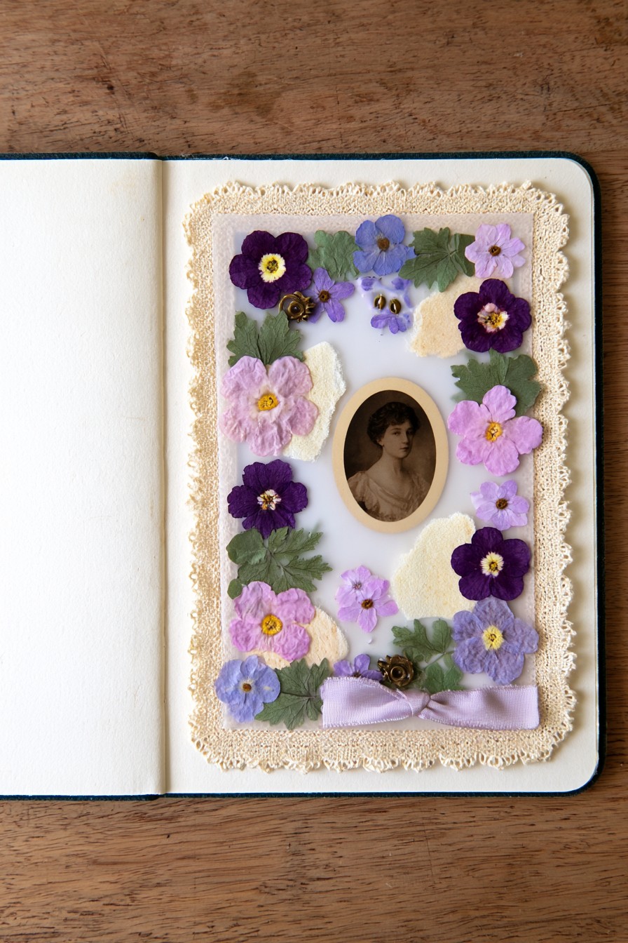
Purple and lilac flowers circle an oval portrait against a pale center, with cream lace around the outside and a lavender bow below. The varied flower sizes create movement while the clear oval gives the face its own space. Small leaves connect the blossoms without turning the center into another patterned area.
Make the floral border on a separate paper panel, following the layering order in the video. Arrange larger flower shapes first, then use leaves and smaller blooms to connect gaps. For a flatter album version, mix printed botanical cutouts with a few dried specimens. Reserve a small label beneath the portrait for a name or memory; the decoration should frame the story as well as the image.
2. Layered Postcard Collage with Vintage Paper Details
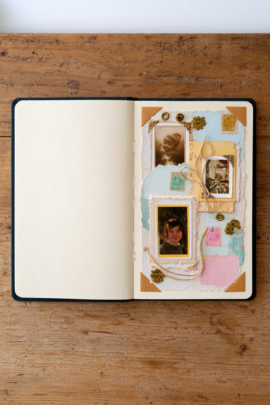
Torn pastel papers, postcard imagery, several portraits, and loose curves of twine give this page the feeling of gathered correspondence. The photographs sit at different heights, so the layout reads as a collection rather than a formal row. Cream and pale blue help separate the images from the smaller paper fragments.
Choose one item as the starting point, then overlap supporting copies so useful words or postmarks stay readable. Attach twine ends behind a backing panel if you want curved lines without loose strands catching during page turning. A brief note can explain why these pieces belong together. Keep the collage about one exchange or relationship instead of adding unrelated ephemera merely to fill remaining spaces.
3. Vintage Floral Portrait Strip with Lace
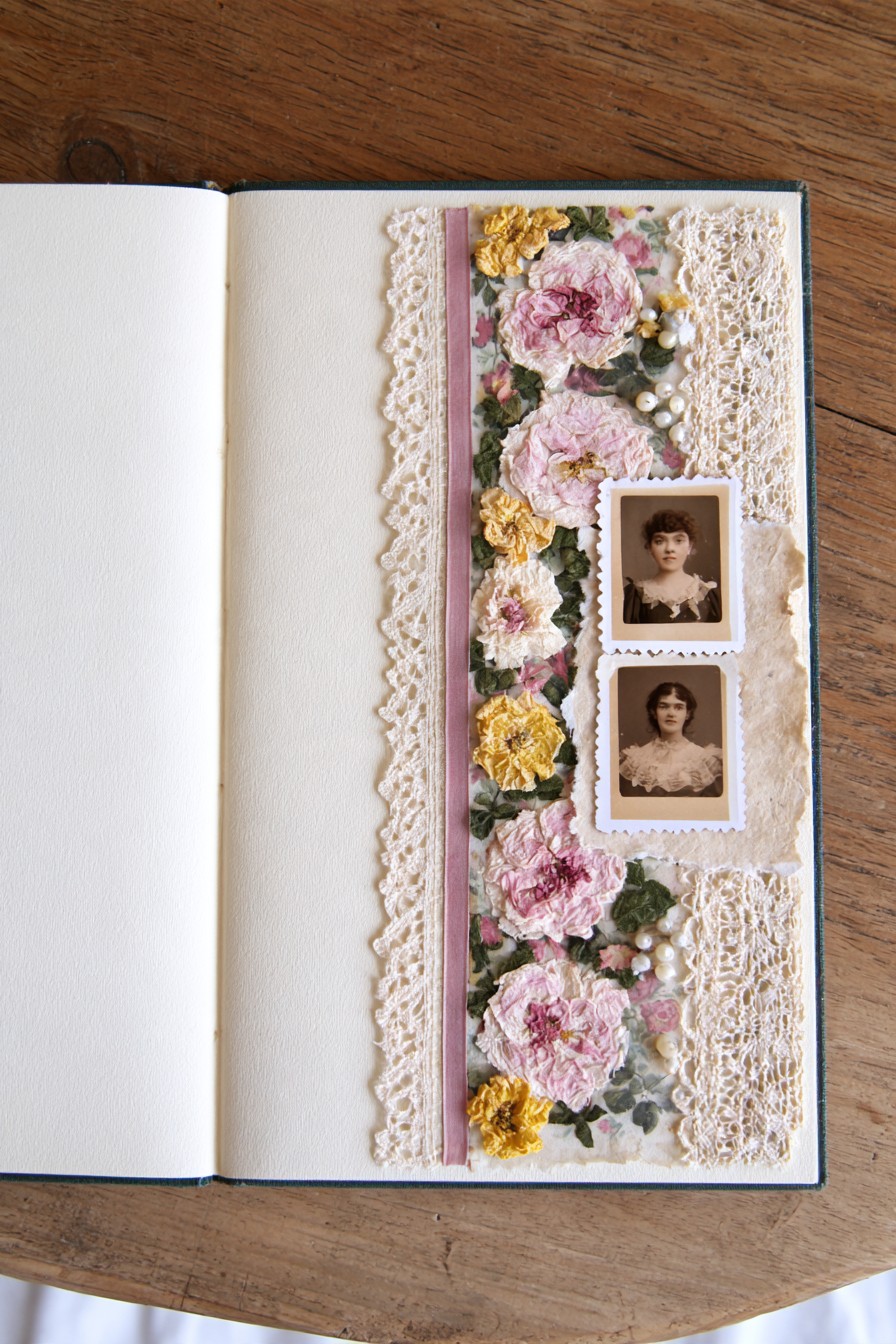
Two portraits occupy a narrow vertical band surrounded by pink floral texture, cream lace, and small pale accents. The tall format leaves much of the facing spread quiet. Repeating flowers above and below the photographs helps connect the two images without giving each a separate heavy frame.
This arrangement suits a pair of related photographs, such as two moments in one person’s life. Size the prints together before adding the border, then leave a narrow caption area between or below them. Flat floral cutouts can recreate the rhythm when textured ornaments would make the strip too thick. Check that the outer lace stays within the page edge and cannot snag as the book closes.
4. Layered Vintage Fabric and Paper Collage
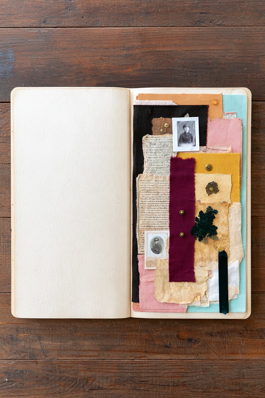
Mustard, pink, turquoise, burgundy, and cream rectangles overlap behind small portraits. Frayed textile edges and smoother paper give the collage contrast even where the colors are close. The narrow dark strip provides a visual anchor, allowing the lighter patches to feel deliberately arranged rather than scattered.
Lay the fabric out as one panel and complete any stitching before mounting the prints. Thin offcuts are easier to accommodate than several thick folded edges. If a fabric has personal meaning, add a small note identifying its connection to the memory. Carry a selected fabric and paper pairing onto the cover with these layered sketchbook cover ideas, keeping the interior page more flexible than the cover.
5. Stitched Linen Portrait Composition with Vintage Details
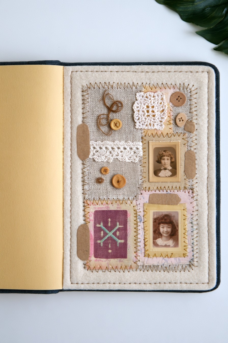
Visible stitches divide a neutral textile panel into small areas for portraits, lace squares, buttons, and thread motifs. The restrained background makes the sewing details stand out. Two small photographs bring a personal focus to what might otherwise read as a fabric sampler.
Prepare the stitched panel off the album page, then mount it once the sewing is complete. Plan buttons around the actual facing page, not just around the binding: a raised button can press into an image opposite it. Close the album gently with the pieces temporarily positioned before fastening them. Use flatter substitutes where necessary, and place a written note on a paper tab if the stitched background is too busy for readable handwriting.
6. Botanical Portrait Collage with Pressed Flowers
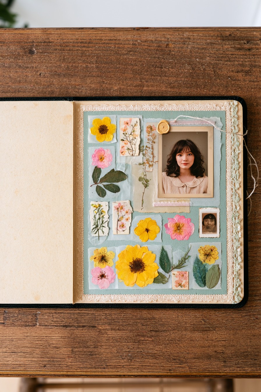
A large portrait sits toward the top of a pale blue composition, while yellow and pink flowers spread through the lower area. Smaller botanical panels and a tiny second portrait introduce variety without taking over the main image. The blue background gives the warmer flowers a clear outline.
Choose flat, completely dried botanical material, or combine botanical prints with a few specimens that can tolerate careful handling. Support fragile flowers on small paper pieces so they can be positioned without repeatedly lifting the stems. Keep adhesive away from the portrait surface. A note about a garden, season, or person can make the flowers meaningful; their species need not be guessed from the finished design.
7. Framed Vintage Portraits with Lace and Dried Flowers
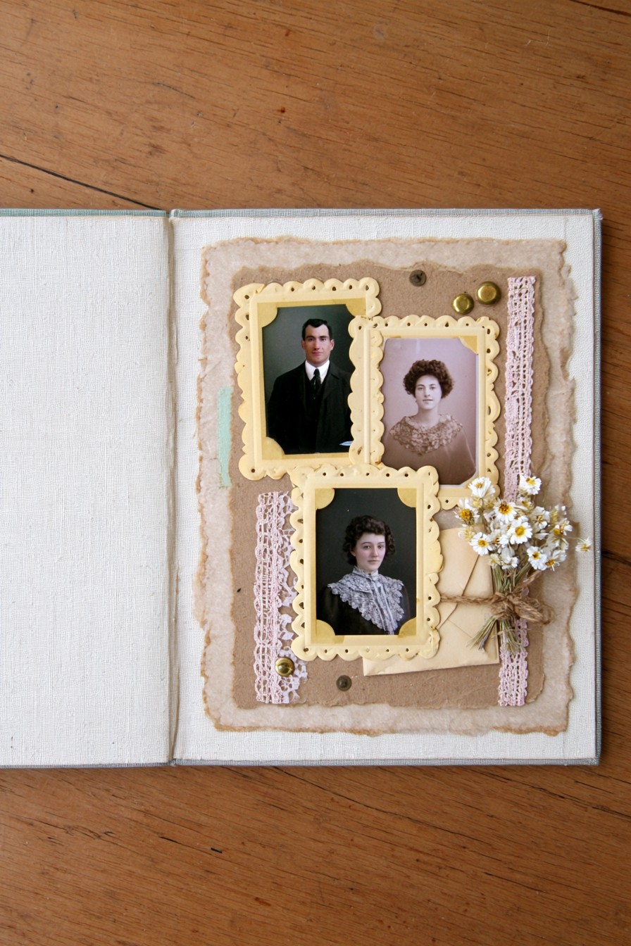
Three portraits form a compact gallery in related cream frames. Pale pink lace runs through the background, and a tied cluster of small white flowers sits beside the lower images. The repeated frame color creates a connection even though the portraits have different shapes and proportions.
Size the photographs before cutting frame openings, checking that no border trims a face or important clothing detail. Try thin layered card for the ornamental outlines when thicker frames would distort the album. Keep the flower cluster toward an open corner, where it will not rub across the images. Label each portrait on a nearby paper strip using names you know, leaving uncertain identities unassigned rather than inventing a family narrative.
8. Vintage Travel Collage with Postcards and Lavender
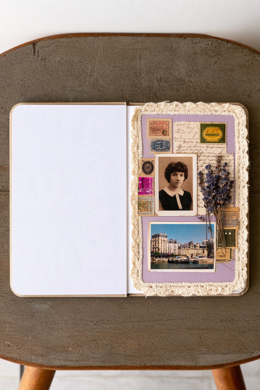
A portrait and a scenic postcard share a lilac panel with handwriting, postage motifs, lace, and a small lavender colored botanical cluster. The larger postcard creates a sense of place, while the portrait makes the page feel like a personal travel record. Small paper details fill the edges without needing another large photograph.
Leave a label area for the destination, date, and one remembered detail, such as who joined the trip or what happened that day. Use the preservation choices explained above for any valuable travel documents. Mount the scenic copy so its most recognizable feature stays visible. If the botanical cluster adds too much thickness, a printed lavender motif can keep the color relationship while making the page easier to turn.
9. Soft Lace Portrait Arrangement with Dried Florals
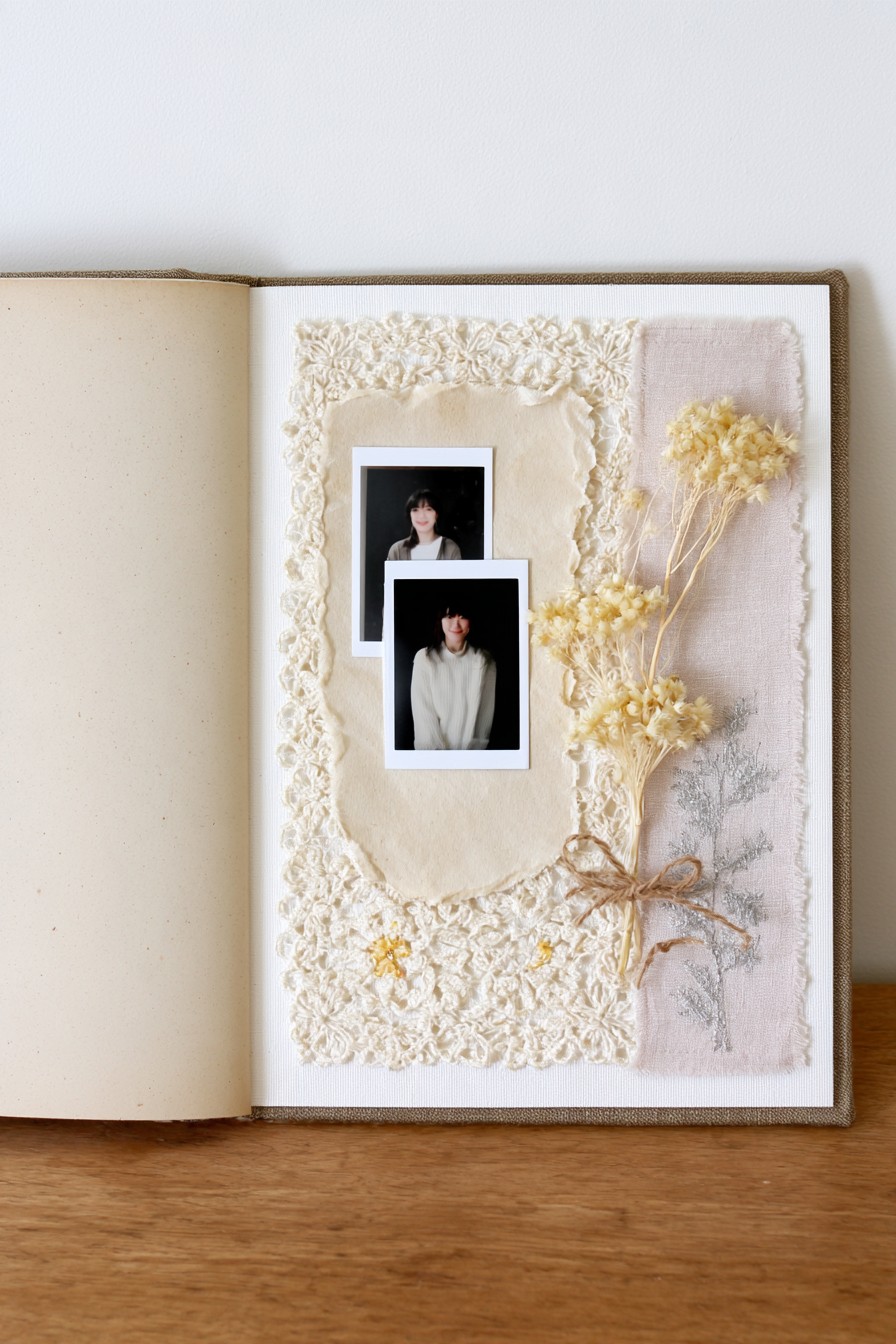
Two small portraits overlap against a broad cream lace area, with a pale textile strip and tied floral bundle to the side. The limited palette lets the texture carry the composition. Because the photographs are compact, the open background gives them more presence than another ornate border would.
Try this layout for a quiet memory or a pair of images that need only a short explanation. Position the portraits where both faces remain fully visible, then measure the floral bundle against the closed album. A flatter stem arrangement can retain the diagonal movement without projecting so far from the page. Write a brief caption on the plain backing, keeping it separate from lace openings that would make small lettering hard to read.
10. Romantic Rose Collage with Lace and Handwritten Notes
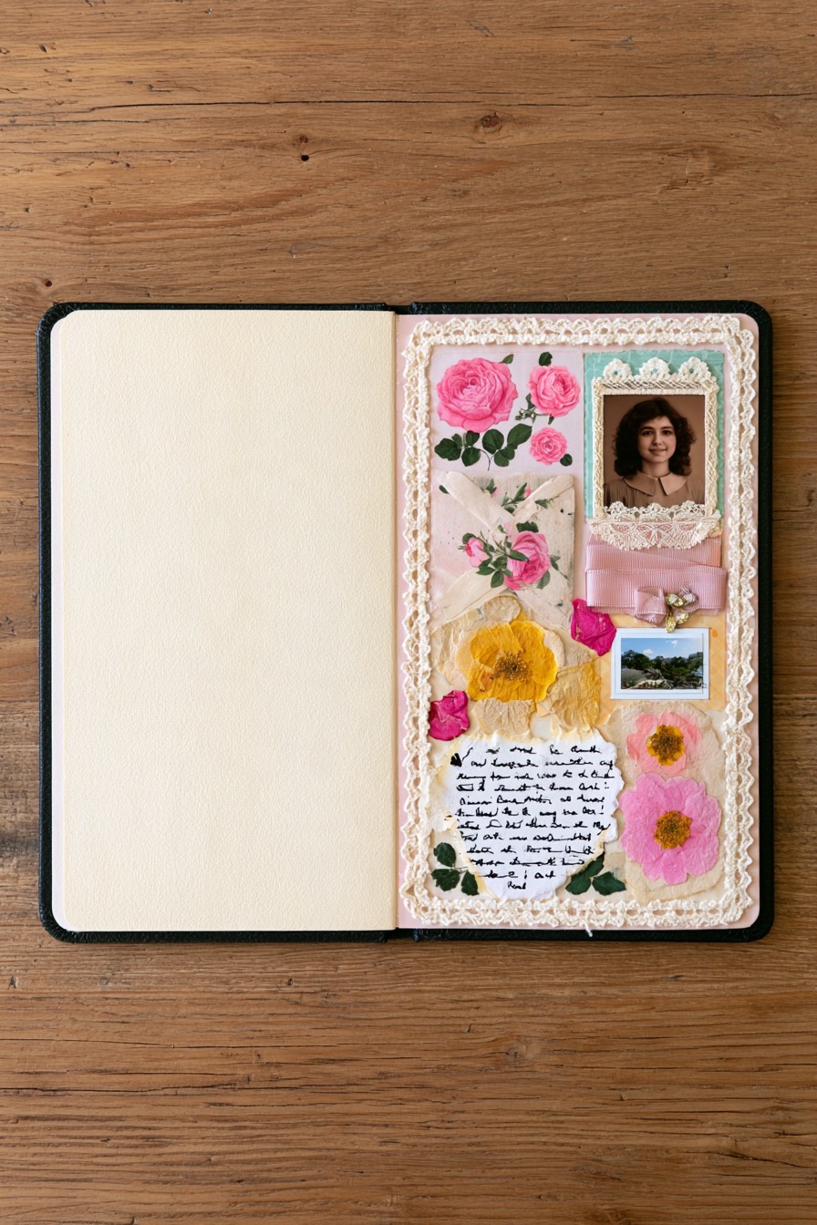
Pink rose motifs and botanical details travel down the page around a portrait, a smaller landscape image, ribbon, and a handwritten area. The page has several points of interest, but the floral path connects them. Cream lace around the edge softens the rectangular composition.
Decide what the handwritten section will say before placing flowers over nearby paper. It could record why the two photographs belong together or preserve a short recollection in the maker’s own words. Combine larger printed roses with smaller decorative blooms to vary scale without building every layer in relief. Place the writing where it can be read without moving ornaments, and keep the lower botanical group clear of any words that carry the memory.
11. Stitched Floral Pockets with Vintage Fabric Details
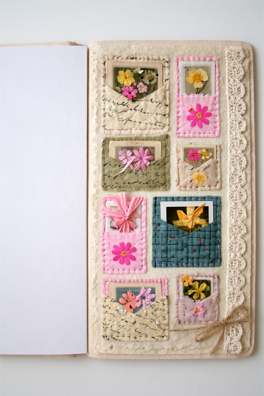
Stitched pockets in cream, pink, sage, and blue create an interactive page of small inserts. Visible thread and varied fabric patterns supply the vintage character. Flowers and miniature images appear above the openings, suggesting a collection that can be explored one piece at a time.
Make each pocket on a separate fabric backing, leaving its upper edge open. Finish seams and loose threads before mounting it, and test the intended card against the lining and corners. A small portion of the insert should remain easy to grip. Use lightweight cards for notes or image copies; fragile loose flowers are better secured to an insert than repeatedly pulled by their stems. Keep pocket contents modest so the page does not become difficult to close.
12. Ribbon Crossed Portraits with Lace and Pressed Flowers
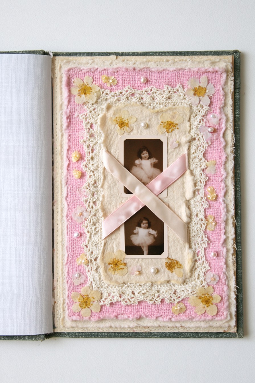
Pale satin ribbons cross between two portraits on a pink and cream textile background. Lace and small floral accents surround the central area, while the diagonal lines draw the two images together. The crossing is the main compositional feature, so it does not need many additional ornaments.
For a decorative version, mount the photograph copies independently and fix the ribbon ends behind the backing. If you want removable copies held by ribbon, test whether they can slide in and out without bending or scraping. Keep the ribbons from becoming tight bands over the faces. Photo corners remain a clearer option for originals. A short paired caption can explain the relationship between the images without requiring another layer through the center.
13. Oval Vintage Portrait Frame with Floral Layers
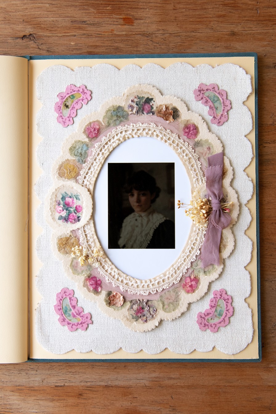
An oval border surrounds a portrait within a broad scalloped cream panel. Pink floral motifs, lace, and a side ribbon give the frame a soft, ornate outline. The empty area around the face helps distinguish the photograph from the decorative ring.
Cut the opening to suit your print first, then size the surrounding rings outward from that opening. Build the frame with thin layers if it will sit inside a bound album. The side ribbon can remain a small accent instead of wrapping around the page and adding another raised band. Test the whole panel against the facing page before mounting. A narrow name label below the oval is enough to give this miniature gallery a personal purpose.
14. Vintage Gear Portrait with Layered Felt Details
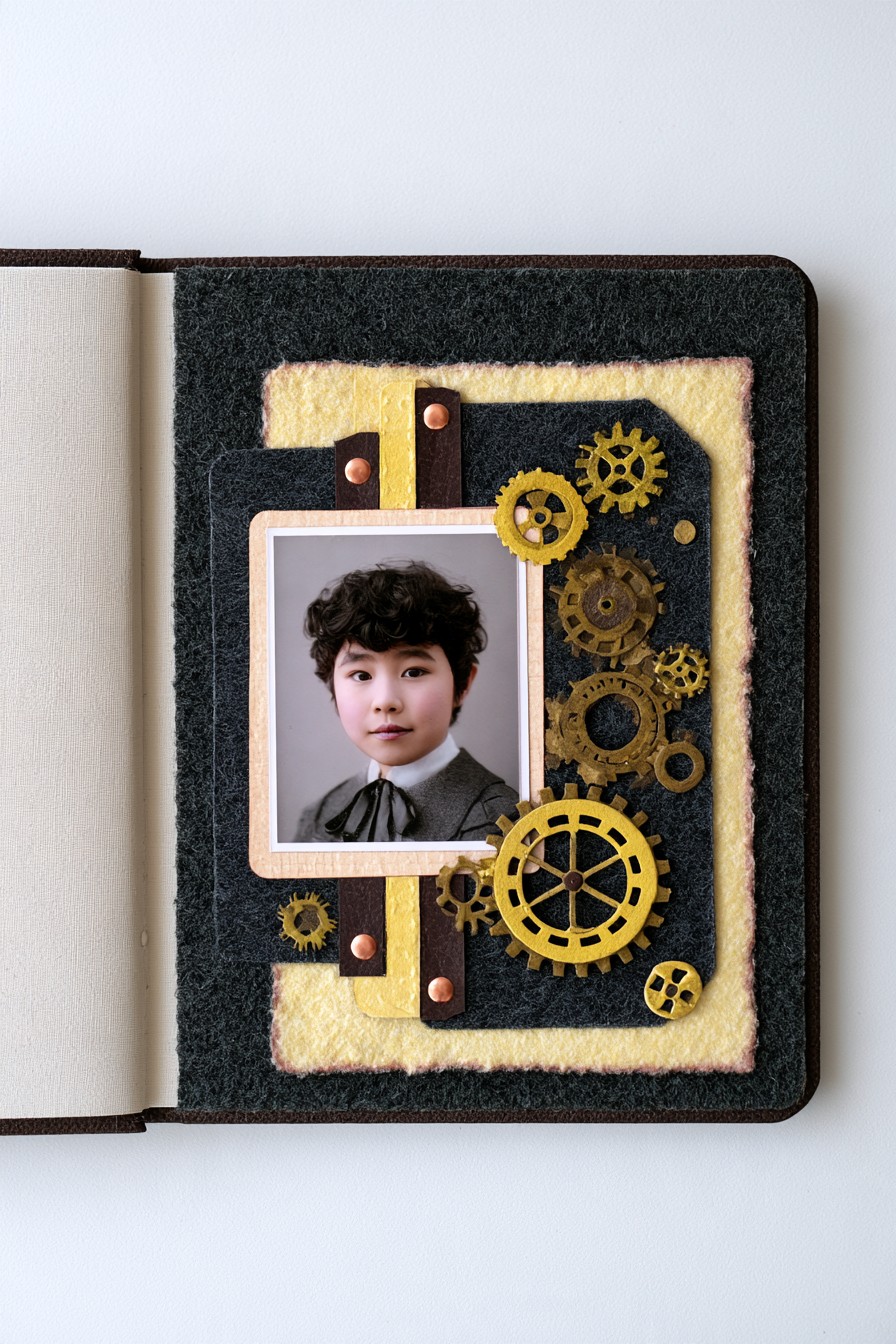
A portrait interrupts a dark field of gear shapes, vertical strips, and warm yellow textile. The contrast between soft fabric and mechanical outlines creates the industrial character. Grouping the gears beside the face gives the design movement without hiding the main subject.
For an album page, paper gear cutouts can recreate the pattern without the weight of hardware. If metal findings are used, check their edges and height and keep them from pressing against a photograph or the page opposite. Felt changes the appearance of the backing; it does not remove the pressure from a protruding piece. Choose a photograph connected to making, work, or a personal interest, and add a note explaining that connection instead of relying on the gear motif alone.
15. Colorful Felt Collage with Vintage Performance Photo
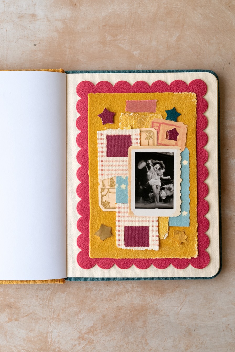
Mustard and raspberry layers surround a monochrome performance photograph, with small stars and patterned panels reinforcing the lively mood. The scalloped outer edge contrasts with the rectangles inside. This is a brighter interpretation of vintage styling, where the event can guide the palette.
Use a photograph copy and leave a caption strip for the performance or celebration name, its date if known, and the reason the image matters. Thin felt or textured paper can reproduce the color blocks without making a heavy stack. Check where the central picture will sit before placing the stars, so they stay visible instead of being hidden beneath it. Use your own documented details; the person or event in an inspiration photograph should remain unidentified.
16. Textile Sample Collage with Buttons and Vintage Portrait
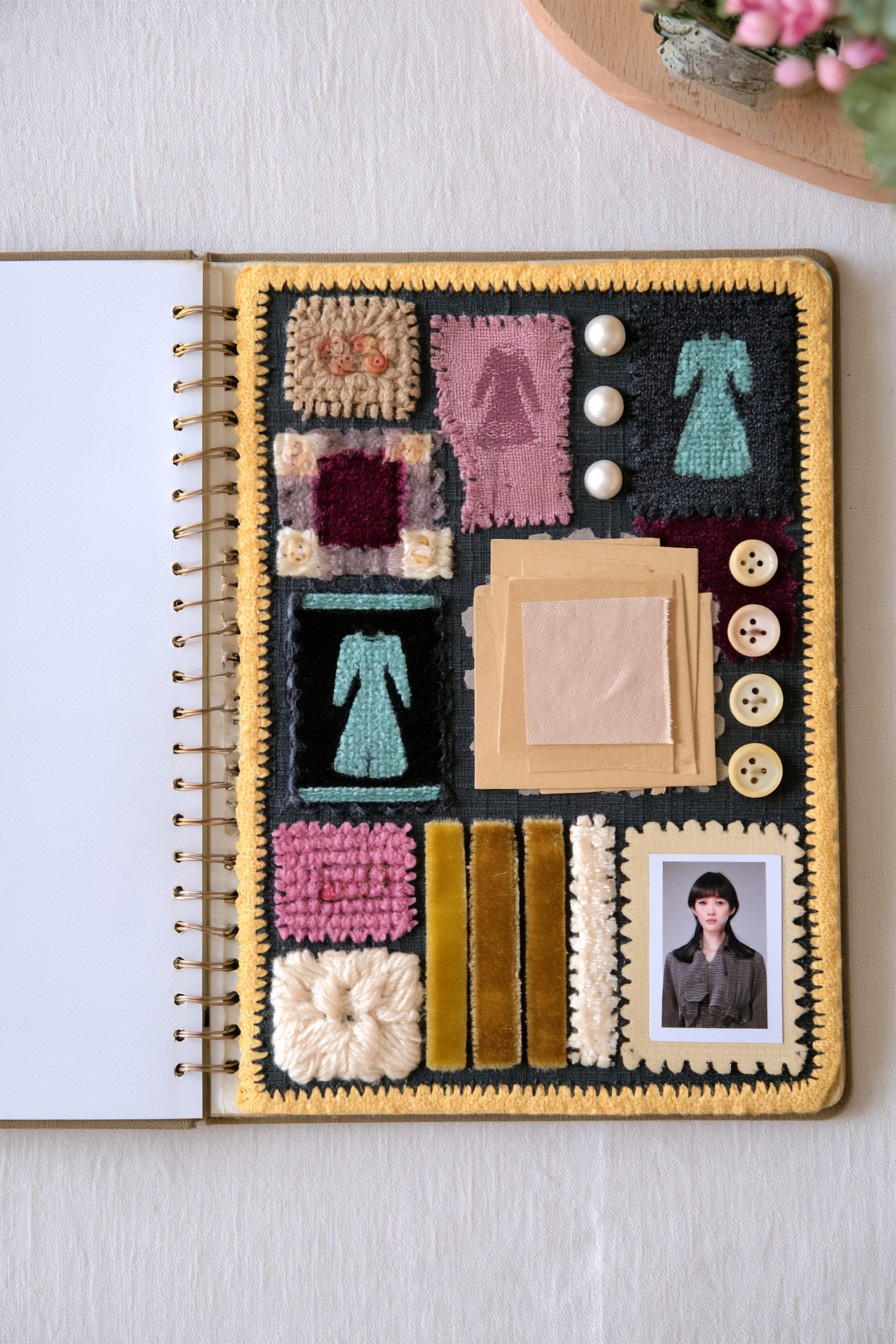
A dark grid organizes fabric samples, dress shaped motifs, textured yarn, buttons, and a small portrait. The repeated compartments give each material its own space. The image in the lower corner breaks the sampler rhythm and provides a personal focal point.
Choose samples with a story, such as a sewing project or a favorite garment, and label a few of them. Complete stitching on the textile panel before introducing the photograph. Position buttons temporarily and close the album to see where they touch the opposite leaf; moving them away from the spine alone is not enough. Flatten or replace bulky pieces if the book resists closing. Keep the portrait area smoother than the surrounding swatches so the small image remains easy to see.
17. Curated Vintage Ephemera with Mini Frames and Metal Details
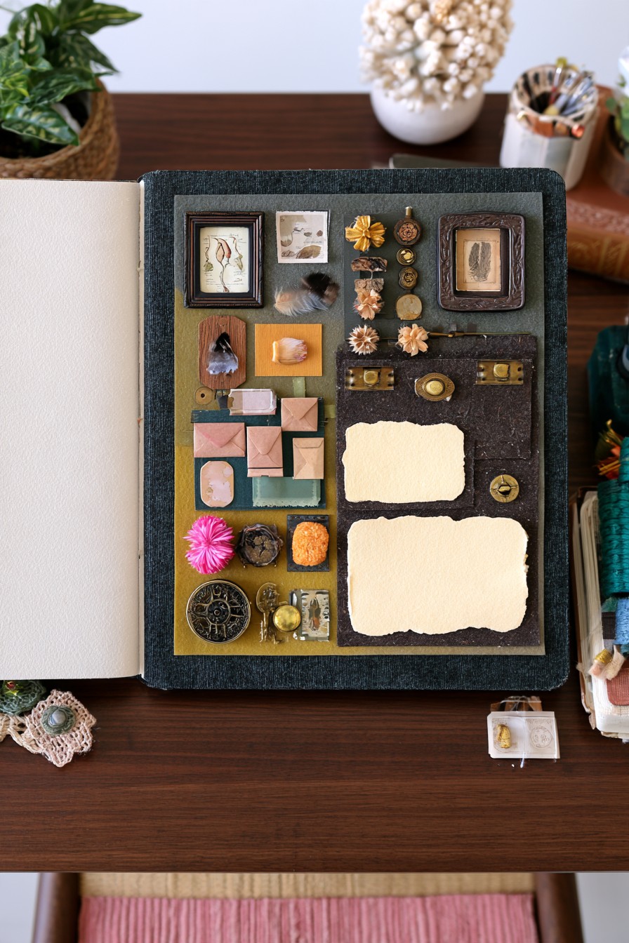
Miniature frames, envelopes, paper scraps, and small decorative objects occupy an olive and charcoal grid. Two pale blank panels offer breathing space beside the dense clusters. The arrangement resembles a collection of selected keepsakes, with the dark backing separating their outlines.
Give each cluster a subject instead of filling every compartment independently. The pale panels can hold a list explaining the objects or a short account of the occasion. Use reproduction ephemera for decorative attachment and reserve valuable originals for separate storage. Thin paper silhouettes can stand in for heavy findings. Leave enough room around the miniature frames to lift and turn the page without catching fingers on ornaments; this layout rewards close viewing more than frequent casual handling.
18. Bold Vintage Portrait Collage with Layered Paper
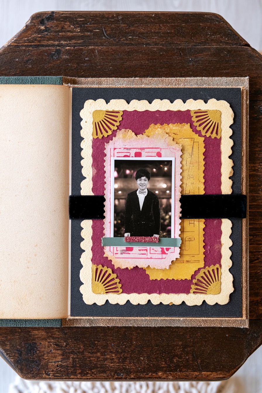
A central monochrome portrait sits within mustard, burgundy, pink, and cream layers. Dark horizontal bands and fan shaped corner motifs make the composition more graphic than the floral examples. The light border around the portrait gives the face contrast against the saturated background.
Build the layered outline from a few paper widths before adding decorative corners. Keep the horizontal band behind the picture area so it supports the composition without cutting across the face. This format suits a single important portrait with a concise caption rather than many competing inserts. A narrow strip below the image can record the person’s name or the moment pictured. Check that scalloped edges are secured where they might lift during page turning.
19. Patchwork Vintage Collage with Cameos and Keepsake Details
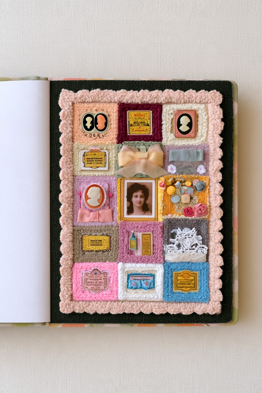
A patchwork grid gives portraits, cameo motifs, bows, labels, and small keepsakes distinct compartments. Pale pink trim connects the outside edge while the interior squares vary in color and texture. The geometry supplies order, allowing different objects to coexist without becoming a loose pile.
Assign each compartment a reason to be there before attaching its contents. Add small explanations such as whose keepsake it is or which occasion it recalls, using facts you actually know. An unfamiliar cameo can remain a decorative motif rather than receiving an invented identity. Lay out the labels with the objects so there is enough readable space. Use one or two repeating accents to link the squares, and let some sections stay simpler than others.
20. Floral Arch Portrait with Pressed Rose Details
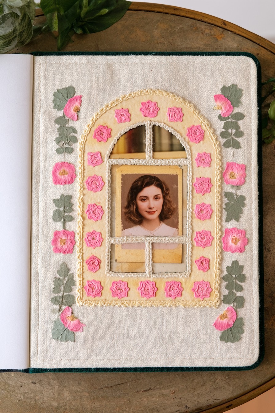
The cream arch resembles a window, with narrow internal dividers, smaller openings above the portrait, and rectangular panels below. Small pink rose motifs repeat around the curved outline, while taller leafy details flank it. The portrait occupies the main opening, making the architectural frame the defining feature.
To recreate the structure, sketch the outer arch and its divisions on paper before cutting the frame. Adjust the central opening to your photograph so no divider crosses the face. Thin card layers can create the window effect with less bulk than a deep frame. Add the repeated rose motifs after the outline is established, checking the book’s closing space as you work. The visible floral details need not all be described as pressed roses; their exact material is not established.
21. Cameo Portrait Collection with Velvet and Antique Details
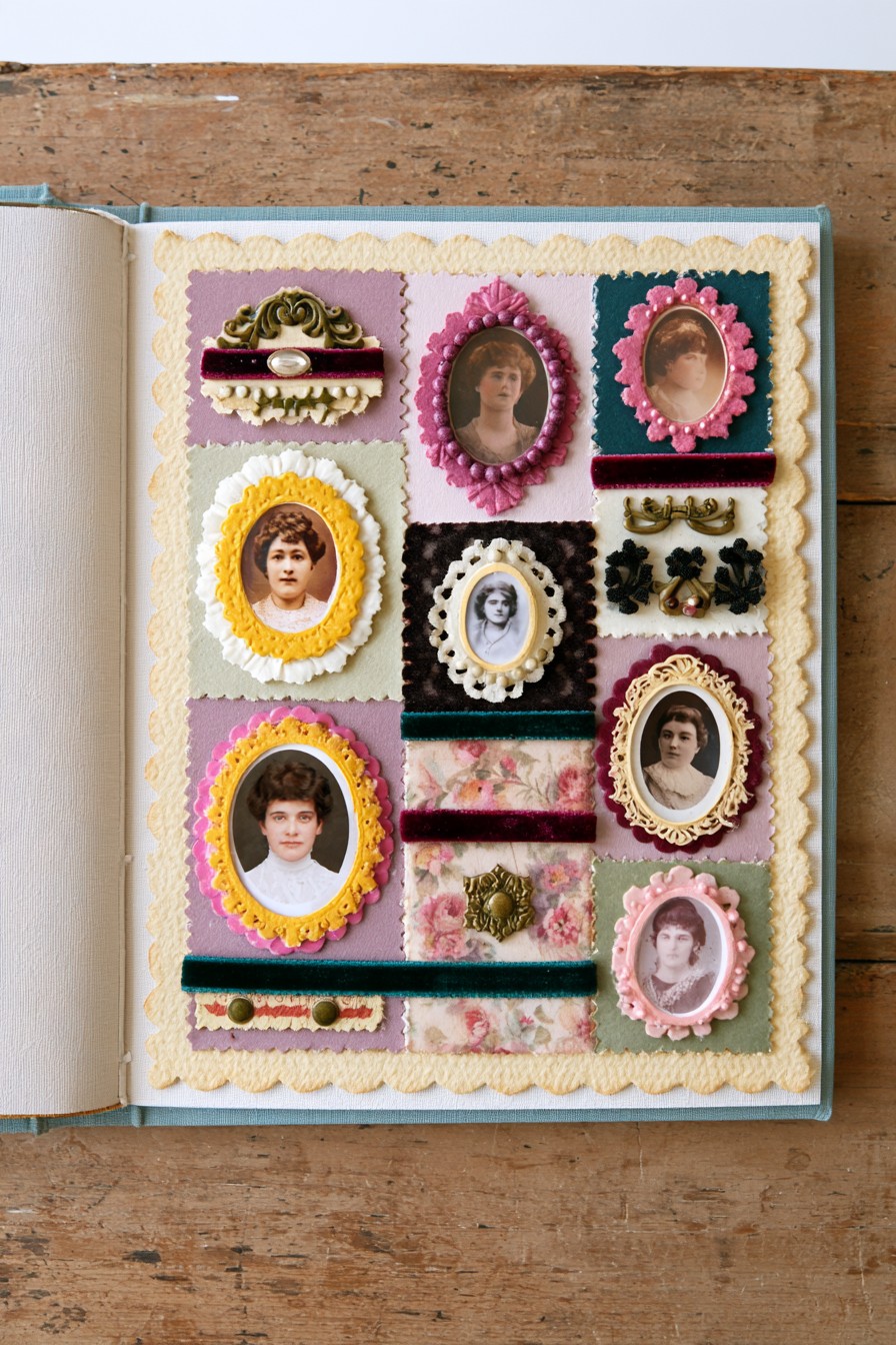
Repeated oval portraits fill a cream bordered page, separated by colored panels, velvet looking bands, and small ornamental details. Different frame colors make individual images distinct while the shared shape holds the gallery together. The arrangement gives several faces comparable prominence.
Lay out the portraits with their names and known relationships before filling the gaps. If the information is uncertain, leave the caption incomplete or mark it as unknown. The repetition of raised frames can create considerable total thickness, so test the album closure with all frames in position before gluing. Reduce relief in some frames rather than forcing the cover down. Thin printed outlines can retain the gallery rhythm on pages that need to stay relatively flat.
22. Cameo Portrait Collage with Pearls and Velvet
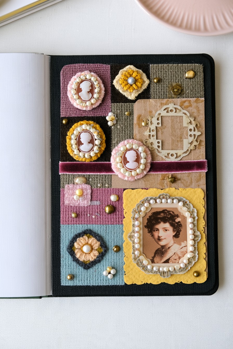
Pearl like borders surround small cameo motifs and a larger portrait on a grid of pink, charcoal, blue, and mustard panels. A horizontal ribbon connects the sections. The larger image provides a clear anchor, keeping the smaller decorative ovals from competing equally.
Choose the large photograph first, then arrange the cameos as supporting motifs. Beaded borders can make a page much thicker when repeated, so try flat printed dots or a shallow trim in some areas. Before attachment, close the album gently with the complete layout in place and check which ornaments meet the facing page. Keep hard pieces clear of image surfaces. A caption beside the larger portrait can carry the story while the cameo shapes remain decorative.
23. Layered Vintage Portrait with Envelope and Ephemera Details
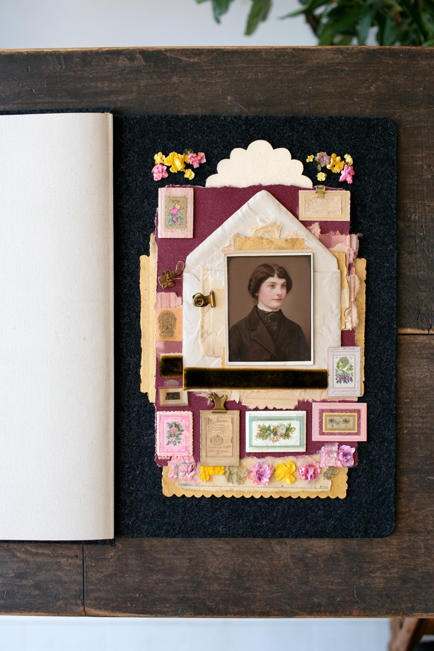
An envelope shaped cream layer surrounds a central portrait against burgundy and dark backing. Small labels, botanical cards, and ribbon accents extend the collage below and beside it. The triangular upper shape makes the page feel like a piece of correspondence rather than a conventional framed photograph.
For a usable note pocket, attach the envelope’s side and lower edges while keeping its opening accessible. Mount the portrait and flowers where they cannot seal or obstruct that opening, then test the actual note before finishing the page. A small exposed tab makes removal easier. Continue the personal message idea with these handmade birthday cards with personal messages. The removable note can explain the photograph without crowding the decorative front.
Finish with a Story and a Closing Check
Before adding another ornament, check whether the page explains what the photograph or keepsake means. Names, a date, or one specific recollection often contribute more than another decorative layer. Test page turning, pocket access, and comfortable album closure after all attachments have dried. Simplify any area that catches or presses into another image.
Support the whole leaf when turning a heavy textile page, and let the binding open naturally without forcing it flat. Store the album flat in an appropriately sized preservation box, away from bright light, dust, damp conditions, and likely leaks. Check occasionally for loose attachments or rubbing between pages. These decorative examples can inspire a personal album, while valuable originals remain protected separately.

Leave a Reply