15 Mid-Century Modern Kitchen Looks with Walnut & Terrazzo

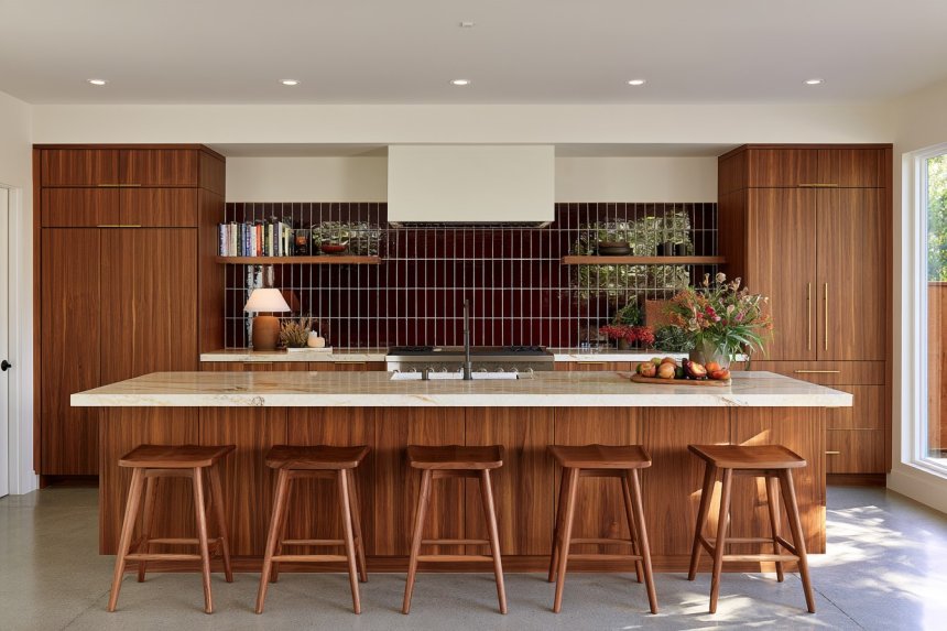
A mid-century modern kitchen works best when warmth, geometry, and everyday practicality are kept in balance. Walnut cabinetry, terrazzo surfaces, muted greens, ribbed glass, slim hardware, and furniture-inspired details can all reference the period, but the room should still function comfortably as a contemporary kitchen.
Before choosing finishes, consider how much natural light the space receives, whether the flooring already introduces a strong color or grain, and how many statement materials the room can support. In smaller kitchens, one or two period-inspired elements may be enough. Larger spaces can handle a broader material mix as long as the palette remains controlled.
Rather than filling the room with obvious retro accessories, let cabinet proportions, material transitions, storage design, and carefully placed color establish the style. These approaches show how mid-century character can feel warm, graphic, and distinctive without becoming overly themed.
1. Let Continuous Walnut Grain Become the Main Visual Feature
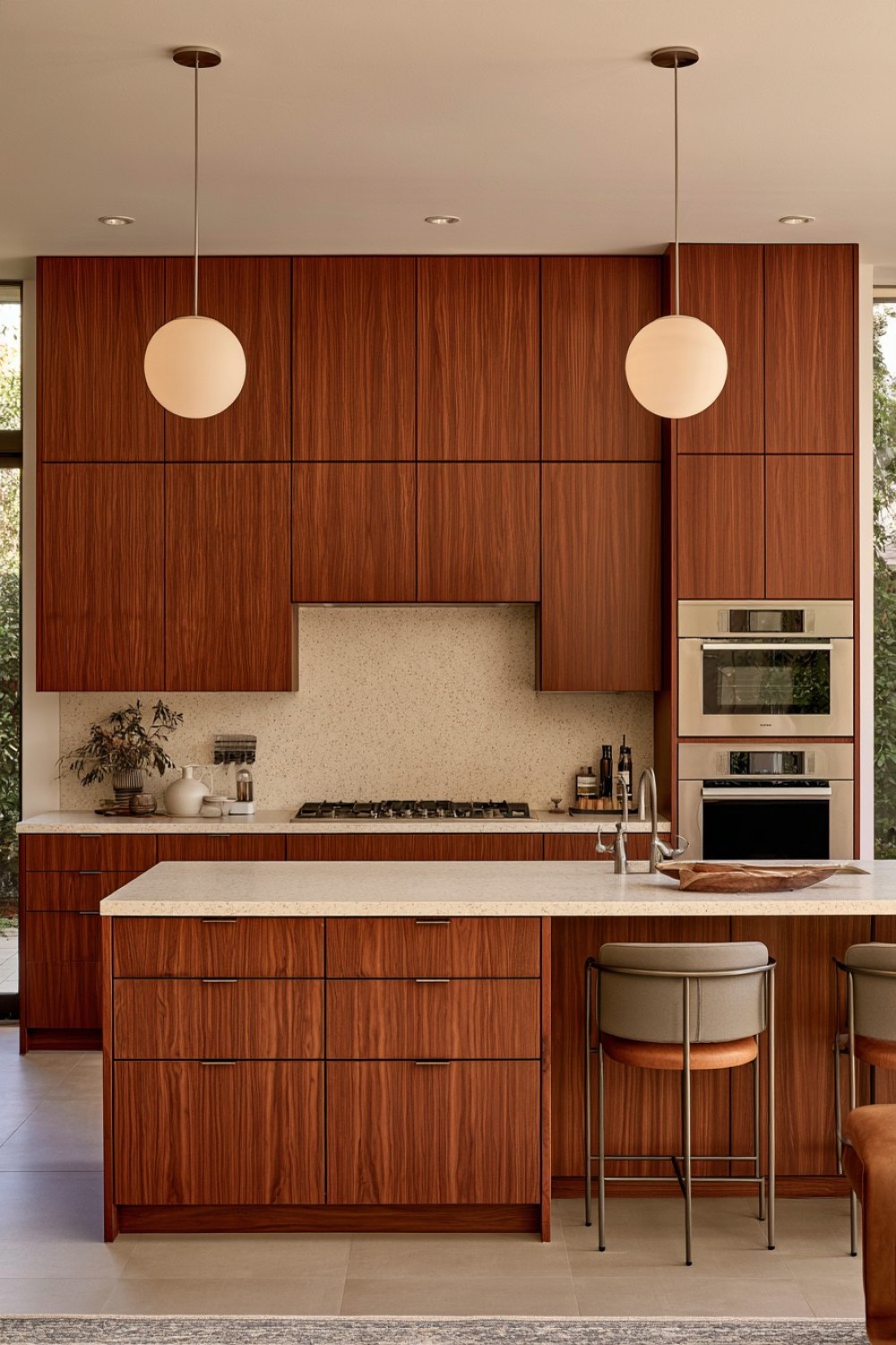
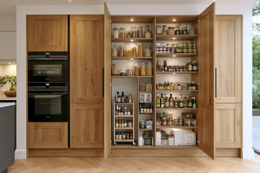
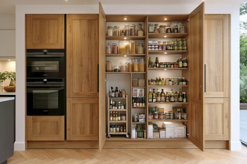
Walnut can carry much of the visual identity of a mid-century modern kitchen without relying on additional ornament. Flat-front cabinetry allows the natural grain to become the decorative surface, especially when veneer panels are arranged so the grain appears to continue across adjacent doors.
A full-height walnut wall can conceal pantry storage, integrated appliances, and utility cupboards while maintaining a calm architectural appearance. In darker kitchens, however, limiting walnut to one major elevation can prevent the room from feeling overly enclosed.
Pair the wood with a pale countertop, softly textured backsplash, or warm neutral flooring to create contrast. Slim pulls, recessed grips, or minimal edge hardware keep attention on the wood rather than the fittings.
This treatment works particularly well because it combines period warmth with contemporary simplicity. Instead of decorating the cabinetry, the material itself provides depth, variation, and character.
2. Reserve Mustard for One Purposeful Cabinet Zone
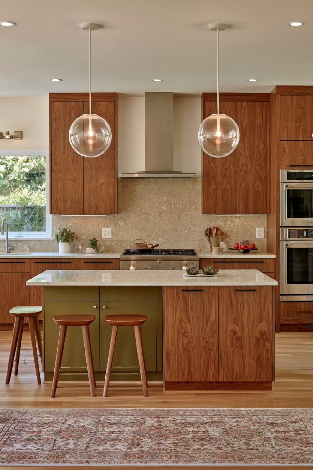
Mustard can reference mid-century color palettes immediately, but it is more convincing when treated as a focused accent rather than a dominant room color. Use it on one architectural zone, such as an island, pantry cabinet, breakfast cupboard, or short run of lower storage.
Surround the color with quieter materials such as walnut, warm white, cream stone, or charcoal. This keeps the mustard from becoming overly nostalgic and allows it to function as a visual marker within the layout.
A matte or satin finish usually feels softer and more architectural than high gloss. Avoid repeating the same mustard tone across stools, accessories, appliances, and wall décor, as this can make the scheme appear overly coordinated.
One well-positioned block of color is often enough to make a neutral kitchen memorable while preserving the clean, controlled character associated with mid-century modern design.
3. Lift One Storage Piece on Tapered Furniture Legs
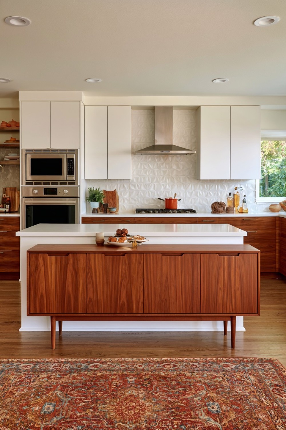
Furniture-inspired cabinetry is one of the most effective ways to move a kitchen away from conventional built-in design. Rather than placing every base cabinet on a continuous plinth, lift one selected storage unit on tapered timber or slim metal legs.
A side cabinet, breakfast station, serving cupboard, or island end section is usually a better candidate than cabinetry directly beneath a sink or heavily used preparation surface. The visible floor underneath creates lightness and makes the piece feel more like a freestanding sideboard.
Keep the cabinet doors flat and the overall proportions relatively horizontal. Matching the legs to surrounding wood creates continuity, while dark metal introduces sharper contrast.
This detail should be used selectively. When every cabinet is raised, practicality can suffer and cleaning becomes more demanding. One furniture-like piece provides enough mid-century character while allowing the main kitchen storage to remain durable and easy to maintain.
4. Give the Backsplash a Quiet Geometric Grid
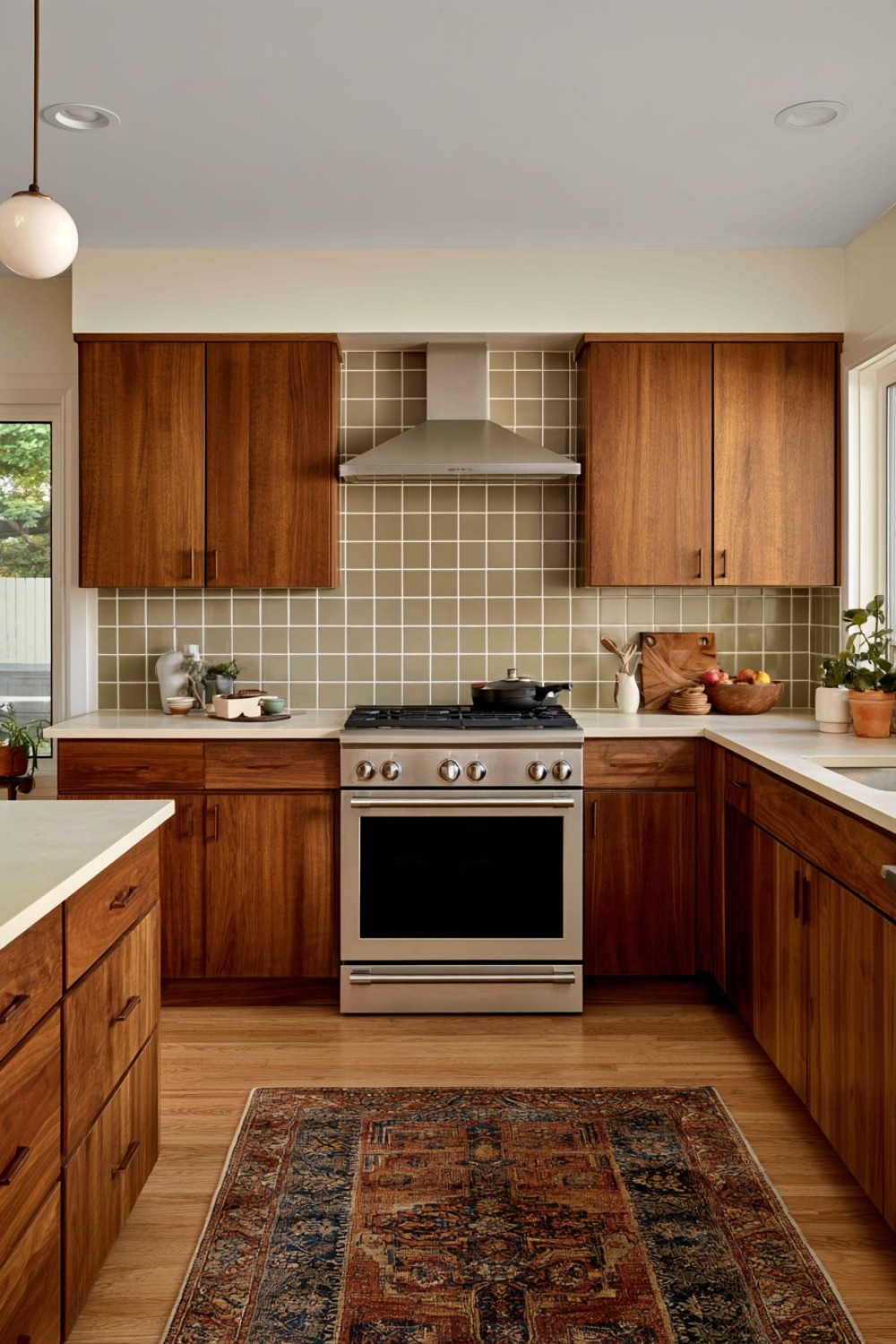
A small square tile backsplash can introduce strong mid-century rhythm without relying on an elaborate pattern. The repeated grid creates visual structure, making color and proportion more important than decorative imagery.
Muted olive, warm white, dusty blue, ochre, soft brown, or two carefully coordinated shades can all work. Grout can blend with the tile for a calmer surface or contrast slightly to make the geometry more visible.
If cabinetry and countertops already have noticeable movement, keep the backsplash relatively restrained. A simple square format often works better than combining several shapes in the same room.
Matte, handmade-look, or subtly irregular ceramic finishes can soften the precision of the grid and add warmth. In a compact kitchen, limiting the stronger tile treatment to one preparation or cooking wall prevents the pattern from overwhelming the space.
The result feels graphic and period-aware without becoming decorative for its own sake.
5. Choose Teak-Inspired Wood When Walnut Feels Too Heavy
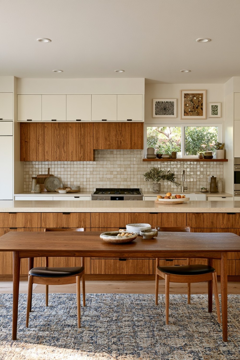
Walnut is not the only wood that can support a mid-century kitchen. Teak-inspired finishes introduce a lighter golden-brown tone that can be particularly effective in spaces with limited daylight or smaller floor plans.
Choose a natural-looking finish with visible grain rather than a strongly orange stain. Pair it with cream, ivory, or softly veined countertops to maintain warmth without allowing the surfaces to blend together.
If the kitchen also has timber flooring, select a floor tone that differs slightly from the cabinetry. Small shifts in depth or undertone help each material remain readable.
Hardware should stay understated: slim dark pulls, brushed metal edges, or integrated handles all work well.
This palette is especially useful in open-plan homes because the cabinetry can relate naturally to dining tables, shelving, and living-room furniture, helping the kitchen feel like part of a larger interior composition.
6. Break Up a Blank Wall With Asymmetrical Display Storage
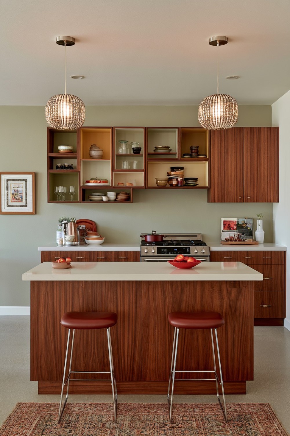
Instead of installing ordinary floating shelves, an asymmetrical wall unit can introduce the playful geometry associated with mid-century furniture design. Divide a shallow built-in into rectangular compartments of different widths and heights while keeping the overall structure visually balanced.
Place it away from heavy cooking activity, perhaps above a serving counter, breakfast area, or secondary storage zone. Use the compartments for ceramics, glassware, bowls, and a limited selection of frequently used objects.
Not every opening needs to be filled. Leaving some compartments intentionally empty gives the structure visual breathing room and prevents the wall from becoming cluttered.
Natural wood can connect the unit to surrounding cabinetry, while a painted backing can introduce a controlled accent color.
Because the shelf itself becomes part of the room’s architecture, it adds character even when very little is displayed, making it more distinctive than conventional open shelving.
7. Pair Walnut With Matte Olive in Separate Architectural Zones
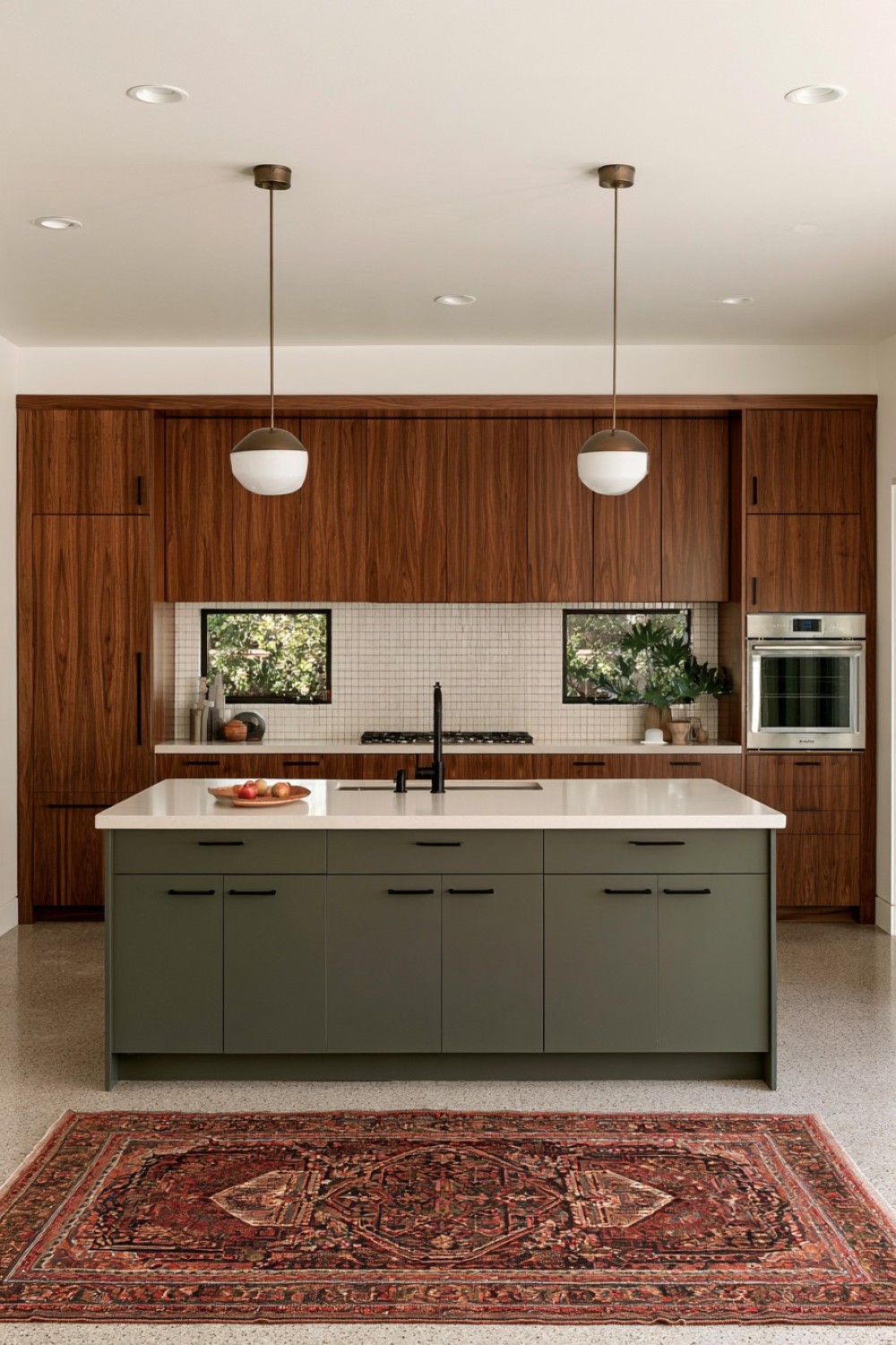
Walnut and muted olive create one of the most natural mid-century combinations because both colors feel warm without becoming excessively bright. The most effective approach is to separate them by function rather than alternating individual cabinet doors.
For example, walnut can define tall storage and appliance cabinetry while olive appears on the island or lower preparation cabinets. This allows each material to read as a clear architectural block.
Warm white or cream countertops can visually connect the two finishes, while pale stone or subtle terrazzo flooring prevents the room from becoming too dark.
Keep additional accent colors limited. Once walnut and olive are established, several extra retro shades can quickly weaken the composition.
Brushed metal, muted bronze, or restrained black hardware can complete the palette. This scheme feels distinctly mid-century while remaining sophisticated enough for contemporary interiors, especially when the cabinet lines stay simple.
8. Treat Terrazzo as a Statement Material, Not a Background
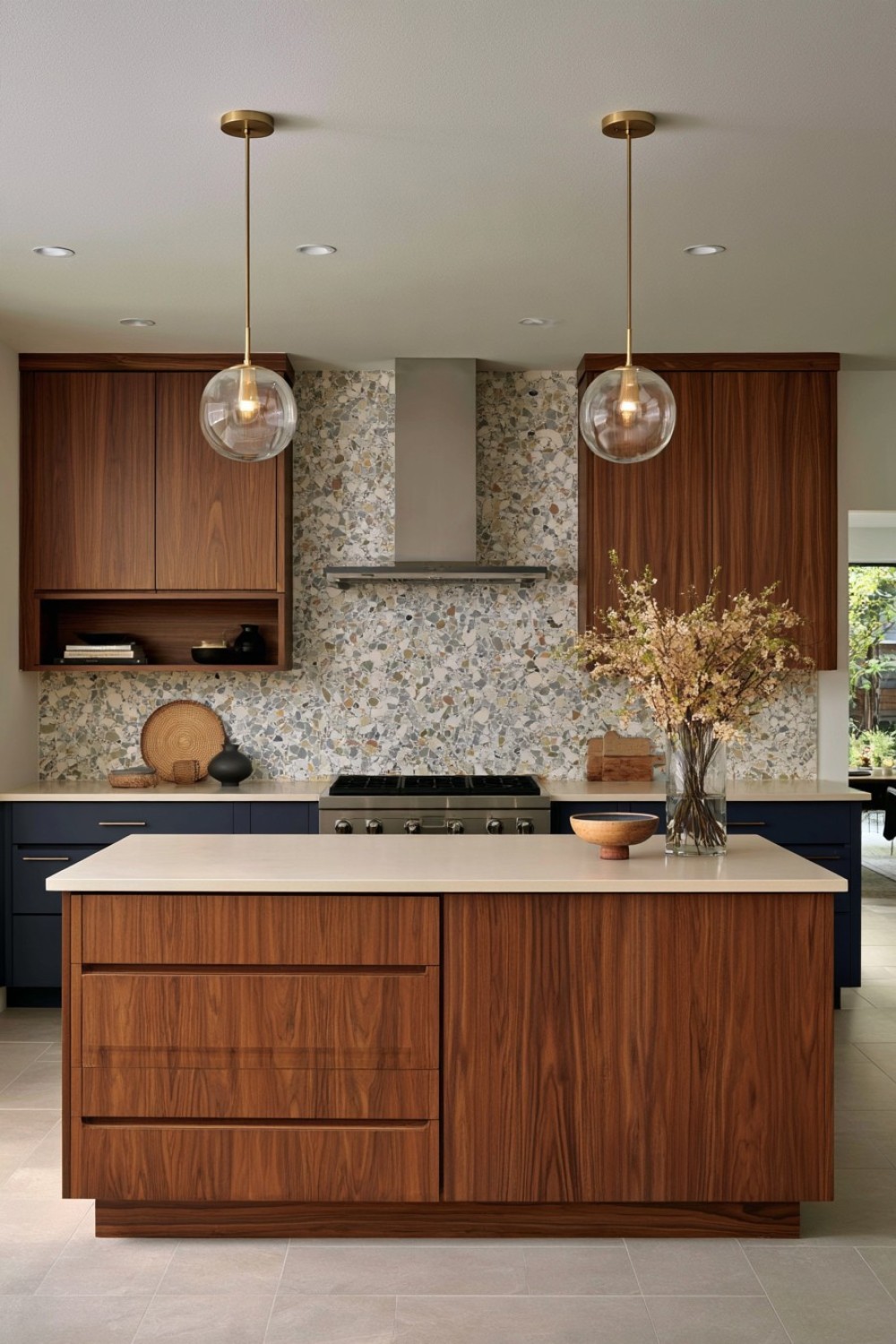
Terrazzo can introduce color, movement, and a subtle retro reference, but its impact is usually stronger when confined to one important surface. An island countertop, breakfast ledge, or carefully sized backsplash can provide enough pattern without overwhelming the rest of the kitchen.
Look for a terrazzo mix containing colors already present elsewhere in the room, such as cream, muted green, rust, brown, or soft gray. Repeating one or two of those tones in the cabinetry creates a more connected palette.
Simple flat-front wood cabinets provide a useful visual counterpoint because they allow the terrazzo to remain expressive without competing with additional surface pattern.
Practicality matters as well. Choose a surface appropriate for kitchen use and understand its sealing, staining, and maintenance requirements.
Used selectively, terrazzo becomes a strong design feature rather than visual noise, giving the kitchen energy while preserving overall balance.
9. Stretch the Room Visually With Long Horizontal Cabinet Lines
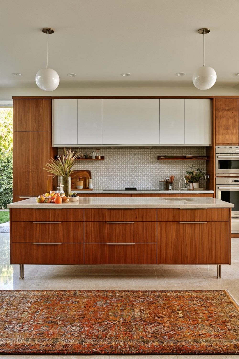
Mid-century interiors often emphasize horizontal proportions, and kitchen cabinetry can use the same principle. Wide drawers, extended cabinet runs, uninterrupted counters, and long handle lines encourage the eye to move across the room rather than up and down.
This approach can be particularly useful in a narrow kitchen because fewer vertical divisions make the cabinetry appear calmer and broader. Where storage requirements allow, combine several small drawer fronts into larger visual planes while maintaining organization internally with dividers.
A thin-profile countertop can reinforce the horizontal effect. Flat cabinet doors and discreet hardware help keep the geometry clear.
Avoid introducing too many narrow cabinet modules purely for symmetry, especially when they fragment an otherwise strong run.
This technique is subtle because it does not depend on a particular color or material. The proportions themselves communicate mid-century design principles while also making the kitchen feel more composed.
10. Soften Rectangular Cabinetry With a Curved Breakfast Bench
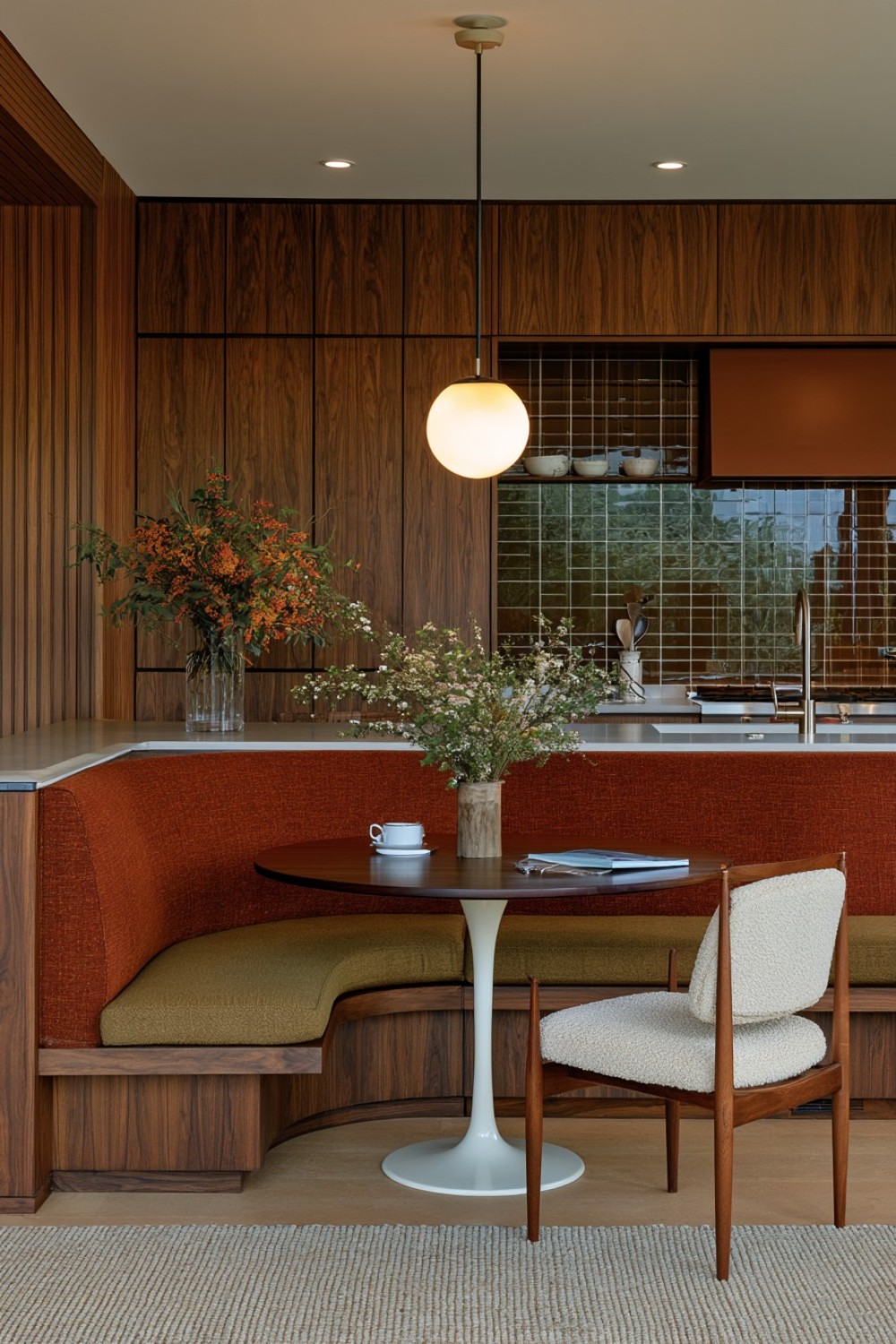
Mid-century modern design is often associated with clean straight lines, but curved furniture can provide an important counterbalance. A rounded breakfast bench introduces a softer sculptural shape beside flat-front cabinetry and linear countertops.
Place it in a corner, along a curved wall, or beside a pedestal dining table where the form can remain visually clear. Hidden storage under the seat can increase functionality without changing the furniture-like appearance.
Upholstery in olive, rust, muted mustard, cream, or a textured neutral fabric can introduce color while remaining connected to the broader palette. Choose durable materials that are appropriate for frequent kitchen use.
A pedestal table is particularly useful because it preserves legroom and avoids adding several more visual lines beneath the seating area.
This element helps the kitchen feel connected to the dining and living spaces rather than functioning only as a workspace.
11. Use Ribbed Glass Where Full Display Cabinets Feel Too Busy
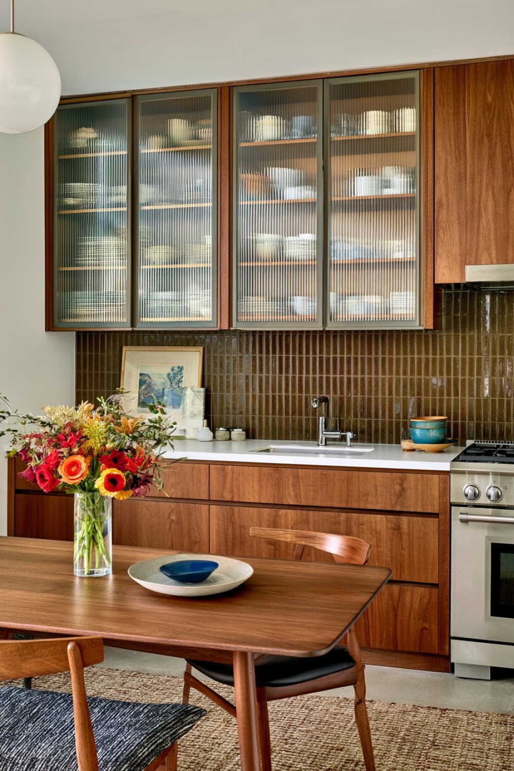
Ribbed or fluted glass offers a middle ground between solid cabinet doors and completely transparent display storage. It allows color and shape to remain faintly visible while softening the appearance of everyday dishes.
Use the material on a limited number of upper cabinets, perhaps near a dining area or serving zone. Slim timber or metal frames can outline the panels without making them feel heavy.
The cabinet interiors should still remain reasonably organized because objects are partially visible through the textured surface. Warm timber shelves can add another layer of depth when seen behind the glass.
Avoid using ribbed glass on every cabinet door. Its value comes from contrast with surrounding flat-front cabinetry.
This detail introduces texture and a subtle vintage reference without adding pattern to countertops or walls, making it particularly useful in kitchens where the material palette is already carefully controlled.
12. Anchor the Room With a Deep Muted Blue Island
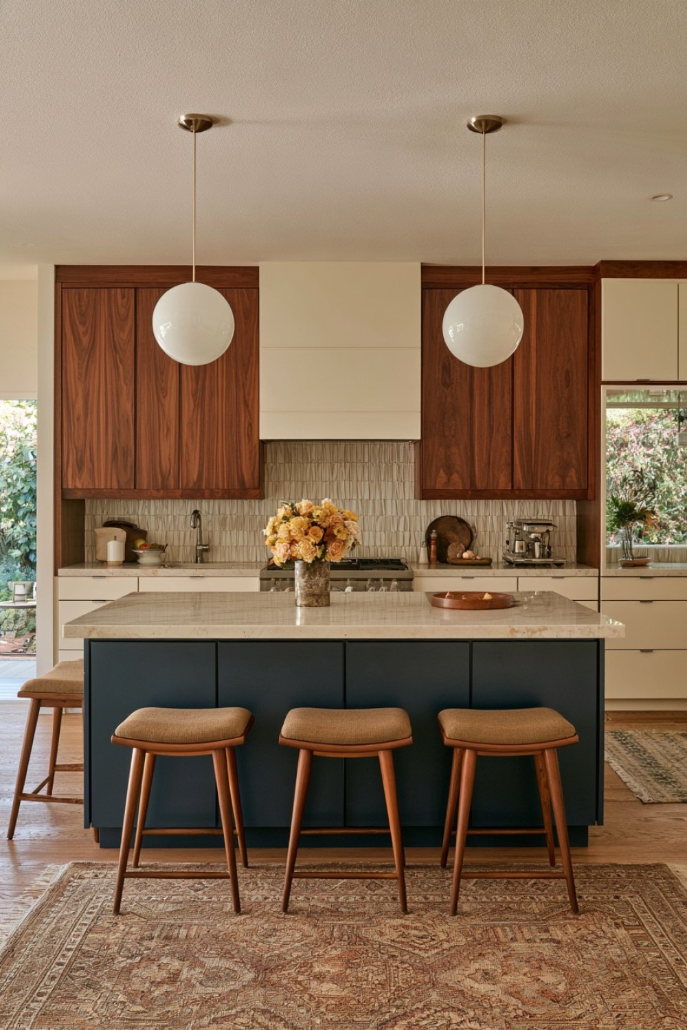
Deep blue can provide a sophisticated alternative to the olive, mustard, and orange tones more commonly associated with mid-century interiors. Applied to a central island, it creates depth without requiring the entire kitchen to become colorful.
Choose a muted blue with gray or green undertones rather than a bright primary shade. Surround it with walnut, teak-inspired wood, cream cabinetry, or warm neutral walls.
A pale countertop can keep the island visually balanced, especially if the base is substantial. Simple slab fronts and slim hardware preserve the clean geometry.
If seating is included, stools with tapered timber legs or restrained upholstery can reinforce the furniture influence without adding another strong color.
Avoid repeating the blue across numerous accessories. Allow the island to remain the primary accent.
This approach gives the room a clear focal point while maintaining the controlled material relationships that make mid-century-inspired interiors feel intentional.
13. Add a Sideboard-Style Cabinet Between Kitchen and Dining Space
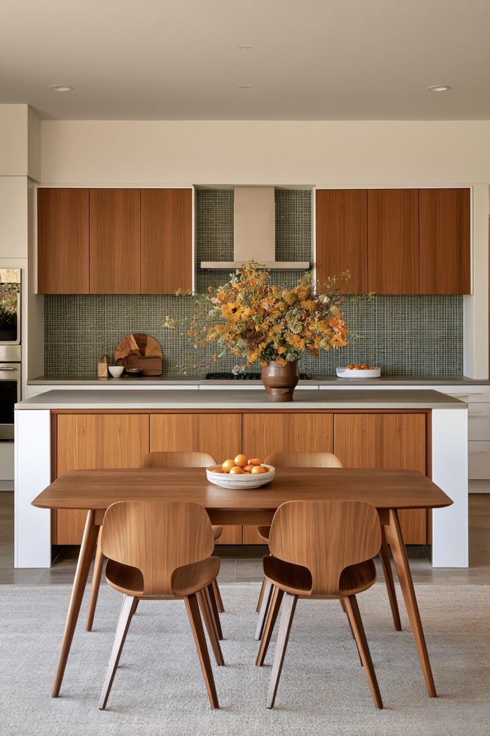
A low sideboard-style cabinet can create a useful transition between kitchen storage and dining furniture. Unlike tall built-in cabinetry, its lower profile preserves open wall area and gives the room a more residential feeling.
Design the piece with flat doors, a long horizontal shape, and tapered legs or a recessed base. Walnut, teak-inspired wood, or muted olive can connect it to the main kitchen palette.
Use it for serving dishes, glassware, table linens, and dining accessories rather than general overflow storage. Giving the cabinet one clear function helps it remain organized and supports its furniture-like character.
The top can act as a buffet surface during meals or gatherings.
This type of cabinet is particularly effective in open-plan layouts because it visually softens the boundary between the kitchen and adjoining living areas. It brings mid-century furniture proportions into the room without compromising primary kitchen storage.
14. Give the Island a Geometric Wood Face
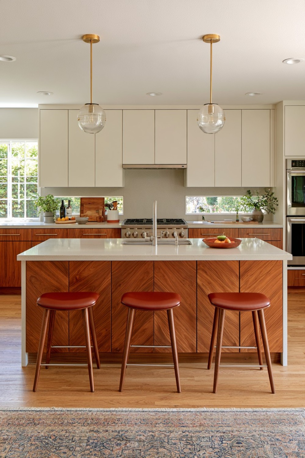
An island can become a focal point through material craftsmanship rather than through a strong paint color. Apply angled veneer, broad timber strips, or repeated geometric panels to the side facing the dining or living area.
Keep the working side of the island comparatively simple so the decorative treatment does not interfere with drawers, appliances, or storage.
Large-scale geometry generally feels more refined than numerous small pieces. Use one timber species or closely related shades to prevent the surface from becoming overly busy.
A plain stone countertop provides a clean visual boundary above the patterned wood.
This treatment works especially well in open-plan homes where the island is viewed from several directions. From the kitchen side it remains functional cabinetry, while from the living area it reads more like a substantial piece of furniture.
The result references mid-century craftsmanship without relying on obvious retro decoration.
15. Balance the Entire Scheme With a Controlled Material Mix
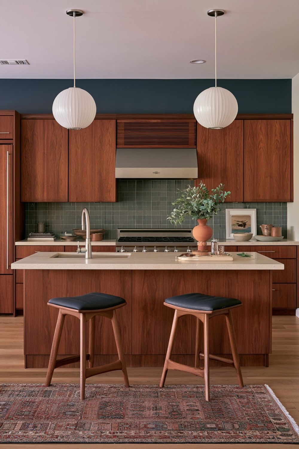
The strongest mid-century modern kitchens rarely depend on one dramatic feature. Their character comes from the relationship between materials, proportions, and color.
Begin with a warm timber such as walnut or teak-inspired wood, then add one graphic element such as square tile or terrazzo. Introduce a single muted accent color and keep metal finishes consistent enough to create visual continuity.
Flooring should support rather than compete with the cabinetry. Pale stone, restrained terrazzo, or timber in a distinguishable tone can all work depending on the rest of the room.
Avoid filling countertops with vintage objects simply to reinforce the theme. Cabinet lines, furniture-style details, ribbed glass, tapered legs, and carefully chosen surfaces already communicate the aesthetic.
By limiting the number of retro references, the kitchen feels more authentic and usable. The style becomes part of the architecture rather than a decorative layer placed on top.
Keep Mid-Century Character Grounded in Function
A successful mid-century modern kitchen should remain practical before it becomes nostalgic. Storage capacity, worktop durability, appliance placement, lighting, cleaning, and circulation all need to work for daily routines.
Once those fundamentals are resolved, period character can come from a few deliberate decisions: expressive walnut grain, a terrazzo accent, olive cabinetry, ribbed glass, a sideboard-style unit, or a curved breakfast nook. Not every feature needs to appear in the same kitchen.
The most convincing spaces use restraint. When each material has a clear role and the palette remains controlled, natural wood and retro-inspired colors feel warm rather than dated.
Instead of recreating a 1950s or 1960s kitchen literally, use the era’s strongest principles—simple geometry, furniture-like proportions, tactile materials, and confident but limited color—to create a kitchen that still feels relevant today.
MORE IDEAS


Share
What's Your Reaction?
 Like
0
Like
0
 Dislike
0
Dislike
0
 Love
0
Love
0
 Funny
0
Funny
0
 Angry
0
Angry
0
 Sad
0
Sad
0
 Wow
0
Wow
0