17 Moody Living Room Styles for Deep Color and Character

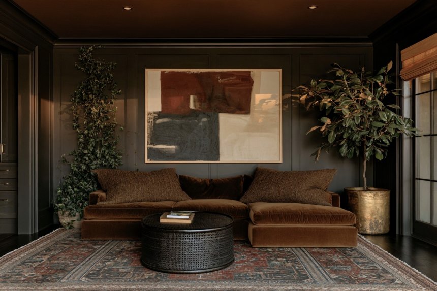
A moody living room is not created simply by painting every surface dark. The most successful spaces combine deep color with contrast, texture, natural materials, and enough visual breathing room to keep the interior comfortable. Charcoal, olive, burgundy, navy, chocolate brown, plum, and earthy red can all establish atmosphere, but the surrounding furniture and finishes determine whether those colors feel sophisticated or heavy.
Before committing to a dark palette, consider natural light, ceiling height, room proportions, existing flooring, and the amount of visual contrast already present. Warm wood, pale stone, linen, leather, velvet, smoked glass, and restrained artwork can help darker colors feel layered rather than flat. These approaches explore different ways to create depth without relying on the same decorating formula in every room.
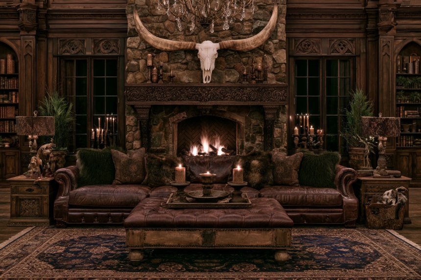
1. Surround the Room With Deep Olive and Warm Walnut
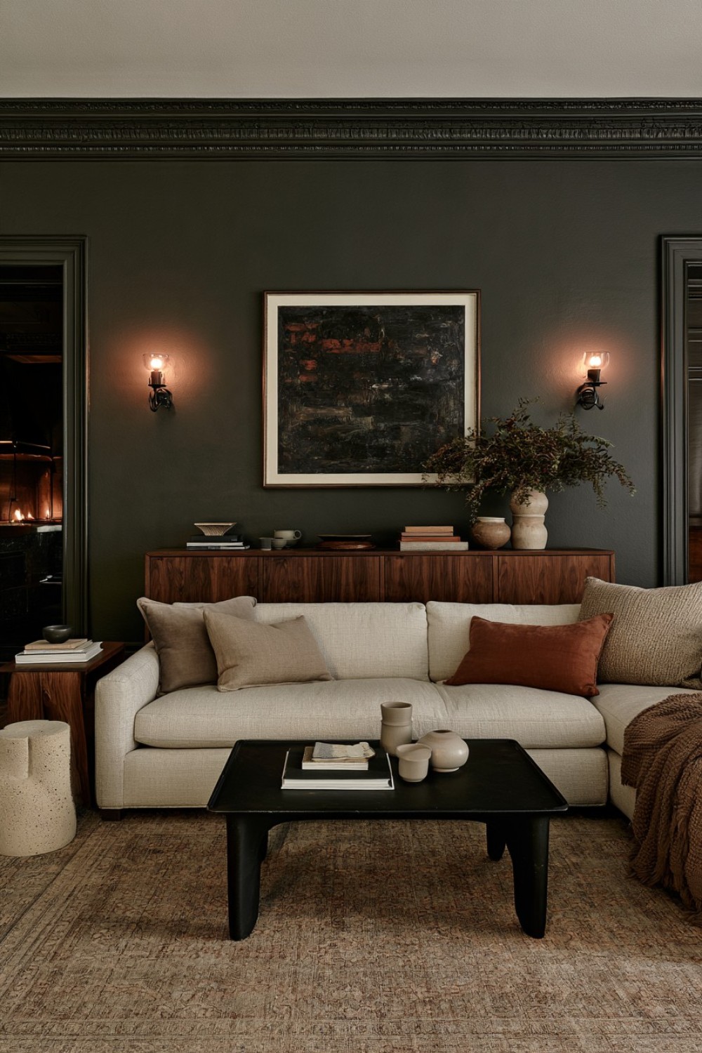
Deep olive can create an enveloping atmosphere while remaining softer than black or charcoal. Use it across the primary walls and allow walnut, smoked oak, or another medium-brown timber to provide warmth against the darker background.
Instead of repeating green across every piece of furniture, introduce a sofa in cream, tobacco, mushroom, or muted beige. The difference in value allows the seating to remain visible rather than blending into the walls.
Natural stone, woven textiles, matte ceramics, and a rug containing warm brown or beige can add further separation without introducing several unrelated colors.
Keep decorative accents restrained. Olive already has substantial visual character, so the room does not need numerous green cushions, accessories, or botanical motifs.
The strongest version of this scheme feels grounded and architectural, using wood grain and material contrast to keep the darker wall color rich rather than visually dense.
2. Balance Burgundy Walls With Quiet Mushroom Upholstery
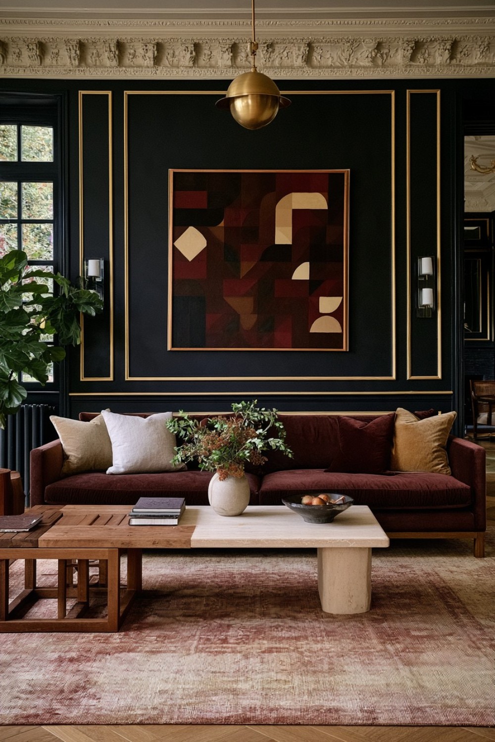
Burgundy can provide unusual depth when it is treated as an architectural color instead of a decorative accent. A muted wine, oxblood, or brown-based burgundy across the walls creates a warmer atmosphere than navy or charcoal.
Pair the deeper backdrop with mushroom, taupe, or warm beige upholstery so the main seating remains visually distinct. Natural timber furniture can bridge the dark wall color and lighter fabric, while stone or ceramic surfaces introduce another material layer.
Avoid introducing several saturated jewel tones into the same room. Burgundy already carries considerable visual weight, so brown, cream, dusty rose, and muted gray usually provide enough variation.
Artwork can include earthy reds without matching the walls exactly. Slight differences in tone create more depth than perfect coordination.
This palette works especially well when the goal is intimacy and warmth rather than the sharper drama associated with black or very dark gray interiors.
3. Warm Up Charcoal With Cognac Leather
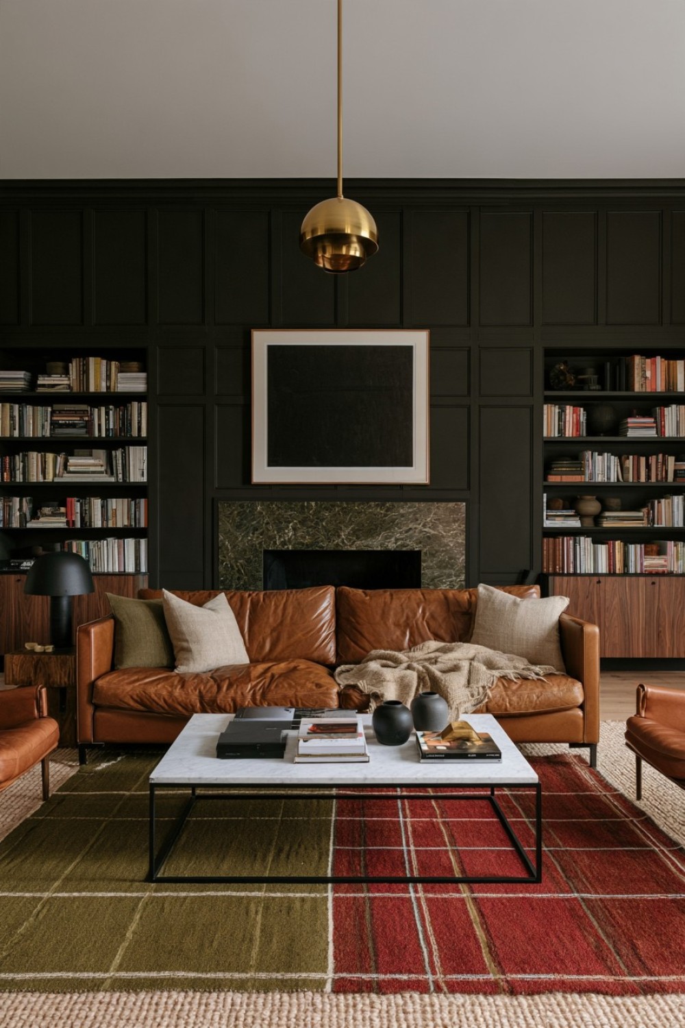
Charcoal creates a strong architectural foundation, but its success depends on introducing warmth elsewhere. Cognac or caramel leather provides that contrast immediately through both color and texture.
Choose one substantial leather sofa or a pair of lounge chairs rather than filling the room with several matching leather pieces. Against charcoal walls, the warm upholstery becomes a clear focal point without requiring a bright accent color.
Walnut, oak, and textured brown surfaces can reinforce the warmer side of the palette. A lighter wool rug helps prevent the floor plane from becoming visually heavy, particularly when the flooring itself is dark.
Use black selectively on frames, table bases, or small structural details instead of repeating it across every piece of furniture.
Linen, wool, and matte ceramics can soften the smoother leather surface. The resulting interior feels refined and grounded, with material contrast doing more work than decorative accessories.
4. Darken the Ceiling Instead of Every Wall
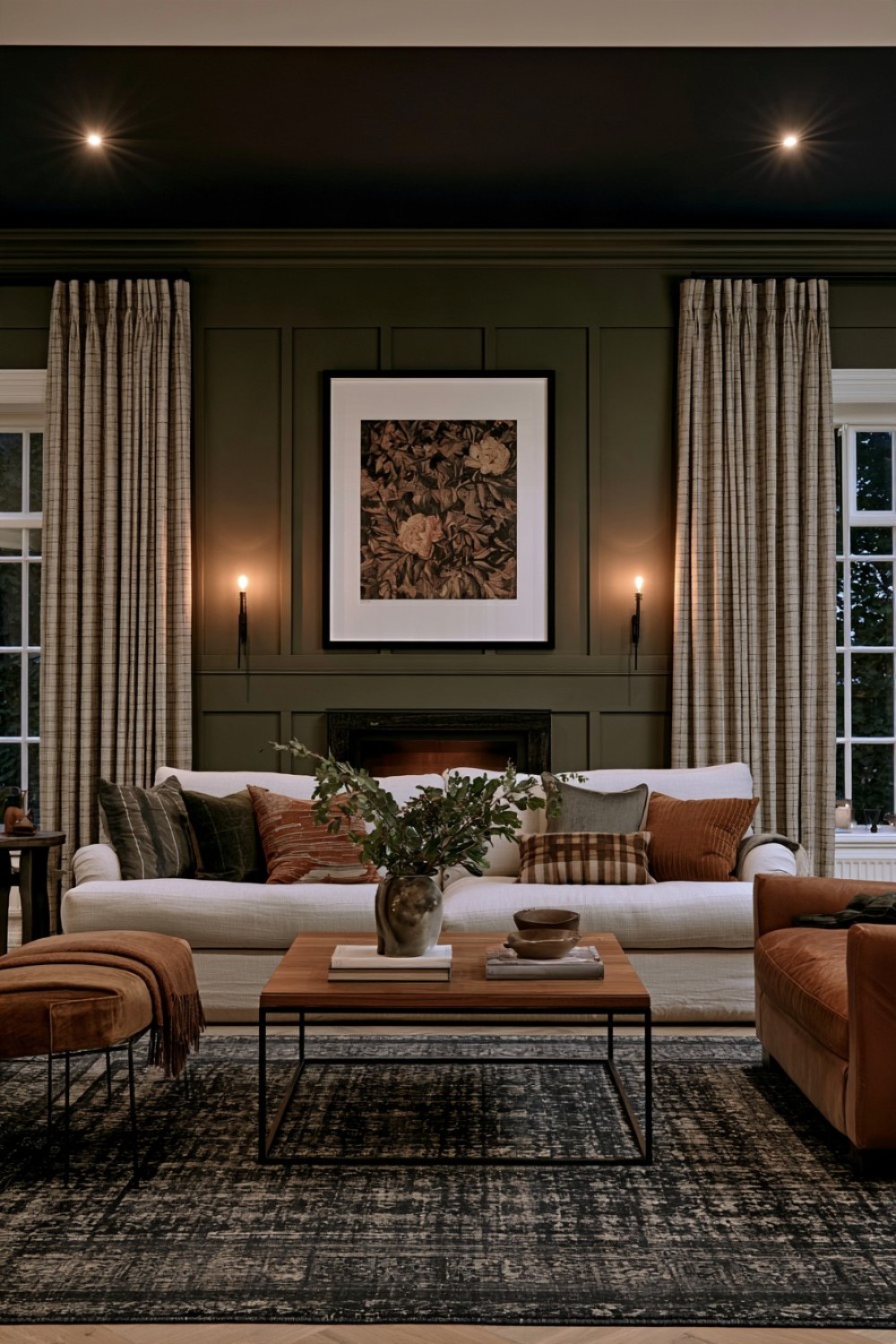
A moody living room does not require a fully dark envelope. Painting the ceiling in deep navy, ink blue, or blue-black can change the room’s proportions while allowing the walls to remain noticeably lighter.
This treatment is particularly effective in rooms with high ceilings, where a darker overhead plane can make the seating area feel more intimate and visually connected.
Repeat the ceiling color only once or twice elsewhere, perhaps through a rug, upholstered chair, or artwork. Avoid matching every dark blue element precisely because the room can begin to feel overly coordinated.
Warm timber and cream textiles prevent the blue from feeling too cool. Keep upper-wall decoration relatively restrained so the eye can register the ceiling as a deliberate architectural feature.
For smaller rooms, a softened navy may be easier to live with than near-black. The effect should create intimacy rather than making the ceiling feel unnecessarily heavy.
5. Build Depth Through Several Chocolate-Brown Textures
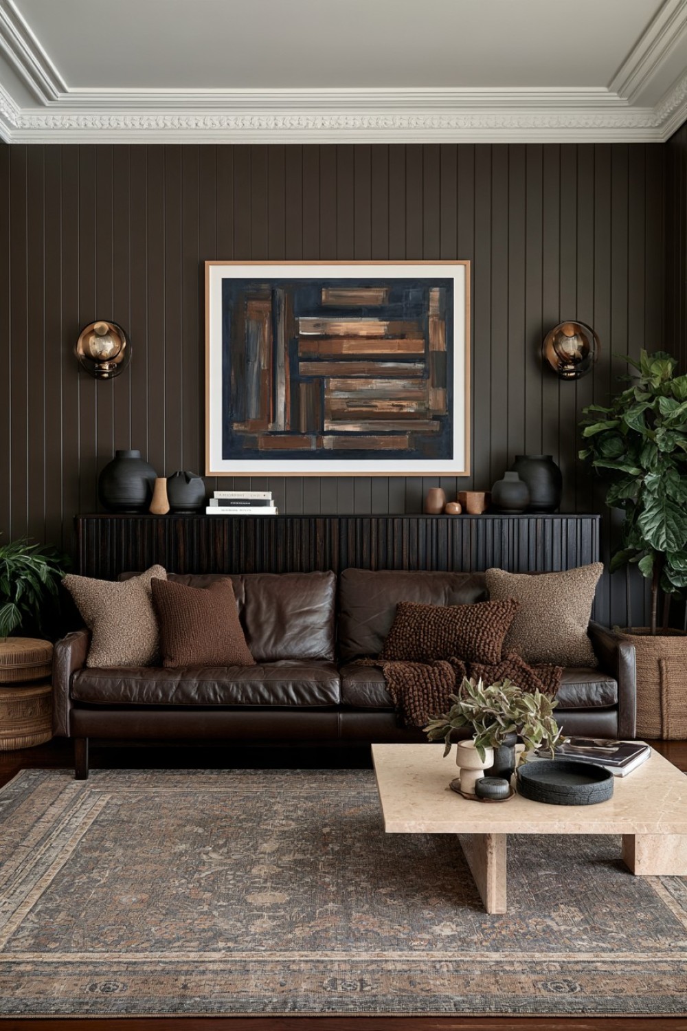
Chocolate brown offers a warmer route to a moody interior and works especially well when the room relies on texture rather than strong color contrast.
Instead of choosing one identical brown finish throughout, combine cocoa-painted walls, dark timber, woven upholstery, leather, matte ceramics, and soft wool. These differences allow similar colors to remain visually distinct.
If the sofa is also dark brown, use a lighter rug, curtains, or occasional chair in sand, camel, cream, or muted taupe to prevent the furniture from disappearing into the background.
Natural stone can provide another useful interruption in the palette without introducing an unrelated hue.
Avoid glossy brown surfaces across large areas, as they may make the room feel heavier and less relaxed. A mixture of matte, woven, grained, and softly polished materials generally produces a richer effect.
The room remains dark, but its interest comes from surface variation rather than obvious decorative contrast.
6. Let a Plum Sofa Carry the Strongest Color
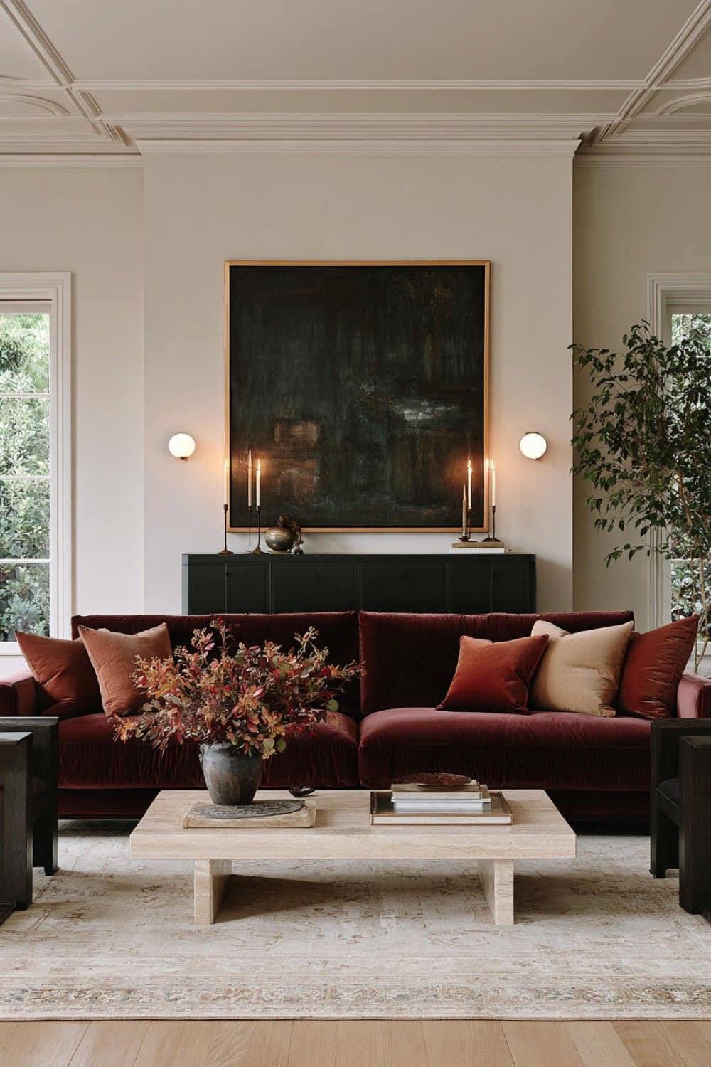
A deep plum or aubergine sofa can establish a moody palette without requiring dark walls. This makes it particularly useful when you want atmosphere but prefer to keep the architectural envelope relatively neutral.
Place the sofa against warm taupe, muted beige, soft charcoal, or another understated background. Dark timber furniture can deepen the scheme while pale stone or a neutral rug prevents the composition from becoming overly saturated.
Velvet will make plum feel more dramatic, while woven upholstery produces a quieter contemporary interpretation.
Avoid surrounding the sofa with several other jewel tones. Emerald, sapphire, and strong burgundy used together can make the room feel themed rather than layered.
Instead, support plum with brown, muted rose, charcoal, cream, and natural wood.
Keeping one dominant colored piece gives the room a clear hierarchy. The sofa provides personality, while the remaining materials create the calm framework needed for that color to feel sophisticated.
7. Contrast Blackened Wood With Soft Linen Seating
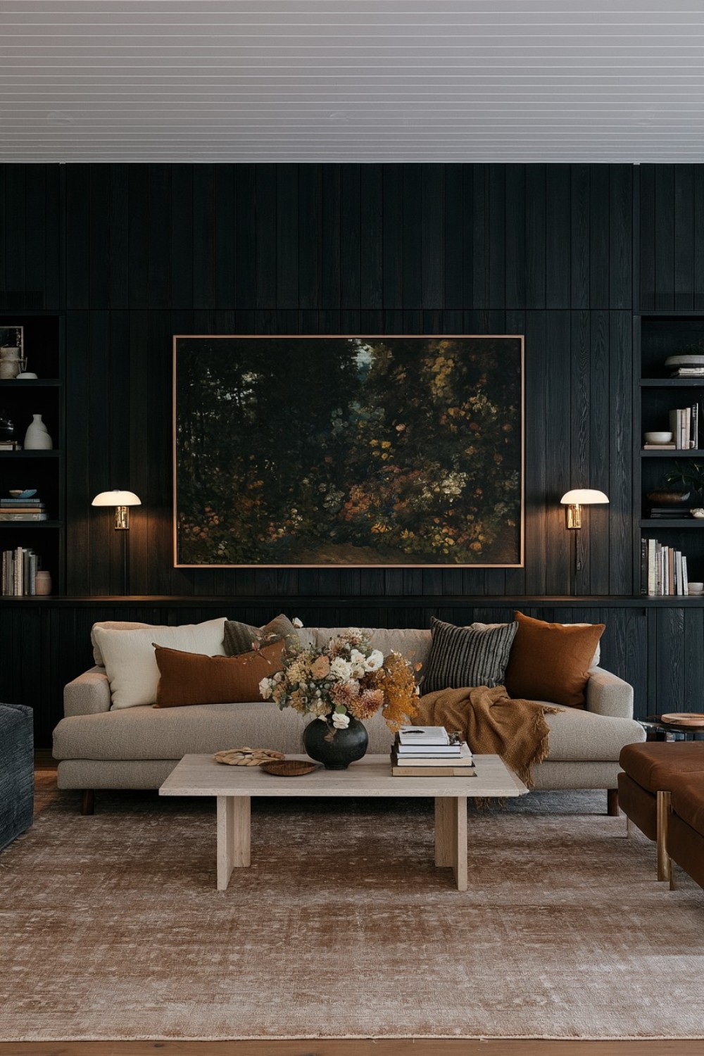
Blackened timber can create substantial architectural depth without covering the entire room in dark paint. Use it on shelving, wall cabinetry, paneling, or a long media unit where its grain remains visible.
Pair the darker wood with oatmeal, ivory, or warm taupe linen upholstery. The difference in both texture and color prevents the room from becoming too severe.
Matte or softly grained finishes generally work better than glossy black surfaces because the wood still reads as a natural material rather than a flat dark plane.
Introduce stone, wool, and subdued brown tones elsewhere to bridge the contrast between the cabinetry and seating.
Decorative objects should remain limited, particularly on dark shelving where numerous small pieces can quickly disappear into visual clutter.
This approach is effective in contemporary rooms with simple architecture because one dark timber element can provide enough structure to make the entire space feel more atmospheric.
8. Make Oversized Artwork the Primary Source of Drama
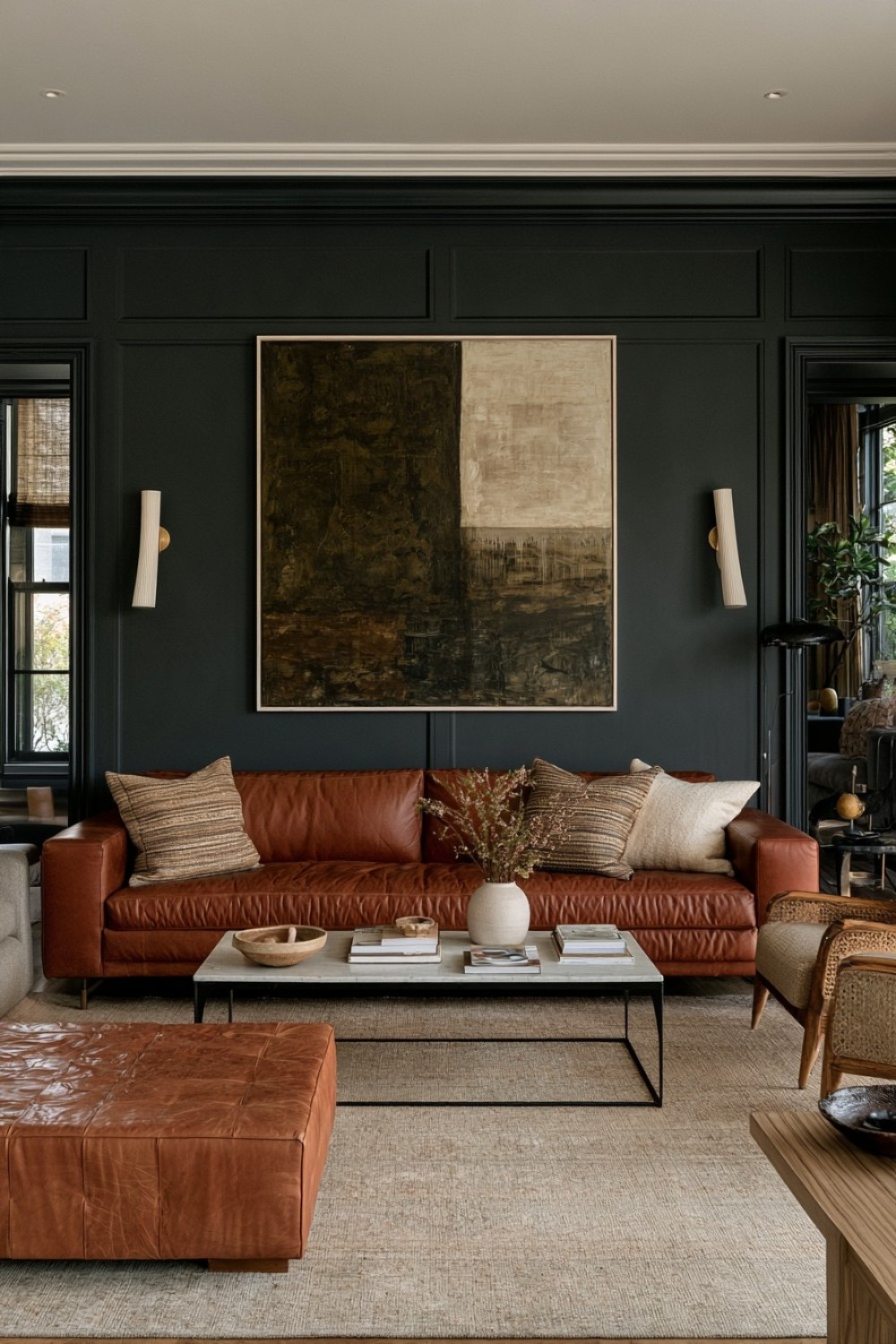
A moody living room can gain much of its character from artwork rather than wall color. One oversized piece with charcoal, earthy red, muted blue, olive, or deep brown can create a strong visual anchor against a dark neutral wall.
The surrounding furniture should remain relatively restrained. A simple sofa, low coffee table, and a limited number of accessories allow the artwork to maintain its scale and importance.
Pull only one or two subtle colors from the artwork into the room. Repeating every shade through cushions, rugs, and decorative objects can make the composition feel overly calculated.
Leave enough open wall around the piece for its proportions to register clearly. A large artwork squeezed between several smaller objects loses much of its impact.
This strategy suits rooms where the homeowner wants a curated atmosphere without relying heavily on decorative furniture. The artwork supplies expression while the rest of the room provides a calmer structural background.
9. Layer Navy, Walnut, and Rust in Unequal Proportions
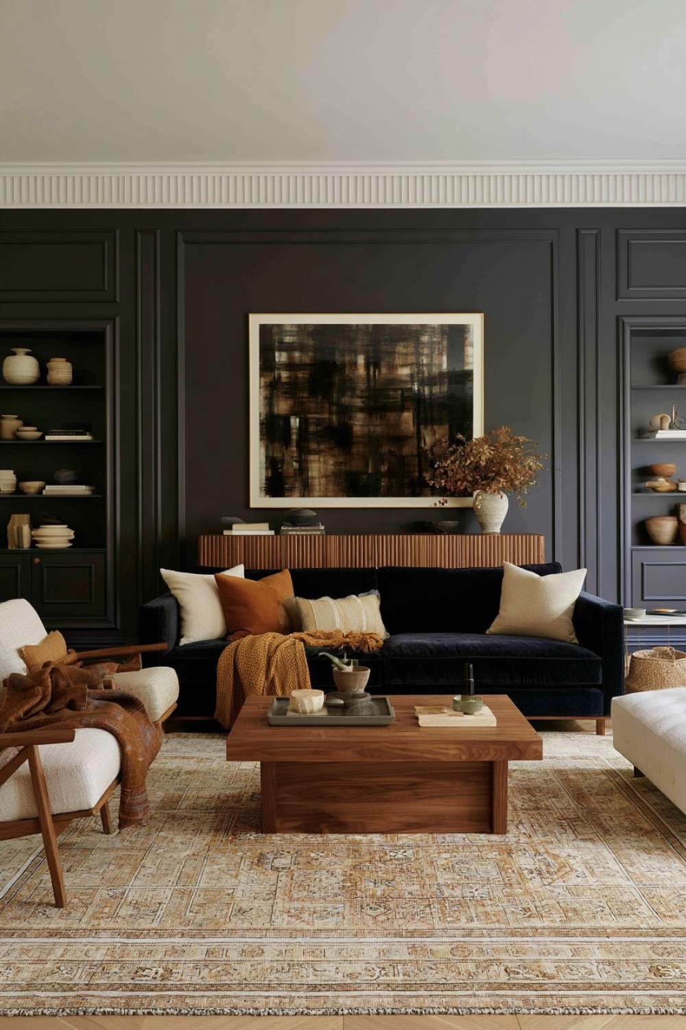
Navy, walnut, and rust work particularly well together because each contributes a different type of warmth or depth. The key is not to use all three in equal amounts.
Allow navy to become the primary background through walls or a large sofa. Introduce walnut through a sideboard, shelving unit, or coffee table, then use rust more sparingly on an accent chair, textile, or artwork.
Warm beige or cream should appear somewhere in the room to provide visual relief. Bright white can feel abrupt against this palette, while softer neutrals create a smoother transition.
Woven textiles and understated ceramics complement the earthy quality of the scheme without introducing another strong surface.
Keep furniture silhouettes relatively simple so the interaction between the colors remains clear.
This composition creates a more varied moody interior than a monochromatic room while still maintaining a controlled, cohesive character.
10. Turn One Wall Into a Dark Reading Library
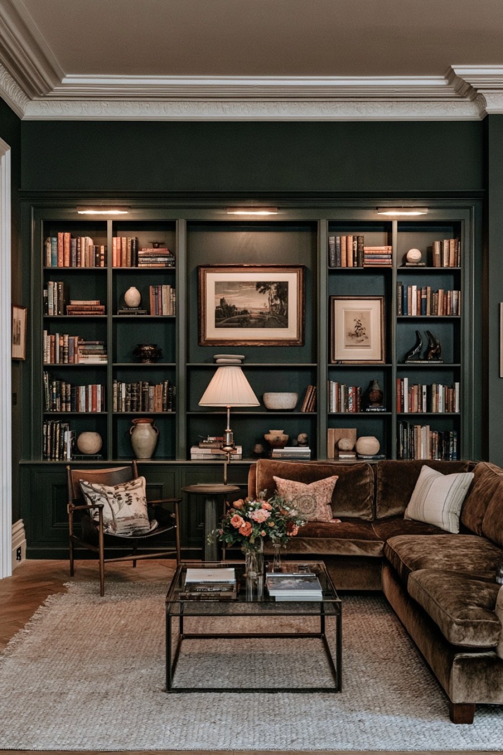
Built-in shelving painted in the same deep color as the surrounding wall can transform a blank elevation into a functional architectural feature.
Charcoal, bottle green, dark brown, or navy all work well when carried across the shelves, backing, and adjacent trim. The continuous treatment makes the library feel integrated rather than like freestanding storage placed against the wall.
Books should not fill every available shelf. Mix them with a restrained number of ceramics, framed pieces, and sculptural objects while leaving selected sections open.
Position a reading chair, compact sofa, or small table nearby so the wall serves a genuine purpose rather than functioning purely as display.
A lighter rug or upholstery can create useful contrast at floor level.
This solution is especially effective in living rooms that need storage and atmosphere simultaneously, because a single architectural intervention can provide both without adding several unrelated furniture pieces.
11. Pair Forest-Green Velvet With Pale Natural Stone
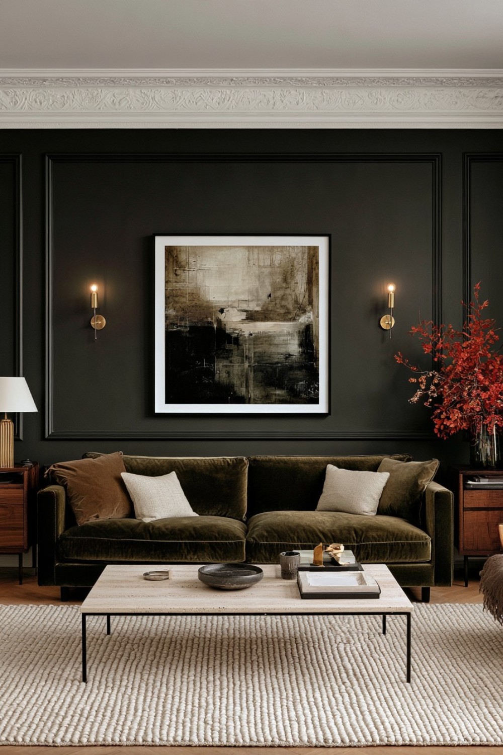
Forest-green velvet creates softness and visual depth, while pale stone provides a cooler, more structured counterpoint. Together they create a balanced moody scheme without requiring heavily decorated walls.
A bottle-green or forest-green sofa can sit beside a travertine, limestone, or light marble coffee table. The stone visually lifts the center of the room while the upholstery provides richness.
Walls can remain warm gray, muted beige, or charcoal depending on how dark you want the overall room to feel.
Walnut or dark oak side furniture helps connect the green textile to the deeper background. A cream or mushroom wool rug can provide additional softness.
Avoid adding numerous metallic finishes because the contrast between velvet, stone, wood, and wool already creates sufficient material interest.
This approach works especially well when furniture and surfaces, rather than decorative wall treatments, are intended to establish the room’s character.
12. Color-Drench Walls, Doors, and Trim for a Unified Envelope
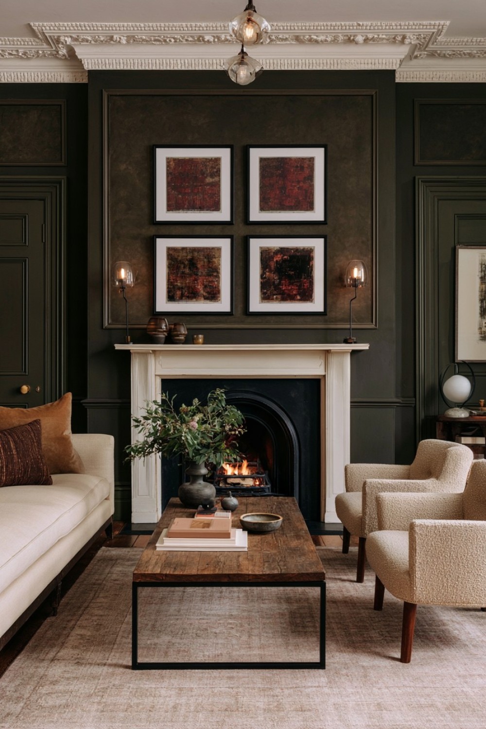
Painting walls, skirting, doors, and architectural trim in one deep shade can make a living room feel more cohesive by reducing visual interruptions.
Instead of outlining every feature with contrasting white paint, allow the architecture to merge into a continuous background. Deep blue-gray, chocolate, muted green, or plum can all work depending on the furniture palette.
This technique is particularly effective in rooms with molding or paneled doors because the relief remains visible through shadow even when the color stays consistent.
Furniture needs enough contrast to remain distinct. Cream upholstery, tan leather, lighter timber, or textured beige chairs can prevent the interior from becoming visually flat.
Avoid introducing several unrelated accent colors afterward. The color-drenched architecture already creates a strong statement.
The result feels immersive but controlled, allowing artwork and furniture to stand out against a quieter architectural envelope.
13. Create Atmosphere From the Floor With a Dark Rug
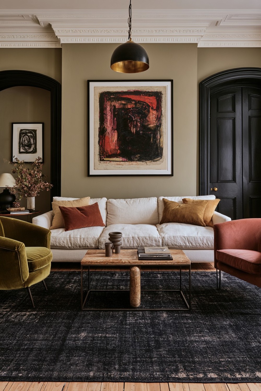
Dark walls are not essential for a moody living room. A large charcoal, faded navy, chocolate, or muted burgundy rug can establish much of the depth while keeping the walls relatively neutral.
This approach is useful in rental homes or for anyone who does not want to commit to repainting.
Choose a rug large enough to connect the major furniture pieces. Ideally, the front legs of the sofa and primary chairs should sit comfortably on the rug so the seating arrangement feels unified.
Subtle pattern or visible texture can make a dark rug more forgiving than a completely solid surface and may also disguise everyday wear.
Use lighter upholstery above it to maintain separation between the seating and floor plane. One or two colors from the rug can appear again in artwork or smaller furniture.
The result creates atmosphere through layering rather than permanent architectural changes.
14. Keep Dark Furniture Visually Light With Smoked Glass
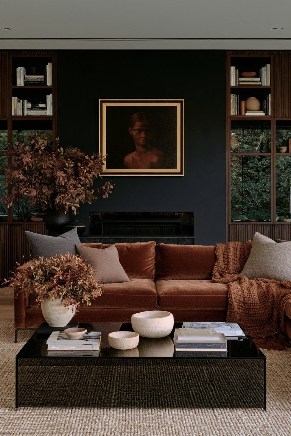
Smoked glass introduces depth without the visual mass of solid dark furniture. A smoked-glass coffee table, cabinet door, or console can work alongside walnut, espresso oak, or blackened timber while preserving some transparency.
This is particularly useful when a room already contains several dark surfaces. The glass allows light and background materials to remain partially visible instead of creating another opaque block.
Pair it with a sofa in warm gray, muted brown, or taupe to soften the harder surfaces.
Avoid surrounding smoked glass with numerous polished metal finishes, which can shift the room toward a sharper commercial aesthetic. Matte ceramics, woven textiles, wool, and natural stone provide a more residential balance.
Keep tabletops relatively uncluttered so the transparency and reflections remain part of the design.
This material combination creates a contemporary moody interior through subtle layering rather than heavy ornament.
15. Deepen the Room With Full-Length Textured Drapery
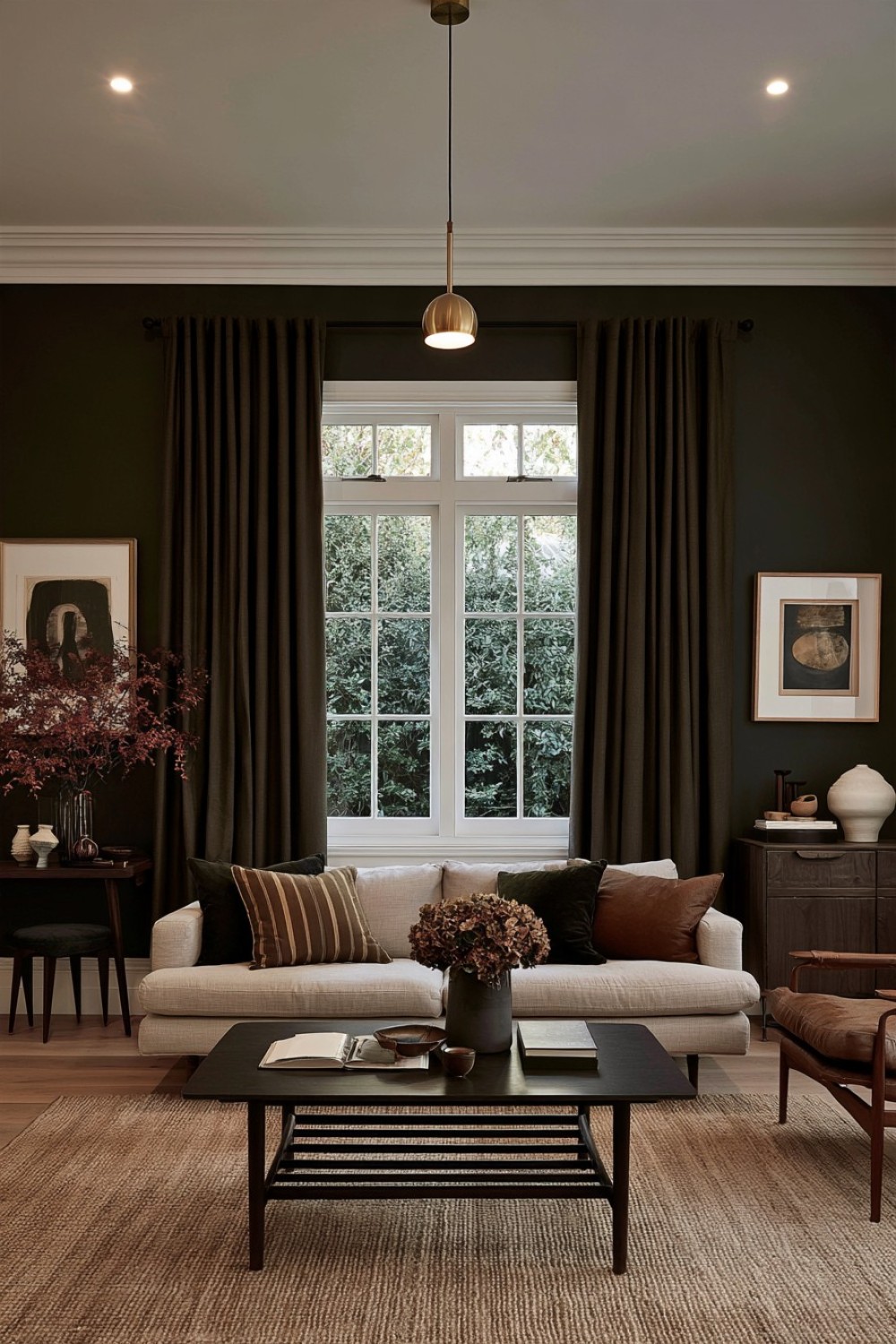
A living room can feel significantly more atmospheric without adding another dark wall color simply by changing how the windows are framed.
Full-length curtains in tobacco, muted olive, charcoal-brown, deep taupe, or another restrained shade can add vertical weight and softness. Choose fabric with visible weave or gentle texture rather than a highly reflective finish.
Hang the curtains so they fall cleanly and avoid excessive pooling at the floor, especially in frequently used living spaces.
The drapery should relate to the wall color without matching it exactly. A slight tonal difference creates more depth and makes both surfaces easier to read.
Pair the heavier textile with lighter upholstery or a pale rug if the room already contains substantial dark wood.
This method is especially useful when you want a moody effect that comes from softness and material layering rather than another dramatic painted surface.
16. Place Pale Sculptural Furniture Against One Dark Wall
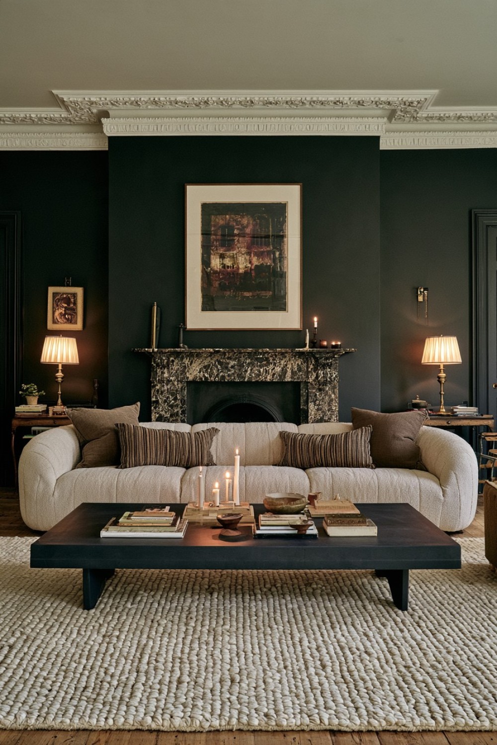
A single dark wall can provide enough visual drama when the furniture placed against it has a distinctive silhouette.
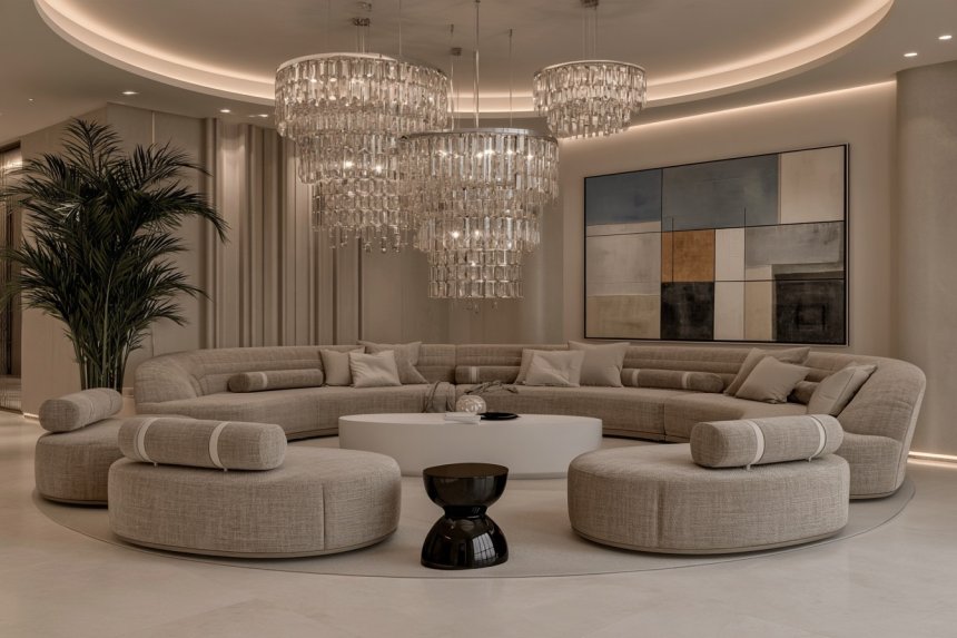
Choose charcoal, deep brown, navy, or muted burgundy for the primary sofa wall, then position a cream, mushroom, or pale taupe sofa in front of it. The contrast emphasizes the furniture’s shape while preventing the room from feeling uniformly dark.
Keep the remaining walls softer so the room retains a sense of openness. A low dark coffee table can visually connect the feature wall with the seating arrangement, while a lighter rug balances the floor.
Avoid filling the dark wall with numerous decorative items. One substantial artwork or sculptural wall feature usually provides enough interest.
This approach works particularly well when the furniture itself has curved or architectural lines, allowing contrast and silhouette rather than multiple colors to create the room’s drama.
17. Use Earthy Red for a Warmer Kind of Moody Interior
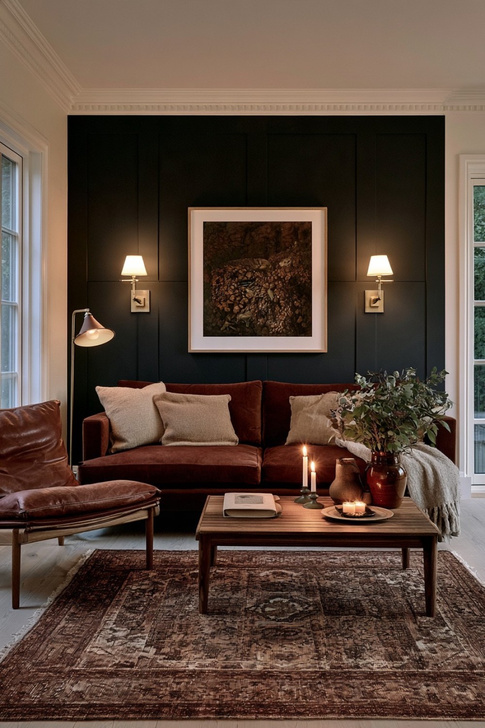
Brick, clay, oxblood, and muted terracotta can create an atmospheric room with noticeably more warmth than blue-gray or charcoal palettes.
Choose one earthy red as the dominant tone, perhaps through a deep clay wall color or oxblood sofa, then support it with dark brown wood, muted beige, charcoal, and natural woven materials.
Avoid bright orange-red accents because they can break the subdued character. Brown-based reds generally integrate more naturally with walnut, leather, wool, and aged ceramic surfaces.
A faded rug containing red and brown can connect the palette without making the room appear overtly coordinated.
Furniture shapes should remain relatively simple because earthy red already creates a strong visual presence.
This direction offers a distinctive alternative to the cooler palettes commonly associated with moody interiors and works particularly well when the goal is intimacy, warmth, and character rather than stark drama.
Keep Dark Rooms Layered Rather Than Simply Dark
The most successful moody living rooms balance depth with visibility. Dark paint alone rarely creates a sophisticated result; the room also needs material contrast, clear furniture placement, lighter surfaces, and enough negative space for individual elements to remain readable.
Begin with one dominant source of depth, whether that is wall color, upholstery, cabinetry, a rug, or a major textile. Then introduce contrast through wood, stone, linen, leather, glass, or lighter neutrals rather than adding several more dark colors automatically.
Consider how the room changes throughout the day as natural and artificial light interact with deeper surfaces. Dark finishes can reveal different undertones depending on their surroundings.
A moody living room should ultimately feel comfortable and intentional. When each color and material has a clear role, the atmosphere comes from layering and proportion instead of darkness for its own sake.
MORE IDEAS


Share
What's Your Reaction?
 Like
0
Like
0
 Dislike
0
Dislike
0
 Love
0
Love
0
 Funny
0
Funny
0
 Angry
0
Angry
0
 Sad
0
Sad
0
 Wow
0
Wow
0